9 Effective Web Design Tips To Improve Your Bounce Rate
Does your website get consistent traffic but having a hard time converting visitors into customers? Are you wondering why your visitors are not spending a lot of time on your site? One of the biggest factors that can kill conversion is a high bounce rate.
A poorly designed website can cause your business or brand to lose potential clients because of the negative experience on their end. Hence, it should be appealing and at the same time engaging if you want your visitors to stick around long enough to perform actions you want them to. To help you out, we’ve listed the most effective ways on how to improve your web design to help reduce your site’s bounce rate.
Speed Up Your Website
The most vital first step you need to do is to improve the load times of your website. If your site is fast, Google is more likely to consider it in its search results or SERP. Keep in mind that your customer’s time is valuable so make sure they don’t have to wait too long to get the information they need.
Here are some tips on how to make your site faster to improve its bounce rate:
- Optimizing the size of your images is one of the simplest ways to boost the load time of your site. Images tend to eat up tons of bandwidth. You can make your image files smaller so that they’ll take up less bandwidth and not affect the way they appear on pages.
- Remove or deactivate any plugins you no longer need or use All your plugins will load once a visitor enters your site.
- Choose a host that meets your needs. If you think that the culprit of the slow loading times of your site is your web host, switch to a new one that can provide faster load times. Opting for the cheapest one is not advisable. You may be saving money now but you may lose even more profit in the long run. Choosing a quality host is worth investing in.
Optimize Your Site For Conversions
The key to optimizing your site for conversions is to make things as simple for your visitors as possible. They should not have to click numerous times just to get to the product page from the homepage. You want them to get the information they want in as few clicks as possible. If there’s confusion along the way, your potential client may be tempted to just exit your site and opt for your competitor. And that’s the last thing you want of course!
You’ll see a massive difference in your conversion rate if you’ll map out the user journey from your homepage to your main conversion goal’s endpoint. Consider testing it yourself and even ask some colleagues or friends to help you out to ensure that getting from one point to the next is as clear and easy as possible.
Furthermore, you want the call to action of your conversion buttons to be very straightforward. Makin them complex or vague is not a good idea. Some examples of excellent calls to action include contact us, add to cart, and shop now.
Apply Visual Hierarchy
Your website’s most crucial features should also be one of the most eye-catching elements. Visual hierarchy can benefit from vibrant colors, large text sizes. Using clear visual cues can show your visitors what’s more relevant and less significant on your site.
Squinting is the easiest way to tell how effective visual hierarchy is. Simply step back from the computer screen and then squint your eyes. This will make the entire page blur. You’ll see that the areas most noticeable on the screen are the most colorful, boldest, and largest. Ask yourself if these are the areas you want your audience to focus on. If not, then it’s probably best to rethink your web design.
The Importance Of Social Share Buttons
Does your site have a blog and have social share buttons on each blog post? All the blog posts on your site should include these buttons at the bottom or in the corner This lets your readers share your content easily on their social media without the need to exit your website. Aside from not adding to your bounce rate, it can help create brand awareness.
On top of that, it may encourage their friends or followers who have not been on your site to check it out. Remember that the more links shared on social media, the higher the chances of attracting new and potential customers. You can also add social media icons to your Divi site’s primary menu so that people can easily find and follow you.
Use Colors And Fonts Effectively
People can’t read what they cant see. Therefore, your website’s colors should contrast in the background. Be sure to use colors that not only complement each other but also make sense together. Likewise, fonts play a major role in your site’s overall appearance. In fact, typography can make a huge impact on the emotional response of your audience.
Using a lot of fonts is unnecessary and will just confuse your readers. When it comes to web design, using Sans Serif is the way to go because these fonts are some of the easiest to read. Elaborate Serif fonts are fun but they are better off for branding or headlines.
Include A Frequently Asked Questions Page
You’ll be providing your visitors with plenty of value by including a dedicated page to answering frequently asked questions about your business and offerings. If a customer has a burning question in mind, one of the first places they’ll probably look for is the FAQ page. If your customers can’t find any answers, they may exit your website out of frustration. That’s why it is advisable to put up an FAQ page. But make sure to keep it updated regularly, especially if there are new questions raised about your products or brand.
Include Testimonials, Feedbacks, Or Reviews
Including honest and authentic testimonials, feedbacks, or reviews of your previous clients on your site is the most effective and quickest way to establish trust in your brand.
The research done by Spiegel Research Center shows that before making any purchase, almost 95% of online shoppers read reviews first. So to build trust and to turn your visitors into paying customers, do not forget to add testimonials and feedbacks on pages. Also, make sure people will not have any trouble finding and navigating them.
Keep Your Navigation Simple
When it comes to navigation, avoid making it complicated. Keep it clean and simple. Visitors often flee a website if its navigation is too difficult for them to handle. Most people tend to get overboard with designing this element. If you’ll put too many options in your navigation, it will just overwhelm your users.
The best practice is to keep the company logo visible and place it in the top left corner of the page. Also, it should be clickable and redirect users to your homepage. Doing so can help people return to the homepage easily regardless of where they are on your website.
Make Your Site Responsive
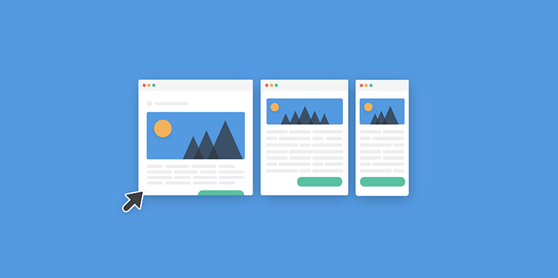
You’ve heard of this a million times. But it’s a web design best practice that’s worth repeating over and over again. The reason for this is because more than half of the global web traffic comes from smart gadgets. Hence, it’s important to make your website mobile-friendly and responsive. Not doing so will make it look very disorganized and cluttered when viewed on mobile devices. The result is a bad user experience, which in turn, causes users to abandon your site.
By following these simple web design tips, you’ll have a more engaging website. Your visitors are less likely to leave which will cause your bounce rate to drop significantly. Try these out today and let us know how it goes. Also, if you have any additional tips of your own, do not hesitate to share them in the comment section below.
Aileen Cuaresma
Aileen is a Technical and Creative writer with an extensive knowledge of WordPress and Shopify. She works with companies on building their brand and optimizing their website. She also runs a local travel agency with her family. On her free time, she loves reading books, exploring the unknown, playing with her two adorable dogs, and listening to K-pop.





0 Comments