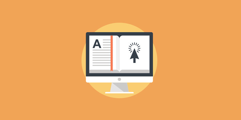
How You Can Use The Power Of Psychology When Choosing Fonts

There are several elements you can utilize to evoke certain emotions in your design. From colors to shapes and layout, you can create a wide array of emotions in your audience. However, one of the most often overlooked elements of design that can make a massive impact on the emotional response of your viewers is typography.
The psychology of font is powerful thus understanding it, is essential. The font you’ll choose can determine whether your design or branding will succeed or fail. It can change how people perceive your design, as well as the type of emotions it stimulates. Use the wrong typeface, and your design will not be as effective no matter how compelling it is.arrow
So what is font psychology, and what makes it valuable to your projects? Also, how can you take advantage of it to develop emotions in your creations?
About Font Psychology
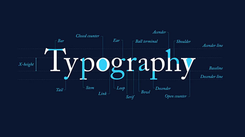
Font psychology is basically the study of how various fonts impact behaviors, feelings, and thoughts. The feelings, thoughts and how humans associate themselves with different typography types is very different, and often, quite specific.
So, if you’ll use Arial in your design, it’ll evoke a different emotional response in your viewers than if you’ll use Roboto or Times New Roman. Also, using Calibri as your main font will have people associating it with an entirely different set of ideas, feelings, and thoughts.
Knowing these various emotional responses and associations, and how you can benefit from them is what font psychology is all about. Understanding it is crucial if you want to create designs that are not only stunning but beautiful as well.
Your selection of font-face will affect the meaning and inferences of what individuals will obtain from it. Your choice will also influence on the overall impact of your text-inclusive designs based on their readability, feel, and look. All of these typography design psychological factors will have a huge role in whether your design will have the impression you’re after or not.
Inferences
Every reader and viewer will make a lot of inferences or conclusions about your design is mainly based on the style of its text. Often, they will not realize how it influences their view of it.
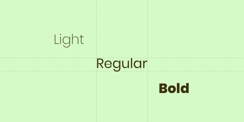
As an example, applying a much bolder than average bold style to your font-face or text generally means you want to put emphasis or weight to it. The text will be more prominent than the other texts in the entire design. On the other hand, the application of italics may imply that you’re putting subtle emphasis. It may even imply sarcasm.
Some typographic symbolisms also have broad meanings, which is why you must be careful when incorporating them in your projects. Script typography normally indicates sophistication or elegance, that’s why you often see them on wedding invites and luxurious brands. On the other hand, some fonts are meant to communicate a specific theme, with some being more complex than others.
When you use typefaces in certain styles, you’ll be able to drive your audience to automatically make appropriate inferences about the essence of your design and how they should feel about it.
Visual And Verbal Meaning
The typography you choose can also help the memory of your readers. It’s especially true if you choose something with a visual style that nearly captures the verbal meaning of your text. Aside from the thematic styles of fonts specified above, it also includes height, weight, and other fundamental typography characteristics.
Although the relationship between visual and verbal meaning is often natural, some compatibility elements in typography psychology are a little less obvious.
Legibility
While most would think that using a more legible typeface would promote an easier text recall, harder-to-read fonts will extend the time your readers will spend reading the text you’ll display. This will cause them to slow down and carefully read the text further. As a result, it will enhance the memory of your text and its meaning. But still, there’s a thin line where the illegibility level considerably outweighs any disfluency advantages that helps memory.
Look And Feel
When the typefaces in your design are distinctive or new to the eyes of your viewers, they’ll slow down their usual speed, similar to the disrupting fluency effect. How fresh or innovative a typeface is will pique their interest naturally, thus, generating a more solid recall.
Although the conformity between the style of your typography and what it’s representing can solidify the purpose of your design, your readers will take longer to process the visual and verbal meaning of your design if there’s an inconsistency between the two. Keep in mind though that your attempt to create inconsistency to enhance recall through typographic designs may exceed the limits of what is acceptable.
Combining complexity with innovation can promote focus and lead to better recall, as well as appreciation, but too many inconsistencies in combinations may also cause readers to lose their interest in understanding your text and design.
Any lack of harmony between your fonts, design elements, and its meaning, may result in a very negative perception of it if you don’t use them intentionally and carefully.
Deciding which font to use in your design is just as significant as colors when conveying a message through your designs. Studies about font psychology show that, as a designer, you should consider these psychological elements when selecting your fonts to create extremely effective designs. Ready to apply these to your projects today? Let us know by leaving a comment below.
Aileen Cuaresma
Aileen is a Technical and Creative writer with an extensive knowledge of WordPress and Shopify. She works with companies on building their brand and optimizing their website. She also runs a local travel agency with her family. On her free time, she loves reading books, exploring the unknown, playing with her two adorable dogs, and listening to K-pop.


0 Comments