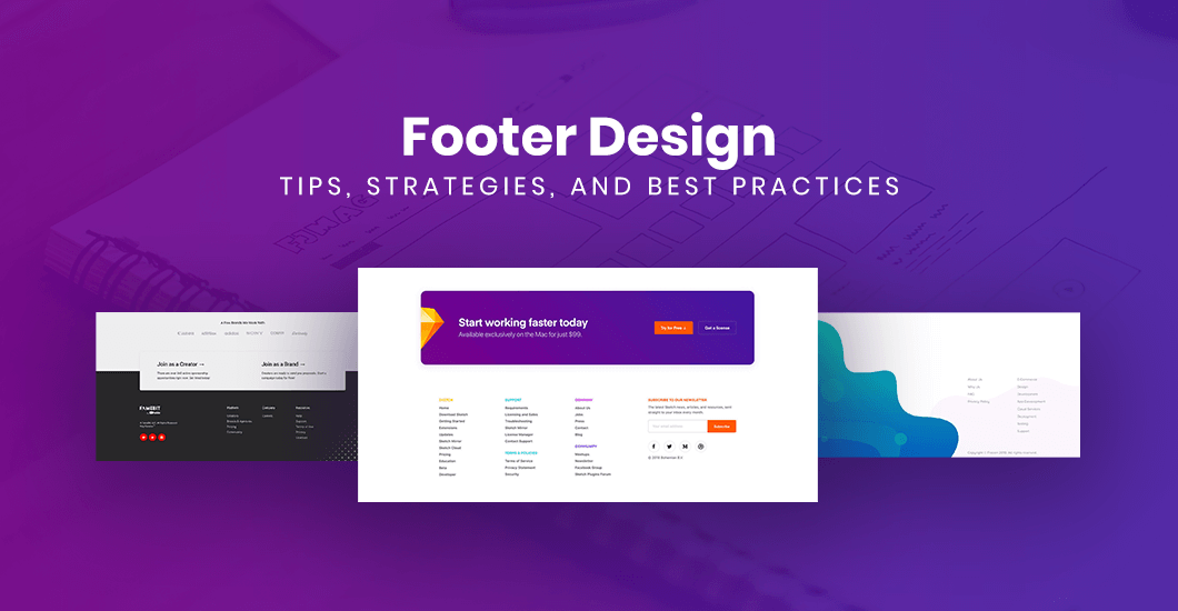
Website Footer Design: Tips, Strategies, And Best Practices
A Footer is one of the most vital parts of your website. It may not have the most awesome design or contain the most exciting content, but it’s often the place where your users go to find the information they need. Hence, it’s an element that you should not overlook when planning your web design.
Most website owners often overlook their site footer. They normally focus on designing the top parts of their sites. After all, it’s one of the first things that your visitors will see upon landing on your page.
No doubt, designing the best header and an engaging banner is a must. But you should also give equal importance to your footer. It should be capable of helping you accomplish some of the specific goals you have for your website.
Your footer is the only component that will show up on every page of your website. Whatever knowledge it holds may dictate whether users will leave for good or continue their interaction with your site.
Keep on reading to learn more about why a footer matters. Also, find out what elements you need to include and exclude to create a compelling one.
What To Include In Your Footer
Look at your site footer as an opportunity. So design it in a way that can help your visitors navigate your pages quickly. It should also meet the goals of your company. Its role should be similar to all the parts of your site.
With that in mind, here are the things that can improve your footer to increase conversions and provide better UX.
Copyright
Copyright information is what any footer needs, no questions asked. It’s the easiest element you can include to protect your site and its content from plagiarism. And with a little coding, the year will update automatically.
Sitemap
This contains the list of your site pages. The footer usually contains your sitemap’s HTML version. And although users seldom use it, it’ll aid search engines like Google to locate and index your pages or URLs easily like the XML sitemap.
Privacy Policy
The privacy policy page is another common component in almost all footer designs. It typically details the policy of your website about information such as what is collected, how it’s stored, and how it may be used.
Some sites include it because the law requires a privacy policy page. On the other hand, some web designers consider it for email signups and form submissions, as well as tracking analytics and remarketing.
Terms of Use
Terms of Use is a bit different to a privacy policy page. It’s similar to a disclaimer which explains what your visitors are agreeing to when visiting your website.
Contact Information
The contact details on your footer will typically include a way for your visitors to get in touch with you, such as an email address and phone numbers. Additionally, it may also contain the location or address of your business and a map or a link to it. These factors will also have a massive impact on your local SEO.
Social Media Icons
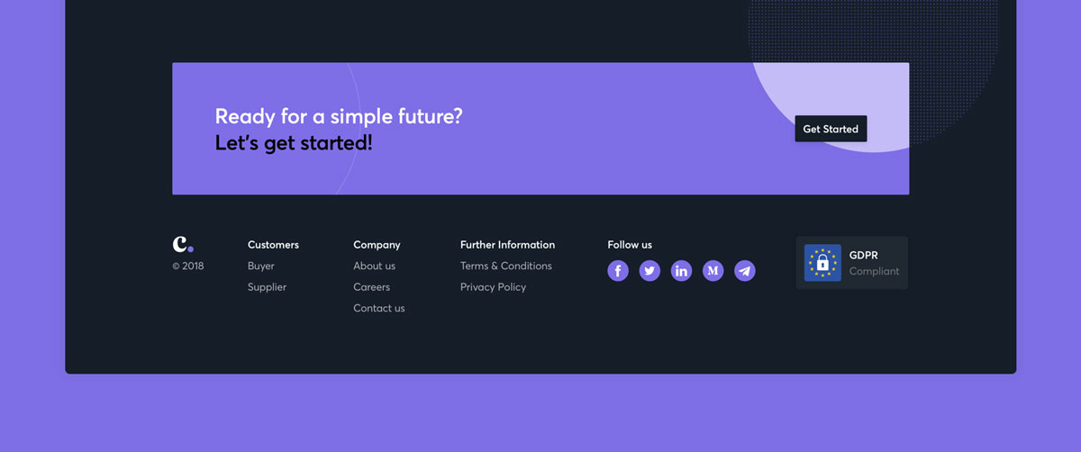
In a world where social media is taking over our lives, it’s foolish not to include links to your social media accounts in your footer. This is especially true if your business is very active on Facebook, Twitter, and Instagram. Also, putting your social icons at the lower part of your site will ensure that it will not distract your visitors from the content of your pages.
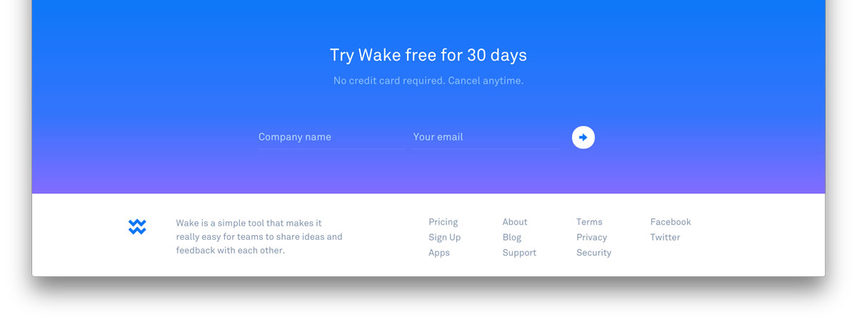
Email or Newsletter Signup
According to studies, about 24% of high-ranking marketing sites put a newsletter or email signup form in their footer. So don’t just place it on the header or as a popup. Generally, the more areas you can remind your visitors about how they can continue interacting with your business, the better. However, make sure not to go overboard.
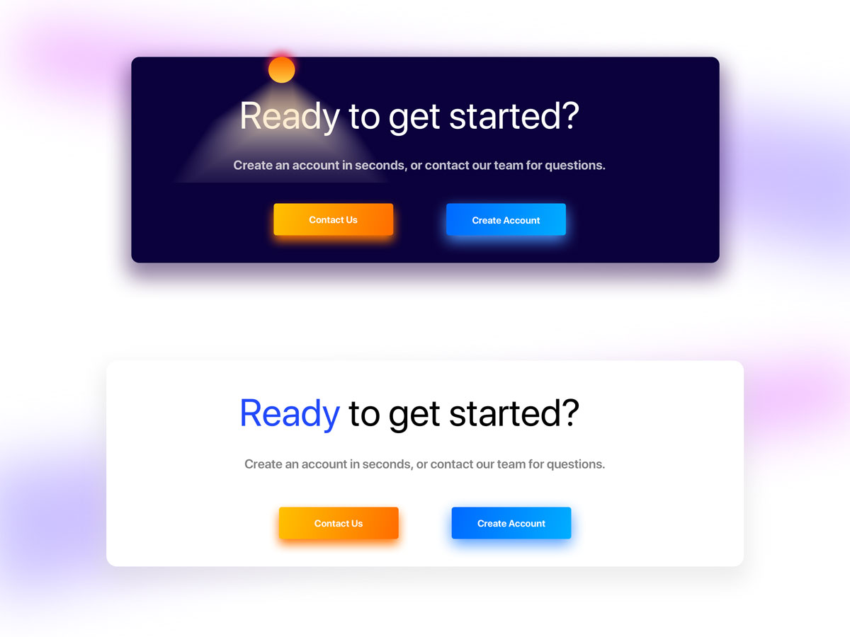
A Call-to-Action or CTA
YCTAs direct your website visitors to take a particular action once they land on your web page. Depending on your niche, you may want to include it on all pages. It can either be a link where they can subscribe to a service or in the form of a button.
Site Search
These tools are not as common as signup forms in a site footer. Nonetheless, some sites choose to include the element at the bottom part of their page to make things even more convenient and easy for their visitors.
Navigation Links
Some users will not spend a lot of time on a page. If they don’t find what they’re looking for, they’ll scroll down to your site’s footer. This is a chance where you can use the footer to provide your audience with added options like navigation.
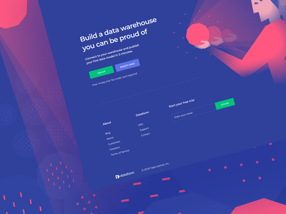
Some websites have a fat footer, which is a footer packed with content. Some even involve a mega menu dropdown, which contains almost every link or piece of content you’d see in a header dropdown menu.
Do’s And Don’ts Of A Professional Site Footer Design
So now that you already have an idea of what elements you need to include on your footer, here are some extra tips to make your footer design even more powerful:
- Mobile optimization.
Design each element of your site with the mobile-first initiative of Google in mind. Mobile users typically scroll down to your site’s bottom part. As your footer receives more exposure from mobile users, it’s vital to make its design and layout optimized for mobile. - Space.
Ensure it has enough space so that it won’t look cluttered. - Columns for related links.
Design columns with related links. Categorize it by giving every section a title. Not only will it make your site easy to navigate, but it’ll also improve user experience. - Color contrast.
Make your footer text as readable as possible. Also, ensure that its color and your website’s overall theme go well together. - Appropriate navigation.
Incorporate your site with just the right amount of navigation. UX should always be your main priority and focus. If your site footer has plenty of information, consider including collapsible sub-footers. The key here is proper information hierarchy.
Bonus: Get An Exclusive Footer Layout Pack for Divi
We often overlook footer in terms of web design. We often think that since it’s at the bottom part of the page people do not pay too much attention to it. However, it’s just as important as the rest of your website.
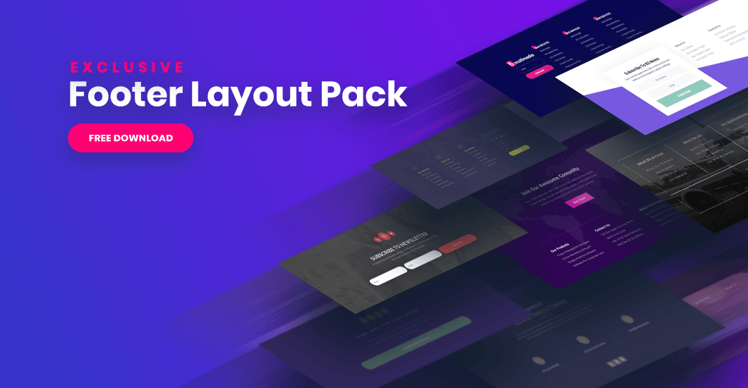
So to help you craft a beautiful and professional-looking footer, we’re giving a new Footer Layout Pack for Divi, which you can download for free. It includes 10 professionally designed footer layouts that are easy to incorporate on your Divi site. They also have all the features your company needs to help it grow, as well as boost its online presence.
A website footer is a vital part of your design. It can also say a lot about your website as a whole. It can guide site visitors on how to go about your page and what they can do.
Additionally, it can tell them who you are or what your company is all about, so do not overlook it. Ensure that it has the right blend of design elements, information, and usability to help with user experience.
So, do you already have a plan on what you’ll put on your footer?
Share it to us by leaving a comment below.
Aileen Cuaresma
Aileen is a Technical and Creative writer with an extensive knowledge of WordPress and Shopify. She works with companies on building their brand and optimizing their website. She also runs a local travel agency with her family. On her free time, she loves reading books, exploring the unknown, playing with her two adorable dogs, and listening to K-pop.
Use coupon code SLIDER15 at checkout!


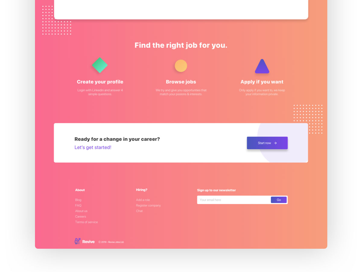
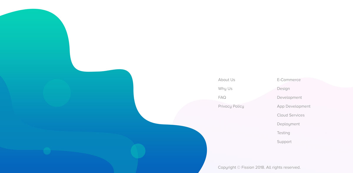
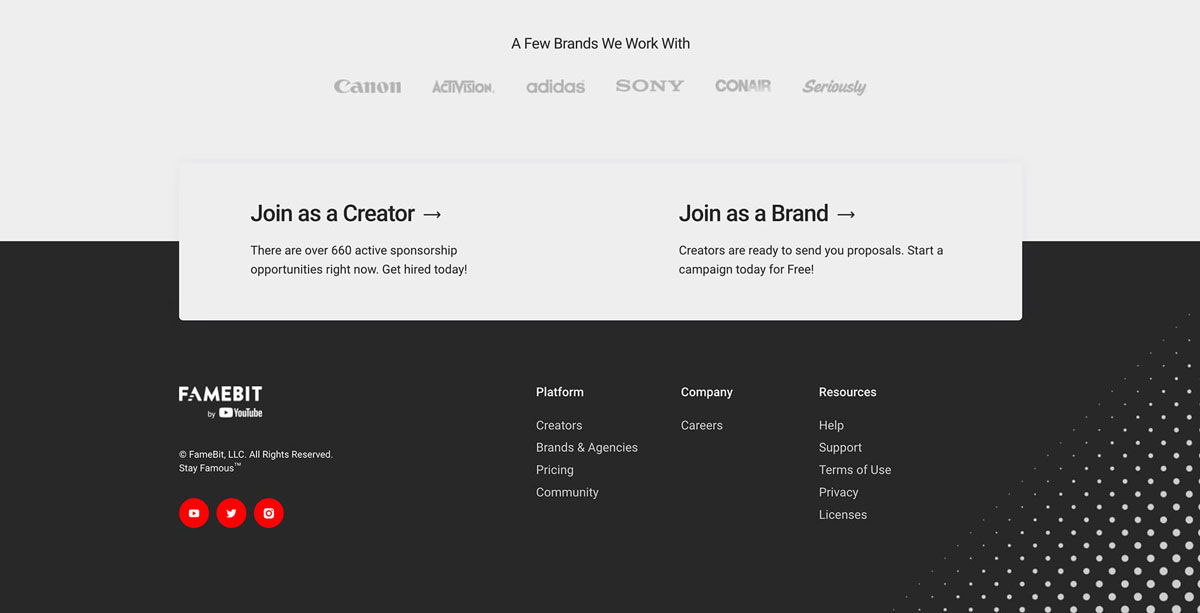
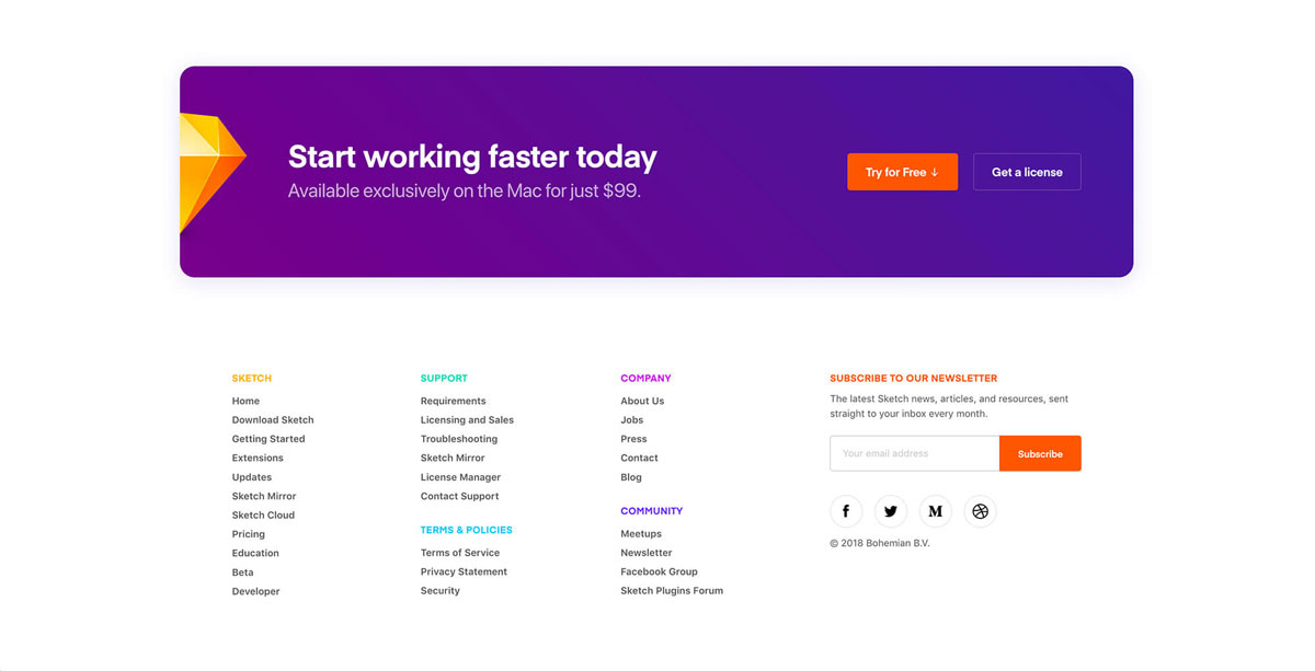
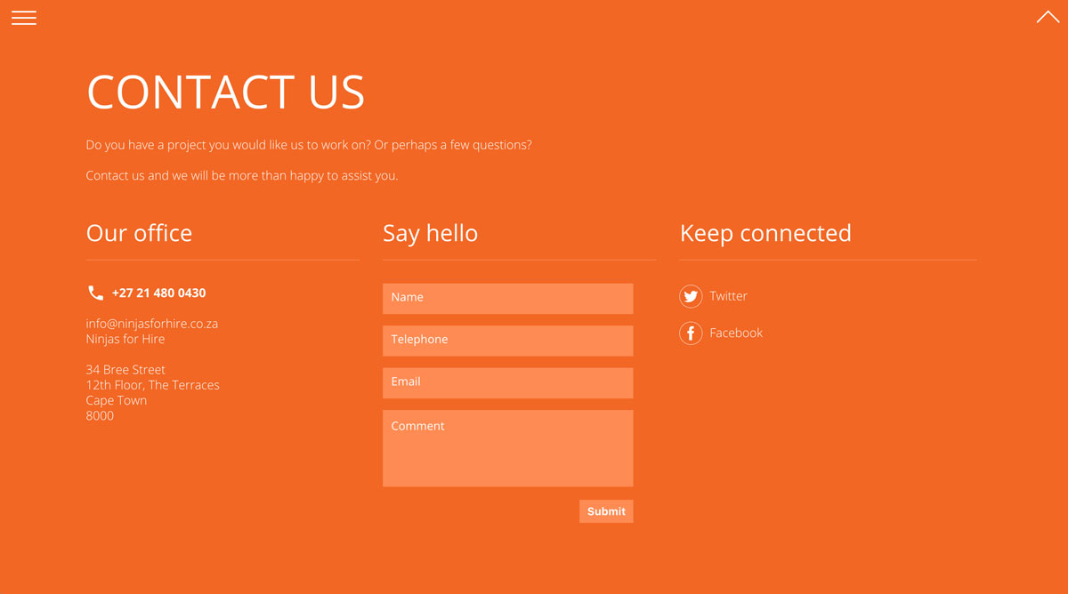
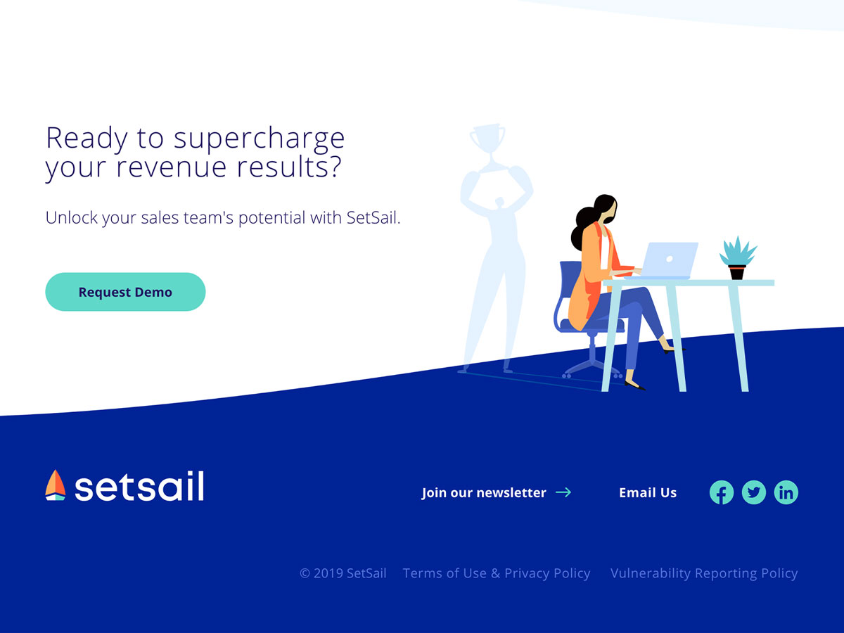
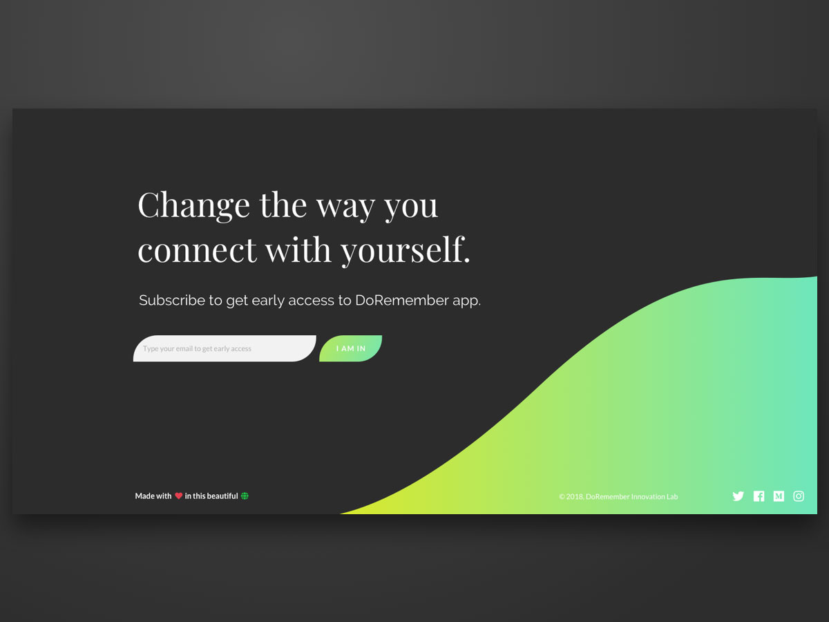



Beautiful footers!
Are they made with Divi? Any json files to share with us??
Thanks Alex! These aren’t Divi footers but we have prepared an awesome freebie for Cyber Monday with 10 beautiful footer designs 🙂 Stay tuned!