Web Design Trends Predictions 2021
Check out our annual round-up of web design trend predictions for 2021. This year, web designers will see some innovations while some current trends will make a comeback with a little twist.
Despite loads of looming uncertainties in 2020, we all have moved forward safely through it all. The past year has allowed designers to come up with surprising innovations when it comes to web design.
Now, web design trends in 2021 will allow professionals to focus on usability, accessibility, and enhanced functionality for a better user experience.
Keeping in mind the latest web design trends will ensure that your website stands out in the ever-growing online ecosystem. Since the list is a bit lengthy, we have narrowed down the list to include only the greatest and most useful ones. Read on to know what 2021 rolls down to web designers:
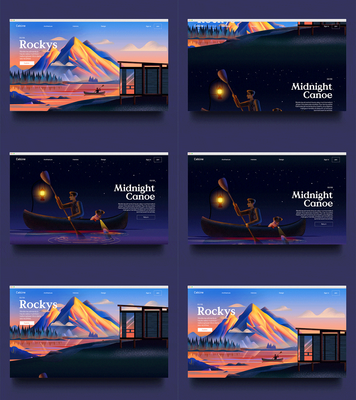
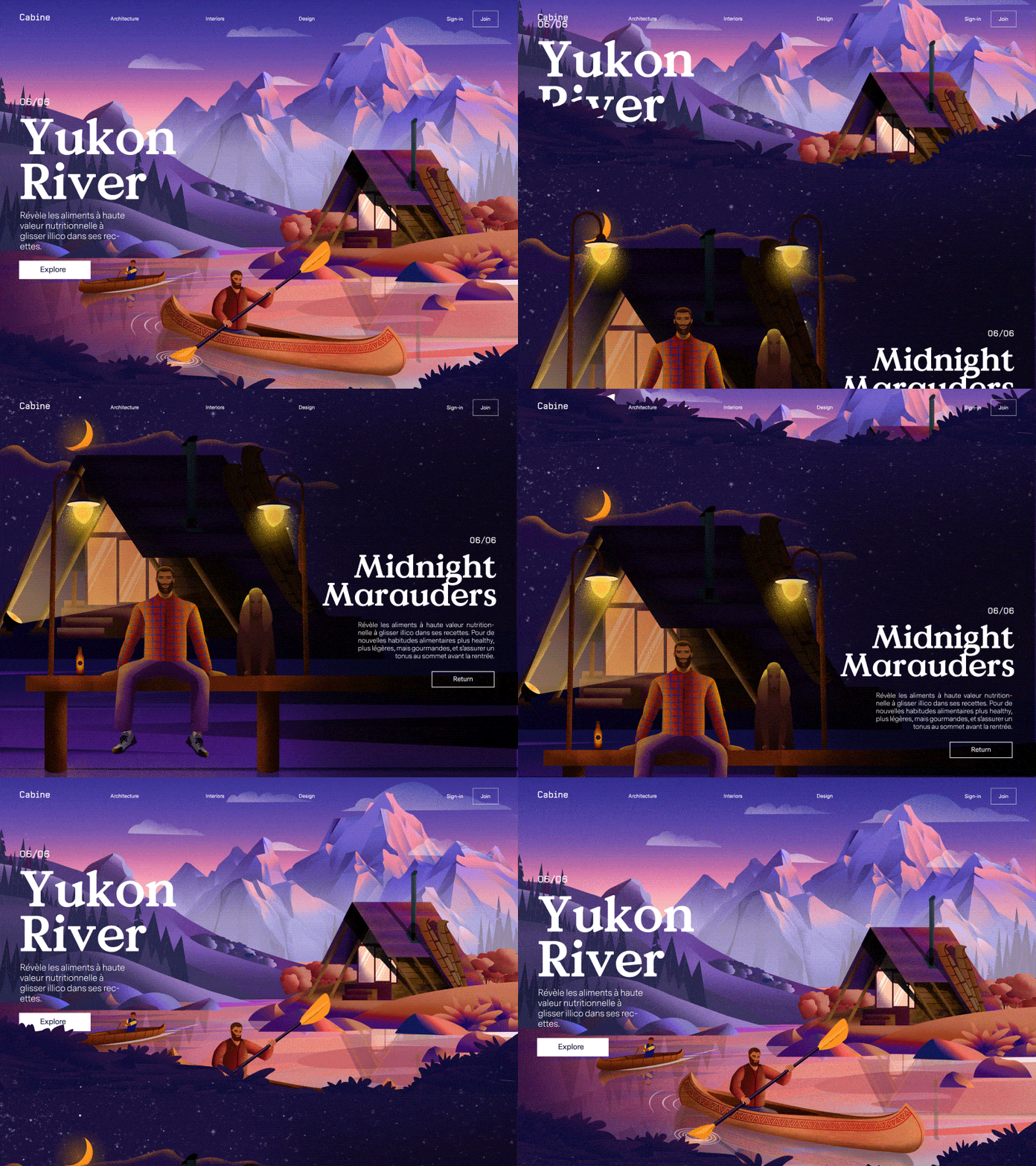
Parallax Scroll Animations
Parallax animations have been around in the web design industry for the past few years. But in 2021, this web animation trend will get even more complex through more creative and subtle explorations. We see the parallax effect in everyday life when viewing passing sceneries while driving. The effect on web pages seems equally real and surreal. You can use parallax scrolling effect to any page – homepage, landing page, blogs, or any other page.
Now, what exactly is this? The parallax effect is an optical illusion of depth when visitors scroll the web page. The part of the page that is farthest from the user moves at the slowest speed. It is like when you look out of the window from your car. The guard rail seems to move fast, but objects in the distance move slower. This leads to a great user experience because of no sudden movements.
But note that too much movement and depth can cause dizziness and disorientation among users with vestibular disorders. So, incorporate parallax minimally without compromising any important information. Expect to see more interactive and impressive websites using parallax scrolling effect in 2021 and beyond.
Cabine by Zak Steele-Eklund
Cabine Yukon by Zak Steele-Eklund
Abstract Art Compositions
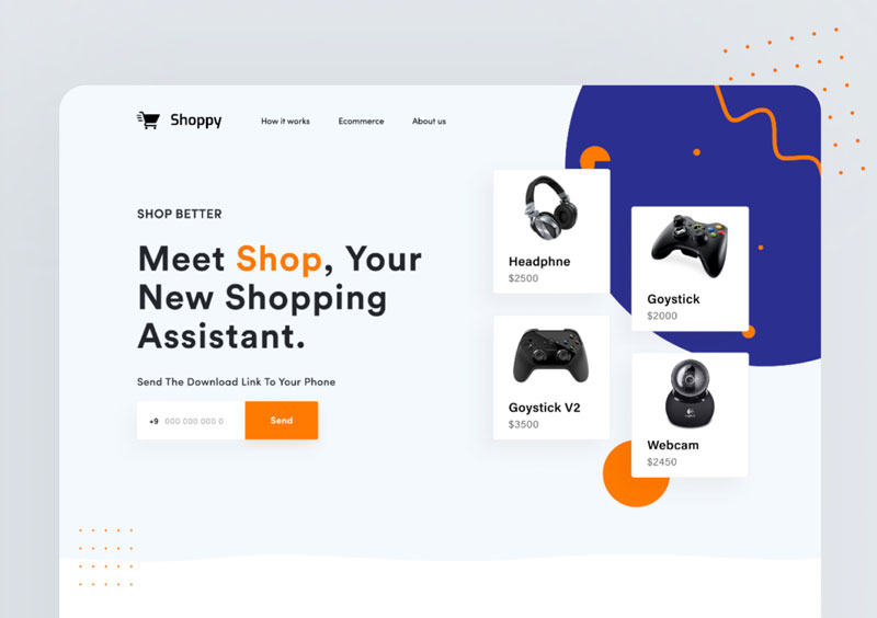
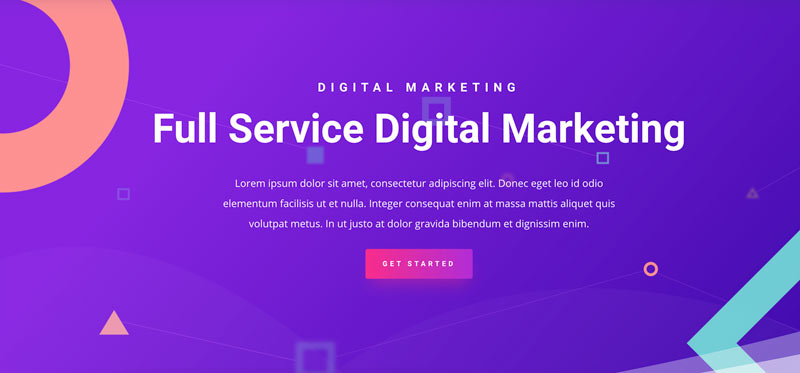
In 2021, web designers are incorporating restrictive and minimalistic abstract shapes into complex compositions that exude creativity and freedom. Abstract art uses colors, shapes and forms to achieve a visual effect that represents an accurate version of the reality.
Making their way beyond painting and sculpture, abstract art composition is making its way to the web design world. These are replacing photography and figure illustrations in web design for tech products, apps, and startups. Bursting abstract art compositions exude energy and warmth, resulting in a website that feels expressive and alive.
Abstract art has the ability to adapt to any purposes and businesses. Therefore, it fits all sorts of websites, including eCommerce business, corporate service, architects, hospitality, and you name it. This design concept adds impressive visual interest to web pages by making them versatile and aesthetically pleasing.
Online Shop Landing Page by Aminul Haque Chowdhruy
SASS Landing Page by Shekh Al Raihan
Digital Marketing Layout Pack by Elegant Themes
Retro Typography
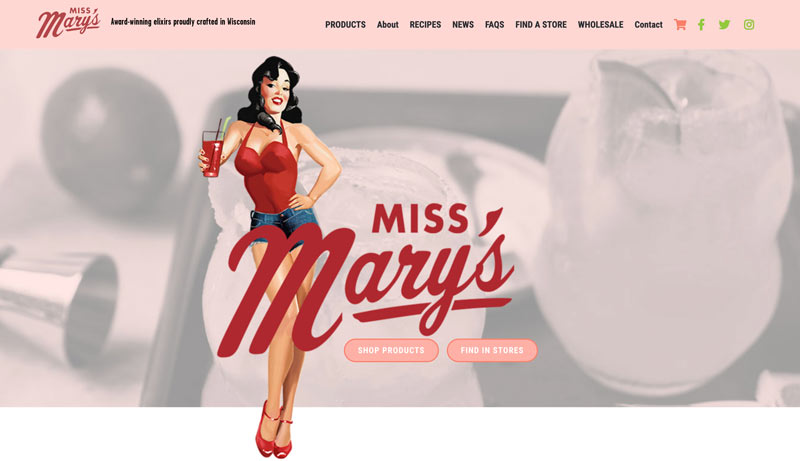
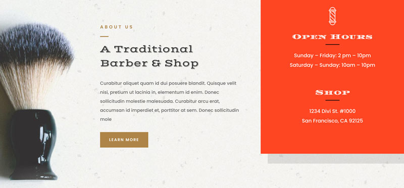
Old trends often make a refreshed and grander comeback. Remember mom sneaker and handlebar moustaches! Retro and vintage fonts have experienced the same flow in their resurgence. Vintage-inspired typography right from the 60s, 70s, or 80s has become popular. These typefaces fit almost all kinds of design projects, including logos, website designs, and mobile applications, to name a few.
Old-school throwback fonts lend a timeless nostalgic feel to websites that no other font can emulate. But, you won’t see the same stale and cliché fonts. Rather artists are reimagining these typefaces to breathe new life in websites for more impressive user experiences.
Some of the most inspiring typography that presents the modern-day sides of retro designs includes:
The Aviator Font Collection: Featuring four different 100% vintage fonts, this style is perfect for logos, posters, signage, advertising, etc.
- Trend Rough Font Family: Using a sans and a slab font, this typeface works well at capturing the fashion world’s aesthetics.
- Rumble Brave Vintage Fonts: This amazing collection combines style, luxury, and elegance all in one.
- MADE Dillan: Boasting a perfect retro vibe, this font brings back to life American retro typography. It works well with logos, posters, cards, and other vintage stuff.
Some other retro fonts that would catch your fancy and fit all sorts of projects are Monton, Fenway Script Typeface, BTX The Bee Line, Camar Vintage Font, and the list goes on.
Miss Marry’s website
Barber Shop Layout Pack by Elegant Themes
Dark Themes
For a long time in the web design industry, the white background has been considered important for a clean, uncluttered website. That’s not anymore! Following the popularity of dark viewing mode in recent times, many applications and web designs are exclusively adopting dark themes. Apple, Mercedes-Benz, and Sony are a few of the top brands that have embraced the dark mode aesthetic.
Dark colors make the overall look of the web page elegant, chic, and sleek. The deep, heavy background serves as a high-contrast background for other elements like videos, graphics, images, shapes, color, etc. The dark mode also increases the contrast ratio and makes elements easily visible. Thus, it is easier on the eyes and helps with headaches and long-term sight problems that are common with screen usage.
You can add a dark mode toggle to websites so that visitors can customize their experience as per their preferences. Originally combining white and light color schemes, more and more neuromorphic designs and flat design in iOS or Android UI are also incorporating dark themes.
When used for OLED/AMOLED devices, dark modes reduce battery consumption even with full brightness. It also prolongs the lifespan of OLED/AMOLED screens.
Remember that when using dark themes, you should avoid lots of text and unnecessary elements. Also, limit your color options because too many colors can clash against the background making your website look unfriendly.
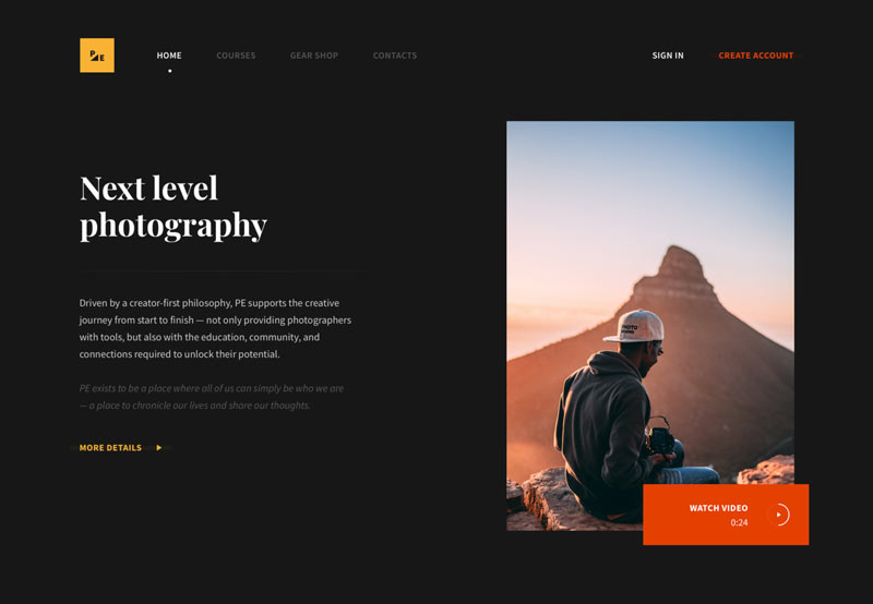
Photo-educat Landing page by Viktor Kirichenko
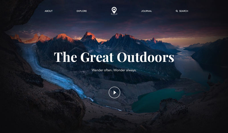
The Great Outdoors by Piotr Adam Kwiatkowski
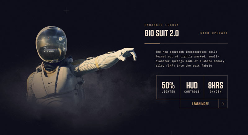
Spaced Entry by Ross Legacy
Cartoon Illustrations
One remedy for pale, boring, and uninspiring websites is cartoon animations. Cartoons have made a natural progression from TVs to web design because of their incredible flexibility and appeal to people.
Using cartoon illustrations is here for a few years and to stay for long. Web designs with illustrations can freely go with their imaginations and think out-of-box. You can create different elements, including scenic illustrations, character illustrations, background doodles, and much more.
Cartoon designs help showcase your creativity while increasing the visitors’ engagement and memory retention on your website. It’s a highly effective way to make a site friendly and fun to its potential visitors.
Cartoon illustrations and character design have gone far beyond standard biases such as almond eyes, particular body types, and fair skin. Now, creators and artists are coming up with cartoons with an increased focus on diversity and inclusivity.
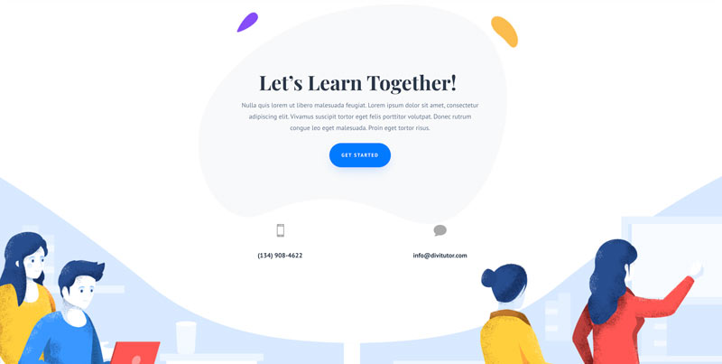
Tutor Layout Pack by Elegant Themes
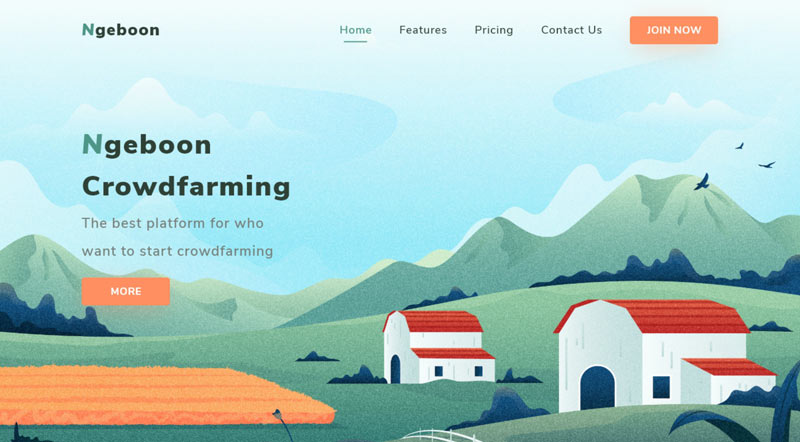
Farming Website by Orely
Asymmetric Layouts and Shapes
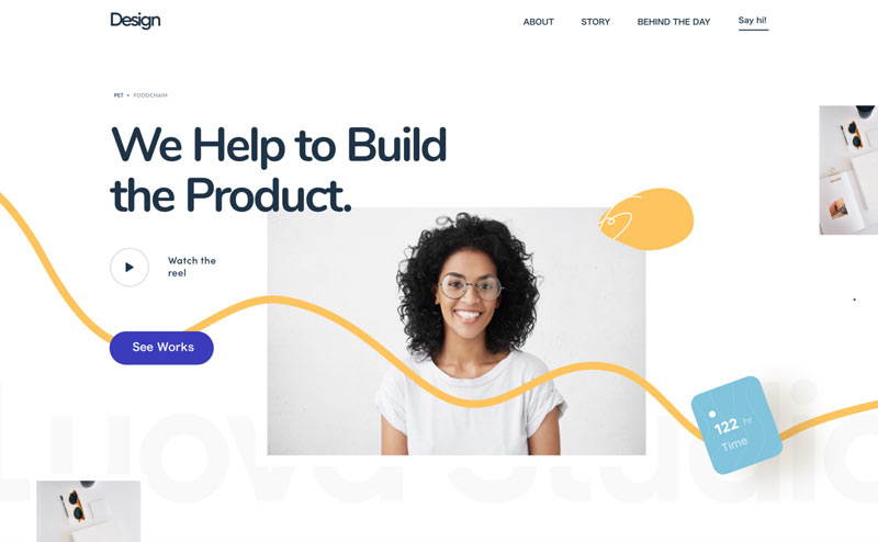
Asymmetric web design approach challenges the conventional grid layout for building websites. Asymmetric layouts and shapes lend more individuality and edge to websites. They keep websites from looking blocky while making them appear very exciting.
Asymmetry focuses on actions and motion. It exudes a spontaneous feeling of dominance and brings the focal point of the website to instant attention. The space between these shapes allows for cleaner asymmetrical lines and bolder patterns.
There is one common misconception that websites with asymmetric layouts lack balance. That’s not true! Every website can have the right visual balance, whether it is symmetric or asymmetric.
Asymmetric designs achieve visual harmony by imagining the weight of each element on the web page. You must consider the size, color and movement of every element before arranging their overall composition.
Note that asymmetry is a complex design concept to master. But, once you shed all your misconceptions and try it out, you expand your horizons and create impressive websites. Just keep the website easy on the eyes while having a unique and functional design.
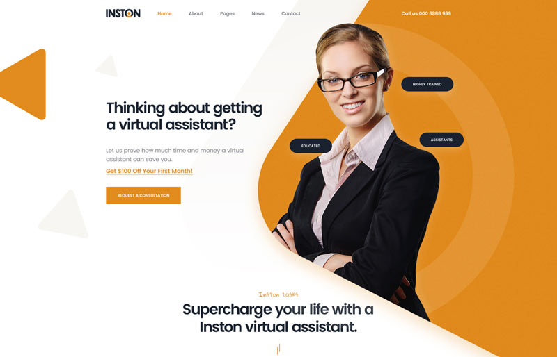
Inston PSD Template available on Theme Forest
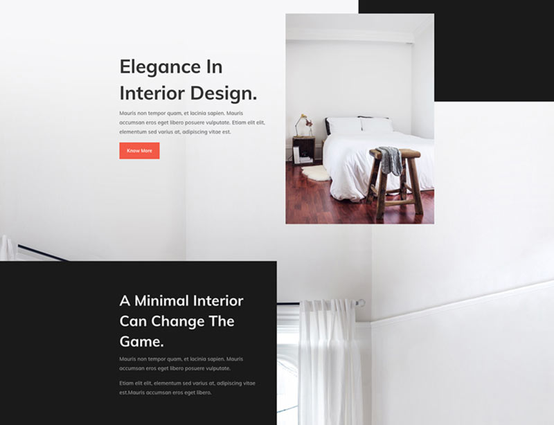
Interior Design Layout Pack by Elegant Themes
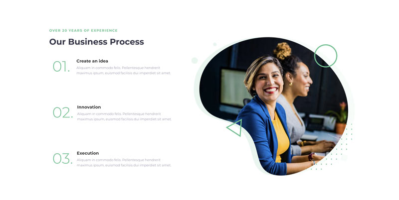
Free Divi Layout by B3 Multimedia Solutions
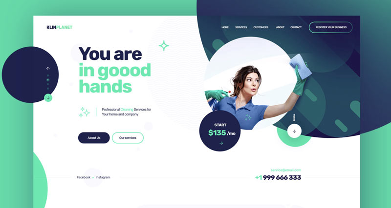
Bold Fonts, Big Headlines
When it comes to typography in 2021, bigger and bolder is better. Fonts want to be noticed and must be noticed. And, that’s possible when these are big and bold.
People notice the big headlines first. That is why these play a major role in making the first impression of a web page. Bold letters grab visitors’ attention instantly. They strike messages and prompt them to take the intended action.
The bold font trend also goes well with minimalist designs; when you are using an oversized font, keep the rest of the composition simple and clean. You can use different section titles and fonts to create a balanced visual hierarchy. This ensures readability and a positive user experience.
Bold and big font trend favors the custom type, bringing into the picture many old favorites as well as new typefaces. You can choose a strong font to give a modern look to your pages.
Just make sure the font looks good on all screen sizes. For this purpose, you can use variable fonts that adjust themselves to various orientations, viewpoints, devices, etc. This typography also provides greater flexibility to typographical elements and reduces the limits of your existing font formats.
Check out the rules of typography every designer should know.
KlinPlanet – onepage website by Marcin Trojanowski
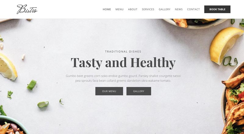
Bistro Layout Pack for Divi by Divi Pixel
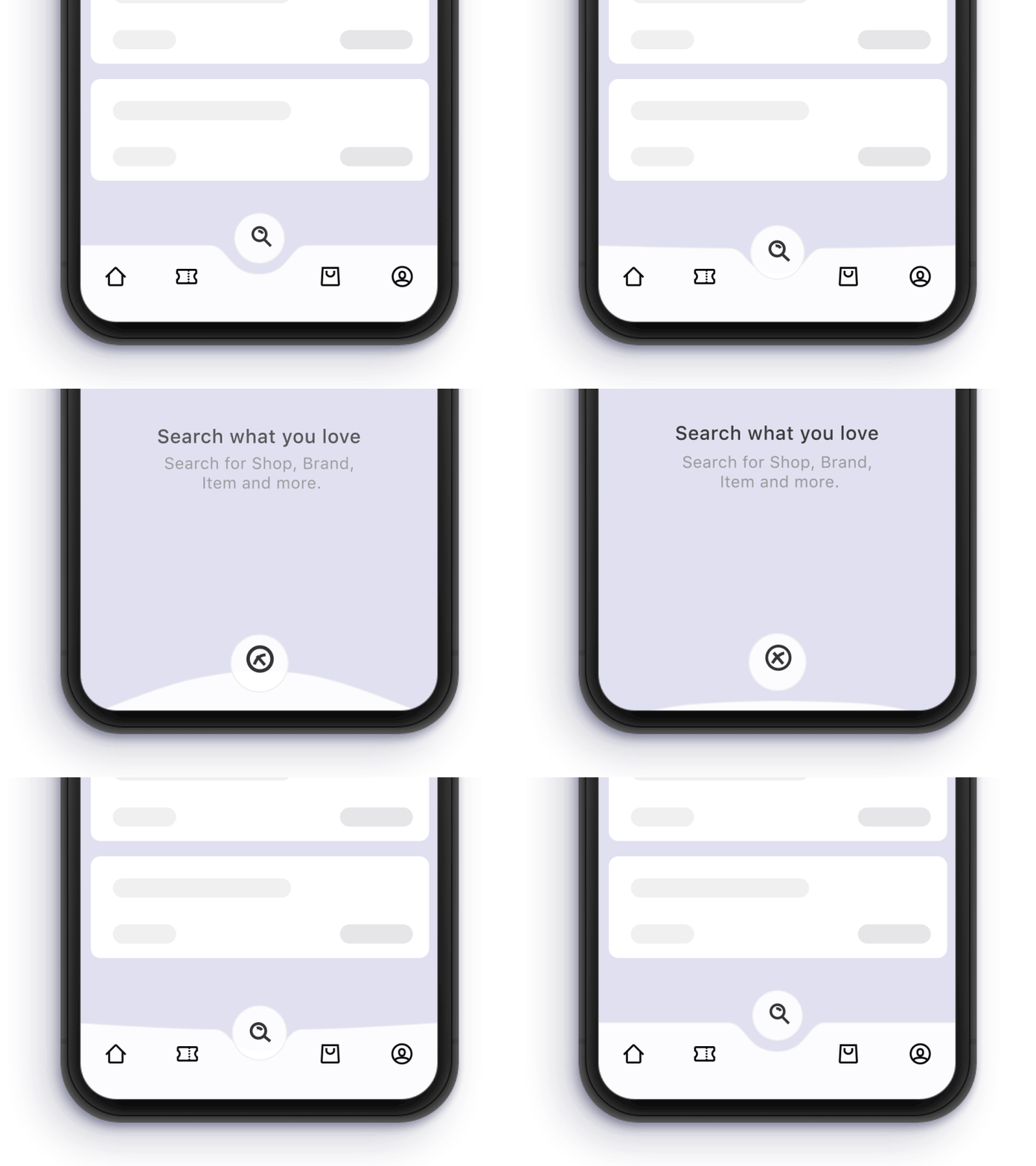
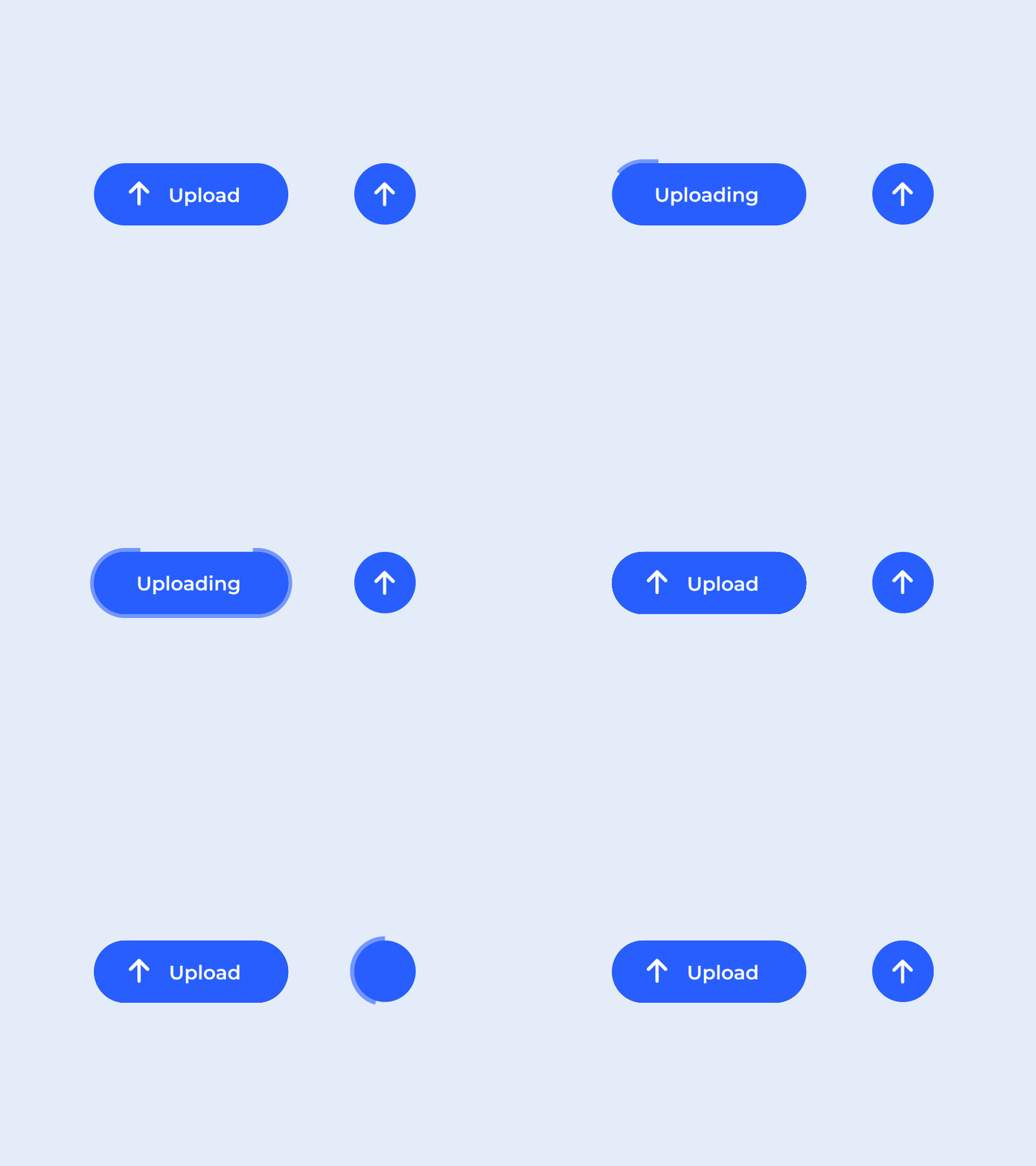
Motion & Interactivity
‘Motion’ lies at the core of every impressive and interactive website. It is used everywhere, from boutique sites to career advice pages online. Motion and animation can convert any ordinary web page into an engaging and exciting one.
In addition, brands are adding other interactive elements such as quizzes, games, and polls to their website for more interactivity. This helps engage visitors while helping them learn more about the business. Remember to maintain the balance; interactivity and motion should not dominate or distract the web page’s intended purpose.
Lastly, advancing technology has made it easier to utilize motion to your web pages, resulting in delightful experiences.
Tab Bar Search Page Interaction by Paarth Desai
Image Hotspot module for Divi by Octolab OÜ
Upload button interaction by Shivam Kaushik
WordPress Page Builders & Template Kits
You will be able to design stunning, feature-packed websites in a fraction of time. Simply drag and drop elements like sliders, videos, images, columns, portfolios, etc., and your website is ready! That’s all with pre-designed website themes. Though the concept of pre-designed website themes is not new, this is going to be even more advanced for WordPress users in 2021.
In recent years, self-serve website templates and page builders have grown in popularity. With website builders like Elementor, Divi, Beaver Builder and others, even novice web designers and programmers can create professional websites in no time. They provide a code-free, flexible and fast way to design websites with professional layouts and full customization without coding knowledge.
Try out Divi Template Kits that have something professional for everyone. Using pre-design templates, you can jump-start your web design project in no time!
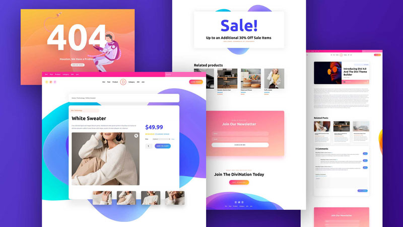
Theme Builder Pack for Divi by Elegant Themes
Agency Layout Pack for Divi & Divi Pixel plugin by Octolab OÜ
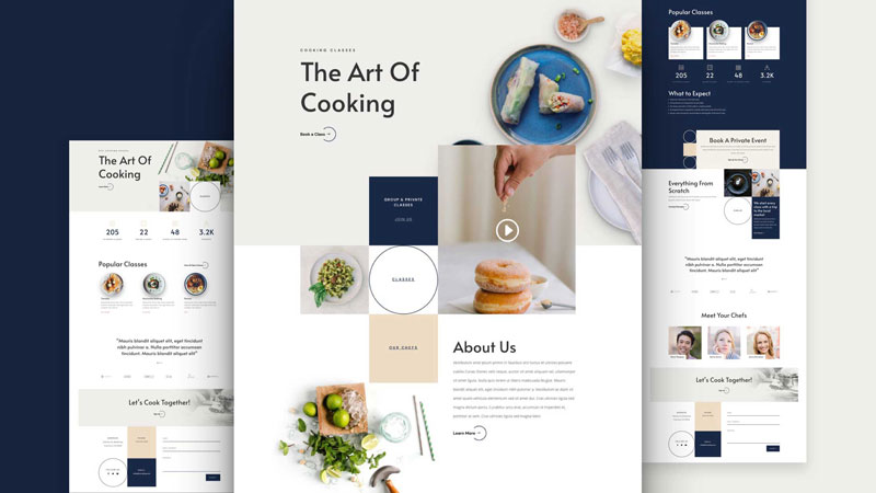
Cooking School Layout Pack for Divi by Elegant Themes
Minimalism
Your website is like your business card. It tells people everything they need to know about the brand. But, websites with many unnecessary elements, a long load time, and poor functionality are not good for user experience. That’s when minimalism enters!
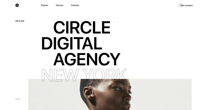
Often confused with simplicity, minimalism is about reducing all elements on a web page to include only the essential ones. This “less is more” approach to web designing effectively conveys the intended message to website visitors. Apple’s website is one of the best examples of the minimalist web design approach.
Minimalist designs are user-friendly and visually appealing. They make websites SEO-friendly by allowing search engines to understand their content easily. Google has already declared that it prefers websites with clean coding and mobile responsiveness.
Moreover, cleaning out unnecessary distractions in web design leads to increased conversion rates and boosted sales. That is why so many businesses prefer this concept to boost their company’s bottom line.
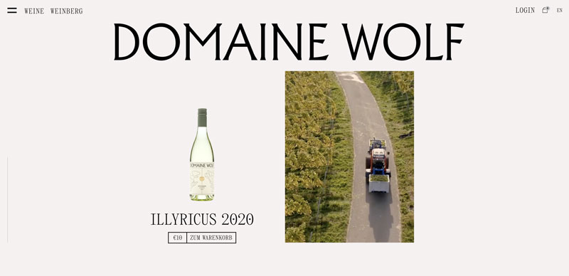
Domaine Wolf Wine website
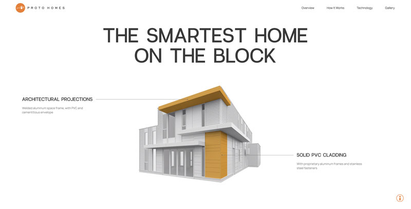
Proto Homes website
Circle Digital Agency website
As you see, web design trends in 2021 are largely focused on improving customer experiences. This means that it is about impressive creative visuals and ensuring truly engaging, responsive and interactive websites. Using all or some of these web design innovations can help elevate your brand’s reputation in 2021. Before you choose any, assess these trends carefully and only choose those that fit your specifications. So, which of the above-listed trends will you choose? Comment below and let us know.
Navkiran Dhaliwal
Navkiran is an experienced technical writer with 10+ years of industry experience. Her writing skills and technical knowledge may be confirmed by reputed clients all over the world.
Use coupon code SLIDER15 at checkout!





Love so much those parallax effects, really cool example!