10 Creative Web Design Ideas to Be a Successful Designer
Web designers have to be perfect with the design and, of course, the coding. So, they being stuck is like the world of websites taking a halt.
If you are a proficient web designer, who is encountering a similar situation, then this page is your go-to destination. Check out some actionable ideas that can help you with web designing.
Revise the Basics
As a designer, never hesitate to revive the basics when you get stuck. Most of the designers concentrate on something out of the box and end up forgetting the conventional principles. While adapting to new ideas is good, it’s best to brush up on the basics beforehand.
You should always check out some relevant UX to recall necessary factors. Essential entities like navigation, links, colors, graphics, along quality content make a great website. Go back to the times of Hicks law, Fitts Law, or Rule of thirds and review it thoroughly. By getting the basics right, your focus will return to the essentials of a good website.
Switch to Tablet/Mobile (Vice Versa)
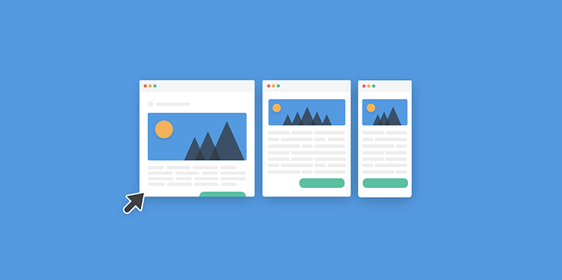
Sometimes when things seem chaotic, switch to a different means. If you are used to designing on a desktop, change it. Try a smartphone or tablet to enhance your creativity. Many times changing the means opens a world full of ideas in one’s mind.
Besides, the mobile approach will also help you to check the page flow, fonts, and contents. With extensive users switching to smartphones, it’s best to keep the website as mobile-friendly as possible. Readers do not like to read never-ending paragraphs. The contents that seem short on desktop view might not look the same on mobile.
So, by designing from a smartphone perspective, you will get an idea of content length. Likewise, if you are already using a mobile-friendly approach, switch to the desktop for innovative designing ideas.
Try What’s New
Who told you to be confined to the client’s idea? If you can experiment, do not hesitate to do so.
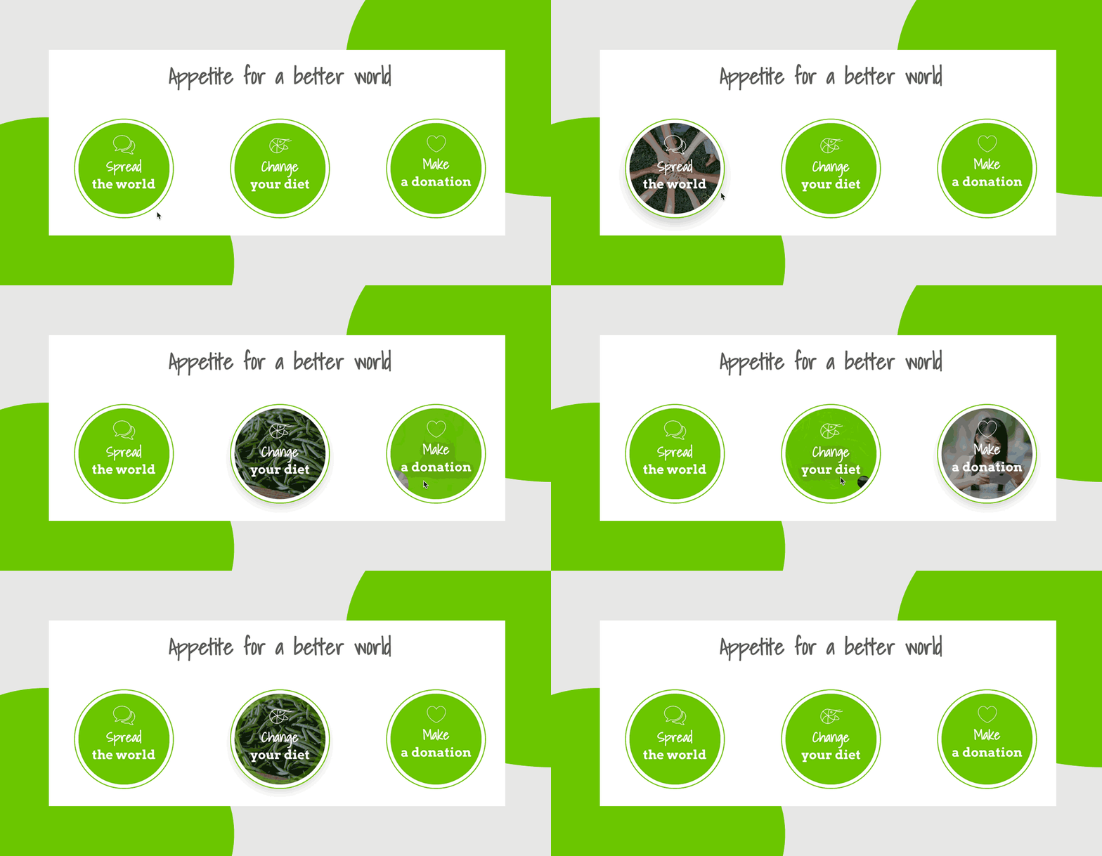
Sometimes, designers keep working on a style that does not match the website approach. In that case, it’s best to opt for an assorted idea. Your clients want good brand transparency through web design; that’s it. Thus, if experimenting is the solution to the same, do not back off. Try to follow the web designing trends and see if it works. Here’s what piping hot in the web designing world
- Parallax scroll effects and horizontal scrolling
- 3D and Augmented Reality
- Gaussian blur
- Cool retro fonts
- Grainy textures
These are just some examples. If you have something creative in mind, discuss it with your client for implementation and add it to the website. You can use different Photoshop plugins for better design.
Watch YouTube or Web Tutorials
YouTube has become the answer to every problem nowadays. You can call it “the Google” for solving dilemmas. With endless creators on the platform, you can search for some ideas that will revive the designing flow.
Besides, it will also render some innovative ideas that suit the design requirements. Most of the creators there are freelancers with expertise in the field. Their ideas can enhance the outlook of the website. So, if something seems difficult for you, it’s better not to stare at the screen pointlessly and waste time.
If not YouTube, the internet itself is filled with endless answers to web designing queries. Just search it up on the web and get quick solutions for anything from typography to design.
One Step at a Time
Stop what you are doing and give a sneak peek at your screen. Does it seem organized? It’s important for a designer to keep everything systematic. Just because you have a deadline coming through does not justify you exceeding your daily limits.
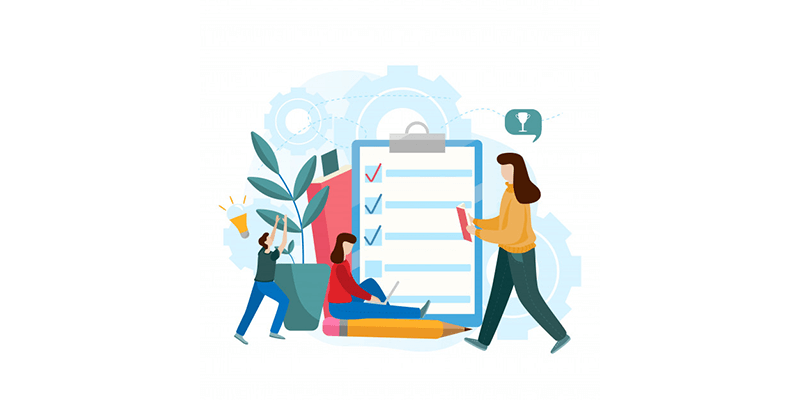
In fact, take one step at a time and be precise with the same. Say, if you are working on the sitemap and wireframe creation, be focused on that section. If something seems complicated in this step, give a thorough glance at the website requirements. Then, think about how features interrelate with the contents.
Once you get the solution, move onto the next step, i.e., content creation. Also, make sure to check if you are using the right web designing tools. You can make a list of the step-by-step process to avoid any chaos. Designers get stuck when they work haphazardly. So, take it slow, stay organized, and be focused.
Take Inspiration from Others
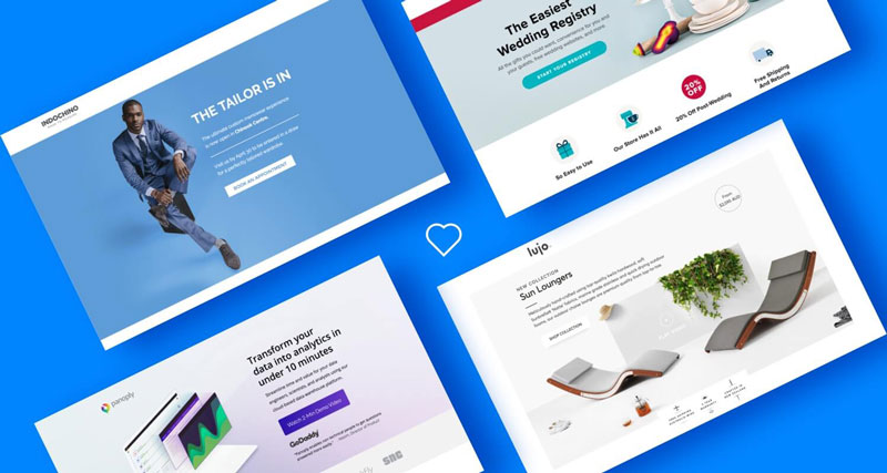
Apart from that, it’s never too late to take inspiration from others. Who knows, you might find something intriguing from their approaches? You can get ideas from social media, casual surfing, web design blogs, emails, websites, and numerous other areas.
There are innovative agencies, pages, and freelancers with some latest masterpieces. In fact, you can research and create a list of such unique websites. If it’s a post, take a screenshot and make a folder of the same for the future. Apart from being a great solution for recent queries, this tactic can help you with future dilemmas too.
Check the Content Formatting
Incorrect content formatting can also be the reason for you being stuck midway. Designers usually fail to present the content as per the structure, thereby creating confusion. With time viewers’ perception has changed.
Either they give a thorough look at the content or just gather the information. Regardless of the reader, the content formatting should be appropriate. Check if the content is formatted in the given pattern.
Headings: Add engaging and descriptive headings as it’s the first thing a reader sees.
Use Images: Try to add more images that justify the content. For example, if you are making a website on digital marketing, add pictures that include its perks. It’s short and easy to understand.
Paragraphs, bullets, and tables: Instead of including everything in a hefty read, break the content into short paragraphs. You can also highlight the relevant points as bullets or make a table for the same.
Fonts: Make sure to be selective about the fonts. That’s because good fonts signify better brand names, website readability, and signs. From Alternate Gothic to Open Sans, choose the one that matches the design.
Add CTAs
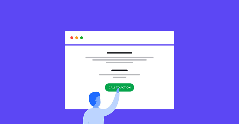
Maybe the main reason for your problem is lack of CTA and too much junk. So, try to add genuine CTAs that direct the readers to the next steps. When a website is focused on a certain topic, excessive, unnecessary elements (point 9) can steal its aura.
Hence, it may look haphazard. Many times web designers think about what’s wrong and fail to spot the same. Instead, they start fixing other areas that do not require customization. So, take a look at the CTAs and their placement on the website. You can add them in the form of social media share buttons, widgets, read more, signup, etc.
Eliminate Unnecessary Elements
Maybe you are going overboard with certain things, and it’s time to keep things minimal now. Not only does it render a good look, but it is also a great way to improve the website bounce rate and increase engagement.
After all, that is what the readers want. Here are some elements that you can eliminate from the website
Sidebars: Sidebars are located at the main content area that contains navigational links. However, websites are finding them unnecessary nowadays. So it’s best to avoid it.
Fluff words: Try to create authentic content that does not have fluff words. It’s best to come up with genuine sentences and premium wordings instead.
Extra Menu: While categorizing the products can be a good step, it can have a negative impact sometimes. That’s because readers find it confusing. So, best to keep it at bay.
Irrelevant Images: Blur or low-quality does more harm than good. They look unpleasant on the website and impact its overall outlook.
Bad CTA: Your CTA should guide the customers with their next step. Take a look at the CTA and see if it justifies the purpose of the website.
Relax Yourself
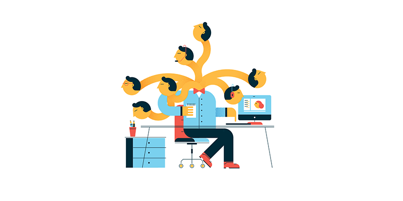
When you are stuck with a web design, it’s best to relax a bit. That’s because many times, designers take too many responsibilities and end up with brain cluttering.
So, with so many things going on in your mind, it’s best to take a break and go for a walk. If not, try meditating or doing something that involves your hobby. You can also play your favorite sport to refresh your mind.
In short, do something that does not involve designing for a while. You can go back to web design after some time, and hopefully, things will be easier then.
To wrap up, try implementing these ideas and see if it works. Designers tend to get stuck, and that’s ok. While it might seem annoying at first, with proper understanding, you can get through it. Hopefully, at least one of the above-mentioned ideas will be your rescuer from the designing dilemmas.
Navkiran Dhaliwal
Navkiran is an experienced technical writer with 10+ years of industry experience. Her writing skills and technical knowledge may be confirmed by reputed clients all over the world.
Use coupon code SLIDER15 at checkout!







0 Comments