Using Gradients in Web Design
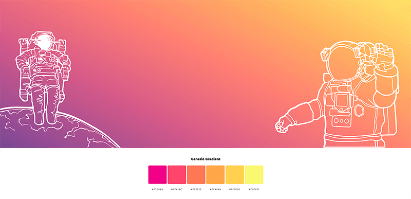
One of the principal visual elements of web design is color. Two years ago, web designers were unsure of gradients, and they went crazy over the flat user interface. However, in 2018, the application of color gradients in web design became one of the most prominent trends and it will continue this year.
There is no question that gradients are back to rule the design world. Seeing gradients being utilized in websites was a rare sight. But ever since the trend began, they are everywhere. They are memorable, create a bold statement, and evoke emotions from users which aid in connecting them with a concept or product. If used the right way, gradients can make your site look trendy and will have a significant impact on your audience.
So What Are Gradients Exactly?
A gradient design is the continuous blending of one color to another. It actually allows a designer to produce a new color. It creates a distinct dimension to any design which makes an object striking and can add authenticity to it. Gradients basically add depth to an object or design.
When you gradually blend from color to black or white and play a bit with its opacity, it can simulate proximity to or distance from a source of light. It is said to be more resolute to the real world since it is not made up of flat colors.
The New Gradient
Some design communities have tagged it as gradient 2.0. It is about taking a risk, getting out of your comfort zone, being brave, and saying goodbye to the old color that you have been using to impress your customers.
Not only will gradient rule the foreground, but we will see it dominate the background as well. It will provide compositions with more dimension and depth making it an essential natural element of web design. As web designers strive to include further immersion, realism, and 3D elements in their design, gradients will be more or less sustained by the commencement of virtual and augmented reality.
→ Visual effects that are unique to the eye stay in our memories because our eyes are not used to seeing them.
→ They feel real. Gradients are more present in real life than flat colors.
→ Innovative and unique. Web designers have all the freedom in the world to break artistic rules and disciplines through the creation of unusual and creative color transitions.
→ Easy to make. Gradients may look fancy but they are easy to create, provided that you have the right tool such as uiGradients and ColorSpace among others. These tools let you generate the corresponding color code and show you what the combination will look like on your screen.
Gradients in Divi
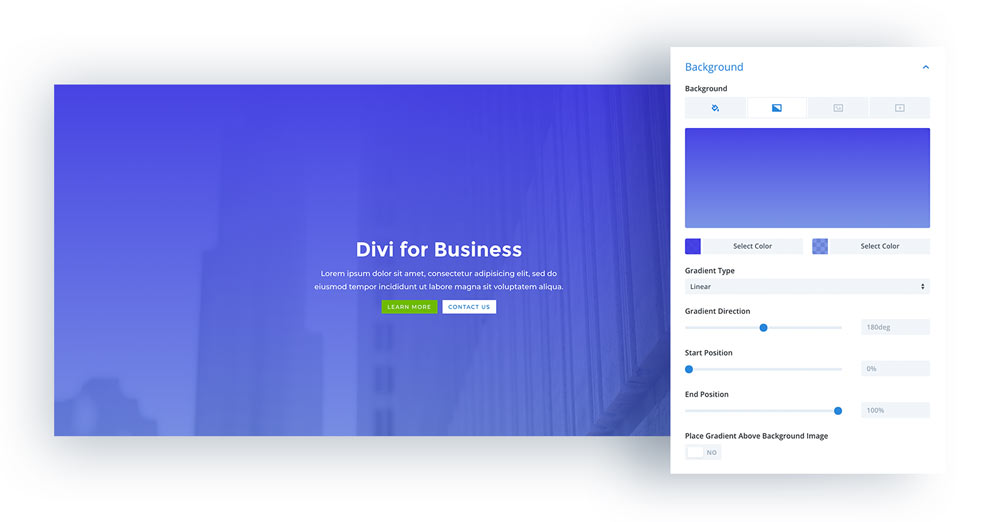
Divi by Elegant Themes provides you with numerous possibilities to design gradient backgrounds using gradient background overlays. The Divi Builder has plenty of design options that you can explore and play around with to see what will best suit the needs of your website.
With the latest background update of the platform, you can now utilize the Divi Builder to make most of your changes instead of going through them on the custom CSS mode. From the hero section to the blurb and pricing section of your Divi site, it is easier now more than ever to incorporate a unique and elegant gradient in the background.
Gradients Best Practices When Used In Web Design
→ Never overdo it.
A pleasant gradient is comprised of only two colors and a maximum of three.
→ Choose colors that blend well together.
Avoid colors that conflict. In most cases, gradients fade in between a combination of two colors that go together well and do not conflict.
→ Use in a suitable place.
A gradient can sometimes be noisy visually, generally it is ideal to isolate it from your web content which is the one you want your audience to focus on. You can also utilize it on buttons, icons, and other web elements.
→ Importance of light source.
Always determine your light source as this will help you decide which areas in your gradient will be darker and lighter.
→ Gradient types.
A linear gradient is best used on polygonal or square areas, while round areas will look great with a radial gradient.
→ Different values of colors.
Better to not use colors with the same value like saturation or hue to avoid creating an effect that looks unpleasant and unrefined.
→ Darker colors should be placed lower.
If the fade of your gradient is downwards, it is recommended to place brighter colors at the top and darker at the bottom. As a result, your design’s contrast will improve and have that natural feel.
All gradients are only as powerful as its base whether it be a multi-tone or dual-tone. When your design is color-based, it is always a good idea to use the color wheel as your guide in order to end up with the right ones. Hopefully, we have inspired you to try gradient in your web design. Let us know about it by commenting below!
Aileen Cuaresma
Aileen is a Technical and Creative writer with an extensive knowledge of WordPress and Shopify. She works with companies on building their brand and optimizing their website. She also runs a local travel agency with her family. On her free time, she loves reading books, exploring the unknown, playing with her two adorable dogs, and listening to K-pop.
Create beautiful blurbs with Divi Flip Cards
Let’s celebrate! We have a sweet deal for you! You can get the best flip box plugin for Divi with a 10% discount! Use the coupon code DFC10 at checkout!






Gradients make the web bestiful. Great article. Thank you for sharing!
Totally agree with you and welcome!