Quick And Powerful Ways To Improve Your Website’s Conversion Rate
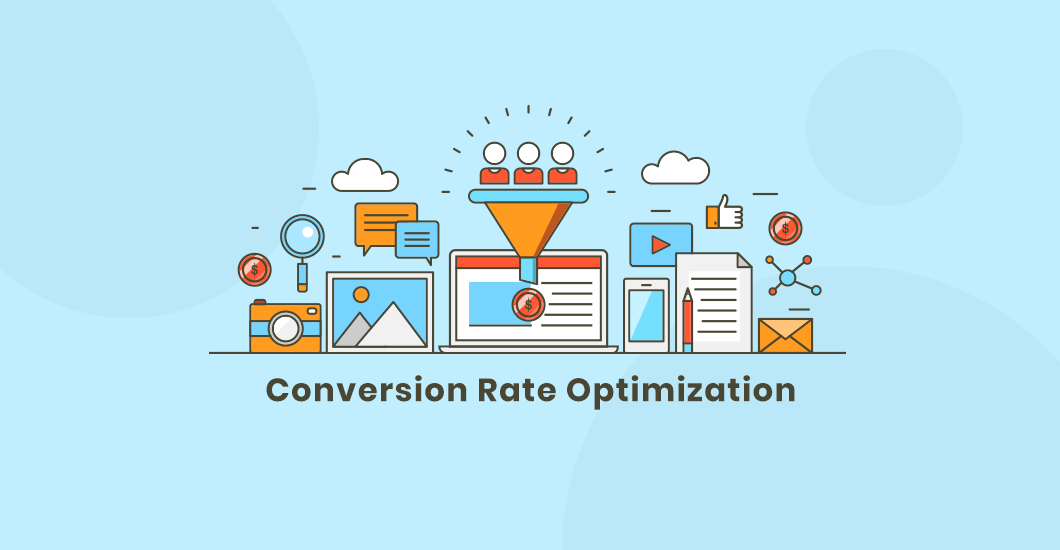
Increasing the conversion rate of your website is unquestionably vital. Having high conversion rates is the base of a high volume of sales.
Any smart marketer knows that the lifeblood of all marketing campaigns are conversions. When you run a marketing campaign, you want your visitors to take actions such as purchasing your product, provide their email, and subscribe to your services to name a few.
The visitors of your website can either take action or not. Some of them become leads, customers, subscribers, and registrants. However, a lot of them don’t. Understanding the ultimate interaction that your visitors have with your site is essential. You have to know the percentage of people that eventually purchase from your site.
Website analytics is a tricky thing. Most of the time, website owners spend their time and energy more on driving traffic instead of their conversion rates. But why worry about doubling the traffic of your site when it’s easier to double your sales from your existing visitors? Keep in mind that you can drive as much traffic to your website as you can, but if that traffic doesn’t convert into paying customers, then it’s worth nothing.
So What’s A Conversion Rate?
Your website conversion rate is a measurement of the number of your visitors that end up buying from you. A lot of websites focus more on growing their number of visitors while they actually have somewhat simple issues that, if given the proper solution, would improve it at minimum cost and have a massive impact on its conversion rate.
Increasing your website conversion rate is quite simpler than you think. Below are the quickest and most effective ways to do just that.
Optimize Your Homepage And Make The Life Of Your Users Easy
On average, our attention span is eight seconds, which means your website only has that long to make a good first impression. Your user’s whole customer journey will depend on the maps of your homepage. Even if you have the best product in the world, you will not be able to convert your visitors by giving them a poor experience. Thus, the very first thing you need to do is to optimize your homepage.
Although it may sound simple enough, most businesses still find it too complex to get it right. People are not likely to purchase your products or services if you make your site difficult for them. The aim of your website should be to make people buy and not prevent them from doing so.
Here’s how you can optimize your site for conversion:
➡️ Clean design: People prefer to read a beautiful and well-designed site. Make sure to consider the important elements of your web design first before going ahead with everything. Make it clean, clutter-free and easy to navigate with fast loading times.
➡️ Color scheme: Balance the colors to avoid putting off your customers. Everything from your logo, banners, font, and background should contrast well and coincide with your brand. Any clickable link, image, or text should not be hidden in your background color.
➡️ Whitespace: These are a must for your design. Using whitespace around vital elements will create focus and increase readability which in turn will help in your website conversion rate.
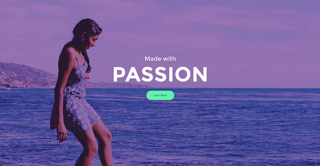
➡️ Banner image or video. Using suitable and impressive videos and images will immediately catch the attention of your visitors. Prevent negative perception about your products and brand by using images with high-quality. Also, ensure that people will be able to connect with your site’s header image to make them stay longer.
➡️ Content: It will always be king, so to avoid losing potential clients over your competitors, publish content that they will find useful and relevant.
➡️ Headlines: Make your headlines effective. Catchy ones are more likely to capture a reader causing them to read the entire content. Nine out of ten visitors who typically read headlines also read the copies.
➡️ Clear purpose. Once a user lands on your homepage, it should be clear to them why they’re there. Your homepage should state the benefits of your services or products clearly. Sharing more relevant information about your services and products will allow them to connect more to your potential customers.
➡️ Testimonials: Testimonials from your previous customers will help build your credibility and reliability. People who are having second thoughts about buying from you are more likely to buy if they see that other people love using your products.
Amp Up Your Speed
People are impatient when browsing the web. Your website conversion rate will suffer if your site loads slowly. Speed is actually one of the many things you need to keep in check before launching your site.
Every second is valuable, so make sure there’s no delay and check your load speed and fix any problems. There are numerous free tools out there where you can run a diagnostic speed test on your website such as Google PageSpeed Insights and Sucuri.
Do You Know What’s Your Unique Selling Point?
Your unique selling point or USP is the most important aspect of all. It’s what will separate you from the rest of your competition. Why would a visitor purchase your product instead of going somewhere else for business?
The majority of companies have USP. However, not all of them know or are aware of what theirs is. If your company is run by the family, you may consider that as your USP. USPs come in different forms, from quality affordable products and amazing customer service to free shipping and unique offerings. Don’t hold anything back and let your users know all about them.
Be Honest To Your Customers
There’s nothing more annoying than reading everything about a product and then finding out it’s out of stock once ready to check out. So if there are out-of-stock products, let your customers know right away.
You also need to apply this to your pricing. Your client may be willing to pay $99, but they may abandon their cart after they realize that they have to pay a delivery fee of $99 as well. Showing shipping prices can be tricky, but it’s possible by using a database called IP to country. The database can help you determine where the user is from and provide them with a suitable shipping price. You also have an option to show the appropriate delivery costs for different countries or major regions of the world you ship to.
Avoid Wasting Time
Whether the process of your conversion is information request or sales, asking for a lot of information from your customers is a big mistake. Do not waste their time by asking details that you don’t actually need. It’s even more crucial to avoid asking questions that they consider private and that they don’t want to provide without a peculiar reason.
There’s no need to oblige a user to give out their email in exchange for a downloadable PDF file. You also don’t have to ask for their personal number when filling inquiry forms. There will be customers that may not want to purchase from you again, so avoid asking them to make an account or connect with their Facebook or Google account before their order can be processed. Provide them with an option to continue as a guest. Do not make the process compulsory.
Trust Issues
It’s understandable for people to be wary when purchasing stuff online. They have the right to do so since there are a lot of people that should not have access to your credit card details. Because of this, it is necessary to let your potential buyers know that you are trustworthy.
A great start is providing them with a real physical address and not some P.O. box, which in most cases is a red flag. It will also help if you have a phone number in place. You can also build trust by having a privacy policy and explaining your shipping process.
In addition, having a website that looks professional and contains high-quality content also plays a role in the trust department. If you can’t afford to create a decent-looking website, how will you assure your potential buyers that you will be able to take proper care of their orders? The same thing also applies for poorly written content. Make sure to show some pride in everything you do.
Increase Familiarity
We all love human faces. Seeing them triggers a feeling within us, or we empathize with that individual automatically. Your visitors will understand and feel a connection in your website if your content evokes emotion.
You can boost your conversion rate by incorporating your content with, opt-ins, and testimonials with faces. Do a photoshoot if you’re the face of your company and brand. Instruct your photographer to take many horizontal shots of you with a negative save on one of your sides where you can put a text or CTA there.
If you’re not your brand’s face, consider hiring a model, or you may also use stock photos. But ensure that they will best represent your brand so that your site visitors will be able to relate to them.
Offer Various Payment Options
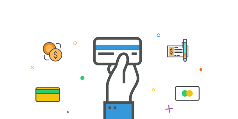
Offering users with different payment methods is an obvious thing. Not all buyers have credit cards, and there are those who have that don’t feel secure using them online. Consider alternative methods than the usual to cater to the needs of your target audience and make the buying process easier on them.
Ready to make the most of your website? Follow these simple tips and see your conversion rate increase little by little. There’s no shortcut to success. It’s all about understanding the needs of your customers and letting them know that you can provide them with what they want. Hope we’ve helped you with this article. Make sure to share your thoughts on the comment section below! Thank you!
Aileen Cuaresma
Aileen is a Technical and Creative writer with an extensive knowledge of WordPress and Shopify. She works with companies on building their brand and optimizing their website. She also runs a local travel agency with her family. On her free time, she loves reading books, exploring the unknown, playing with her two adorable dogs, and listening to K-pop.
Start Building your Legal Services Website with Liberty!
We have a sweet deal for you! We are offering a huge sale! You can get our latest Liberty Divi theme with a 20% discount! Use the coupon code LIBERTY20 at checkout!









0 Comments