Pantone Color of the Year 2021
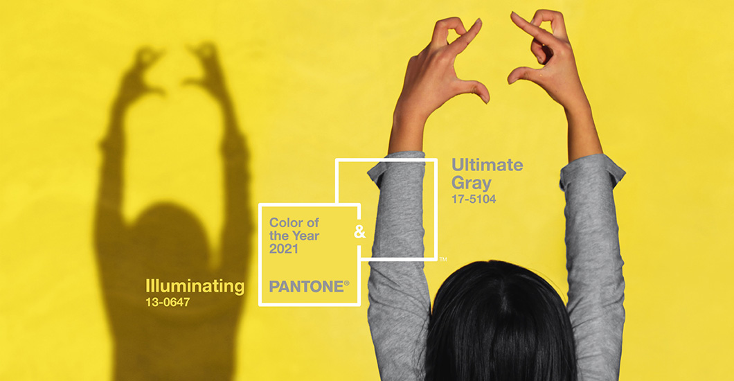
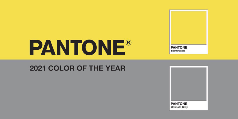
Pantone has unveiled not one but two hues that will best reflect the year 2021 ahead. Ultimate gray and Illuminating! The union speaks of the optimism, resilience, hope, and positivity we need to reset and reinvent.
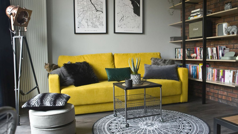
Though ultimate gray feels solid and bleak, illuminating yellow brings light and hope. The best part is you don’t have to use both colors in equal proportions. Either color can take precedence, whether for beauty, home furnishings, packaging, or websites. This fitting combination brings warm resilience to your designs.
So, if you are planning a new creative project, it is the right time to consider Pantone’s colors 2021. Before that, you have to familiarize yourself with the power of these newest shades. Read on to know the meaning of these Pantone colors and how to incorporate those in your design projects.
Color Values
You can find out the RGB and HEX values for Pantone Colors of 2021 on its official website. You can use these values to reproduce both hues in different mediums. The website does not list the CMYK values. So, we have listed the same for you below.
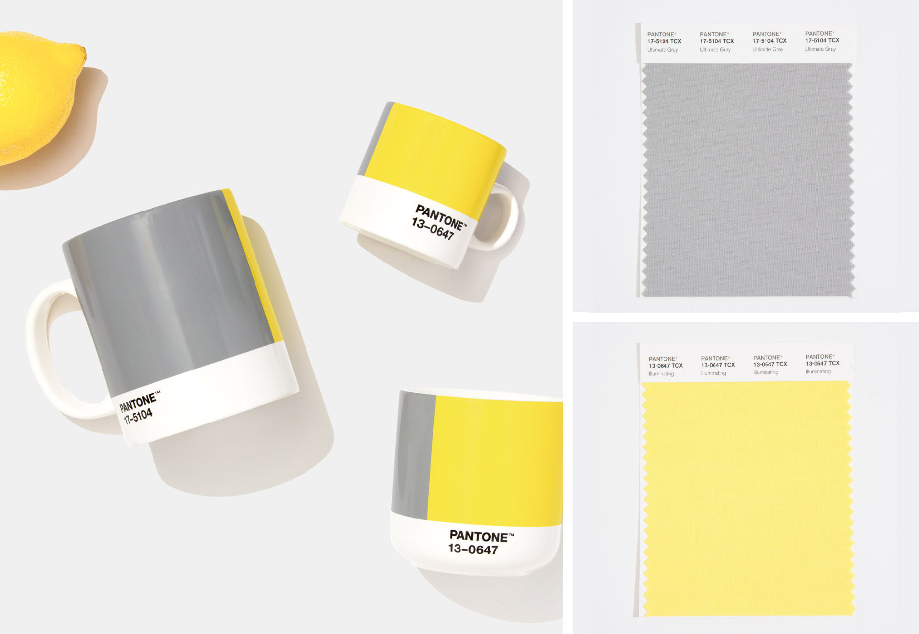
Ultimate Gray Color Values
Pantone: 17-5104 TCX (Cotton), Cool gray 7 C (Solid Coated Ink)
HEX/HTML: #97999B
RGB: 151, 153, 155
CMYK (approx): 44, 35, 34, 1
Illuminating Color Values
Pantone: 13-0647 TCX (Cotton), 106 C (Solid Coated Ink)
HEX/HTML: #F5DF4D
RGB: 245, 223, 77
CMYK (approx): 6, 7, 82, 0
Psychological Association of Pantone Colors 2021
The two independent colors bring together different elements to support one another. The combo of PANTONE 17-5104 Ultimate gray + PANTONE 13-0647 Illuminating is rock solid and practical. At the same time, it is warming and optimistic too. As we look forward to fortifying ourselves with clarity, energy, and hope to overcome uncertainty, spirited colors satisfy our quest for vitality. The marriage encapsulates deeper thoughtfulness with the promise of something sunny.
The choice is based on the quarantine-era when we had to insulate ourselves and curled up in comfortable gravity blankets. That’s gray! Now, 2021 is a year full of hopes, light, and renewal. That’s BRIGHT YELLOW!
The gray of natural elements, home furnishing, and low-light screens — evokes irresolution and ambiguity. The illuminated – bright, highlighter yellow exists at the end of the tunnel, like a sunrise over a dark landscape. It is most often associated with energy, joy, cheerfulness, and happiness.
Past Pantone colors tend to be a bit blatant to fit current events. Take 2020’s Classic Blue that offered a balm to feelings of unrest and instability. But, the color was announced just before the international crisis. The 2019’s choice – energetic Living Coral – highlighted both the beauty of the ocean’s microorganisms and warming oceans due to climate change.
Pantone chose Green for 2017 to elude the political turmoil of the U.S. presidential election. The color indicates restoration and renewal. Though Pantone’s decisions are mostly based on the state of the art and fashion spheres, they could not get indifferent to the pandemic’s influence for this year. The 2021’s Pantone colors express both the strength and the hopefulness. And, that’s what we need this year!
Upgrade Your Designs with Pantone Colors of 2021
So this year, your designs can benefit from two active colors. And, it’s definitely going to be challenging to manage them. Most web and app designs use one major color to reflect their individuality and psychological meaning. With gray and yellow hues, you don’t have to choose a perfect neutral color for the background. Because you already have it!
Design layouts with Ultimate gray and Illuminating Yellow evoke energetic and peaceful feelings. These reflect happiness, trust, and loyalty in your apps or web products. More importantly, UX designers can confidently go for yellow hue for projects that demand a high level of interactivity.
Using a lot of white space will help balance both gray and yellow. This also makes your typography stand out. White fonts look great on a sophisticated gray, while yellow typeface triggers the visitors. You have endless options to experiment with this contrast and achieve a good level of usability.
App designs lack space, and users tend to quickly scan the information. Thus, the yellow color helps highlight any important element of content on your apps.
How to Use Ultimate gray and Illuminating
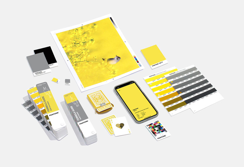
The Pantone Color Institute uses its unparalleled knowledge of colors that affect designs and consumerism. As usual, this year’s color palettes help designers to pair shades into striking designs. After all, when it comes to designs, color is the most powerful tool in your arsenal.
Some recommended pairings are listed below:
- Intrigue: Create a captivating fusion by combining colors of 2021 with Iris Bloom #5C609F, Fennel Seed #998456, Willowherb #8F4584, and Spice Route #BA5B3F.
- Aviary: Achieve a joyful, cheerful, and lively combination with Fruit Dove #CF5C78, Peacock Blue #00A0B0, Cloud Dancer #F0EEE9, and Skydiver #00589B.
- Sun and Shadow: Evoke the positivity and strength by pairing with Shadow Green #CFC486, Oil Green #80856D, Blue Nights #363B48, and Wild Ginger #7C4C53.
- Enlightenment: Ultimate gray and Illuminating fit excellently with Lavender #AFA4CE, Lead Crystal #C2BFB5, Placid Blue #8CACD3, and Prism Pink #F0A1BF. As a result, it creates a hypnotic space that stimulates your imagination by expanding your mind.
You can use these pairings to design websites, create cheerful ready-to-use templates, social media graphics, and other creative projects. Use this with other web design trends in 2021 to stand out in the crowd and to build your brand individuality.
Pantone’s choice of colors is backed by science and evidence. So, apply their color knowledge to fuel your success. Use Ultimate gray and Illuminating yellow to design websites and apps that engage your target audience this year.
Navkiran Dhaliwal
Navkiran is an experienced technical writer with 10+ years of industry experience. Her writing skills and technical knowledge may be confirmed by reputed clients all over the world.





0 Comments