Examples Of Inspiring Personal Brand Websites Built With Divi
Personal brand websites are highly popular these days. The main focus of these sites is having the brand based on a person and the services they are offering. The niche may vary from entrepreneurs to bloggers, but the site branding focuses on a single individual.
WordPress is the platform of choice for creating a personal brand site. Users can create their own site and deliver their message across the world. Divi is the perfect tool that can help you achieve that and much more. Today, we have listed (in no particular order) some of the top personal brand websites out there that can inspire you on your next project.
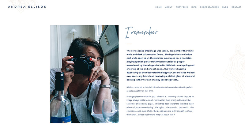
Andrea Ellison
Andrea Ellison is an excellent and gorgeous wedding photographer website. It uses coastal colors and simple, classic fonts to match a modern day wedding genre. It has a hero image of a happy couple in a rustic, coastal-themed wedding which sets the mood for the entire site. The slider uses unique large photos with a thick white border. Each wedding featured in the portfolio section also features large unconventional photos that captures the joys of a wedding and behind-the-scene fun moments. The website is very consistent with its beautiful style on every page, from color and fonts to its layout.
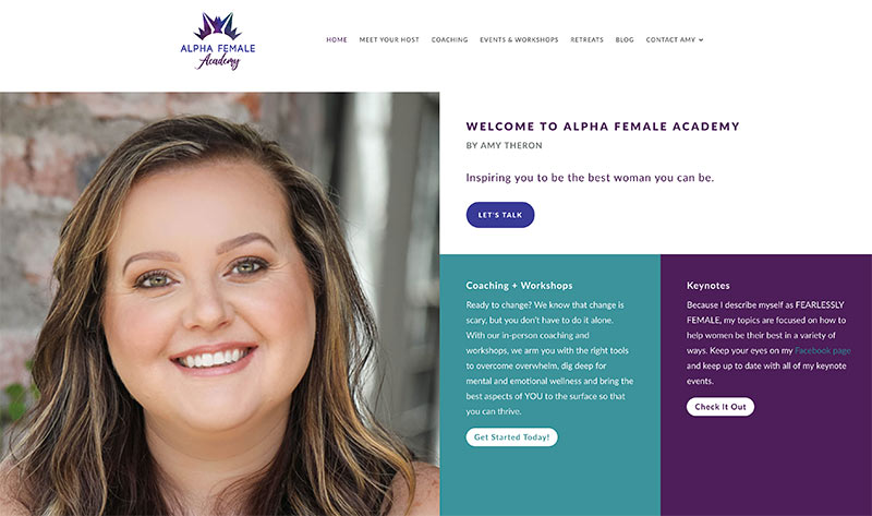
Alpha Female Academy
Alpha Female Academy welcomes visitors with a smiling image of Amy Theron with a tagline and a columned-section with CTAs. The photo they used of Amy is very strategic since her aura coincides with the message she’s trying to convey which is helping women to be the best that they can be. The website is simple and clean. The choice of color is beautiful as well. The homepage was incorporated with white, making the purple and teal combo easy on the eyes.
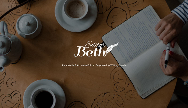
Editor Beth
Editor Beth is a one-page site that displays a full-width image in an overlay with a description of who “Editor Beth” is. The image of a person holding a pen sitting with an open notebook in front of her is brilliant. It’s very intriguing and draws you in right away. The order of the content is just as ingenious, starting with Beth Crosby’s mini-bio and some highlights of her work, followed by testimonials, services, a personal quote, and CTA. The website is very professional and straight to the point.
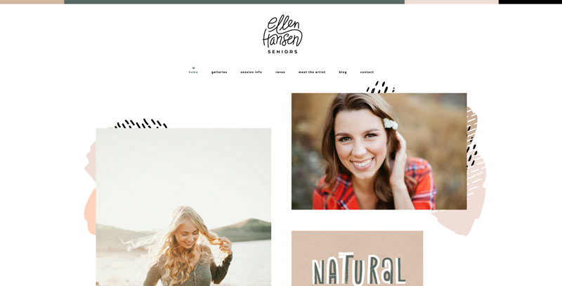
Ellen Hansen Seniors
Ellen Hansen Seniors is a fun photography website that uses earth tone colors. The layout of the site is modern, fresh, and uses plenty of white spaces. Different font sizes are also utilized to highlight certain texts. Right away you will see the work of the artist in an animated collage and a tagline describing her work as being unique and distinct. Overall, the website feels young and active just like her target audience.
CVS by Louise
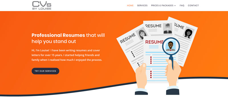
CVS by Louise is a professional CV service website with a very fresh and clean look from testimonials and services offered to CTAs. The homepage clearly explains why you need to be armed with a perfect resume when applying to your dream job. Jump over to the prices and packages page, and you will see the Divi pricing table in action.
Christine Ink
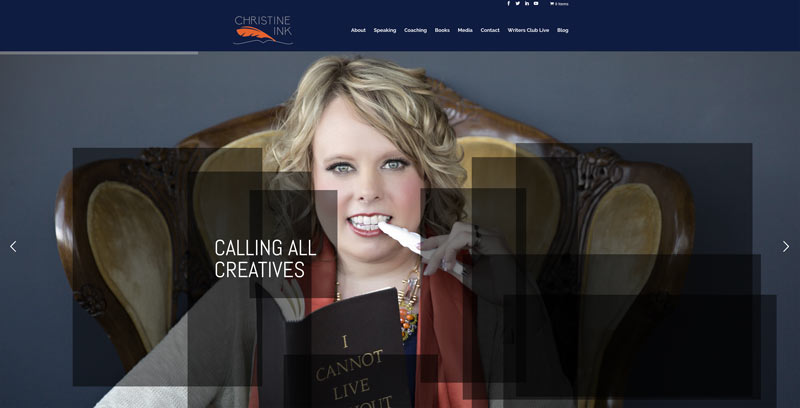
Christine Ink helps you write a book and turn it into a brand. It’s a modern website mixed with a retro vibe thanks to the color combination used on the site. The homepage uses a full-width slider with a quirky image of Christine, followed by several colorful photos with text over them. You will also find the services offered in the same place alongside testimonials and a convenient contact form, this has a pretty nice effect. The About Us page features a video casually explaining the process of how they work with their clients. The site also has a blog organized in clean boxed posts.
Divi Dojo
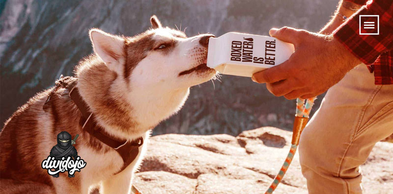
Divi Dojo gives you a contemporary feel right away, and the person in charge did a rather good job at representing his own skills, expertise, and services within a site that equals the work he produces. You’ll see some samples of his work which exhibits the same contemporary appeal as his well-thought site. You’ll see modern touches everywhere on this site from logo and icons to styles.
Created by Carla
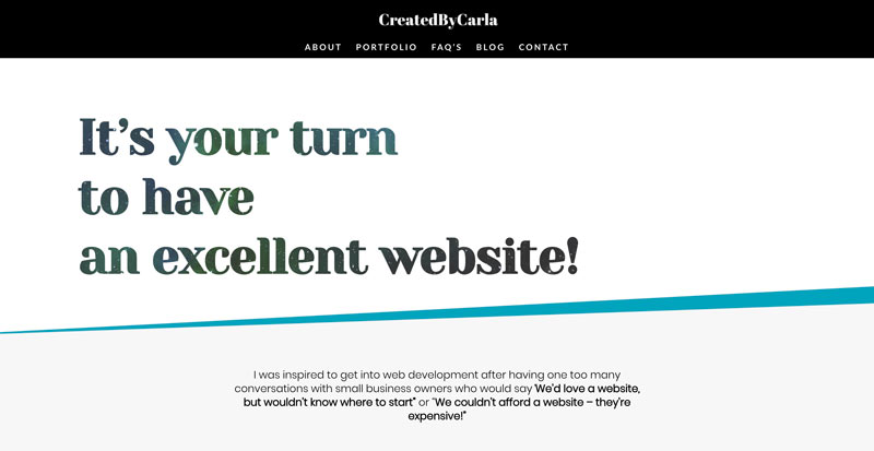
Created by Carla is a simple and yet stylish, elegant web design site with subtle animations. The site uses one-of-a-kind animal images that will get your attention right away, making it hard not to get engaged. The same style is carried throughout the entire website which shows Carla’s abilities to think outside the box and present sites that most users haven’t seen before.
Tim Mason Author
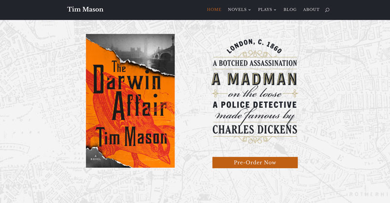
Tim Mason Author uses a theme that matches the artistic and inventiveness of the author’s latest book, which is the main focus here. It’s a pretty straightforward website that has a hero section at the top with an image of Tim’s novel and its description in various font sizes and styles, which also serves as a CTA. Scroll down, and you’ll see when it will be available as well as reviews about the book, a little insight about Tim himself, and a simple menu.
Steph Will
Steph Will is a personal site about coaching. It also uses a full-width image with a tagline and CTA for scheduling an appointment at the side which you can minimize. The photos of Steph are well thought out as they evoke her message which is to be the leader that you want to be. Even the clothes she is wearing on those photos match the site’s color scheme. The entire site focuses on what Steph and her coaching services can do for you.
Randy A Brown
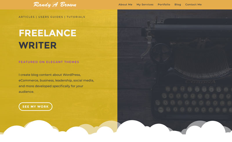
Randy A Brown is a WordPress freelance writer. He is popular in the Divi ecosystem, and his works have been featured on major sites like Elegant Themes. His portfolio site is pretty straightforward. The homepage includes a brief description of all the services he’s offering. The entire website is clean, contemporary, and professional, which is a crucial thing as it speaks about what kind of work a writer can deliver.
These are just some examples of amazing personal brand sites built with the help of Divi. Whether you’re looking for inspiration for your site’s fonts, layout, colors, how to present info, and more, there will always be something out there that can help you with your next Divi project. Let us know what you think by commenting below!
Aileen Cuaresma
Aileen is a Technical and Creative writer with an extensive knowledge of WordPress and Shopify. She works with companies on building their brand and optimizing their website. She also runs a local travel agency with her family. On her free time, she loves reading books, exploring the unknown, playing with her two adorable dogs, and listening to K-pop.
Use coupon code SLIDER15 at checkout!







Nice! I have one too, if you need another one. 🙂
Hi Randy 🙂 Thanks for commenting! You have a beautiful site there! We have just added it to our list 🙂
Have a great day!
Ahhh this is super cool!
Love some of the designs.
I also have a site I’d like to contribute if that is possible?
My site is https://digitalmastery.agency
Some people call it “too simple” – but it’s right up my aesthetic and I took a long time working on it. I hope it makes the list!