How To Design A Contact Page That Drives Engagement
A “contact us” page may seem less important than other pages on your site. But it’s actually vital to convert your visitors into customers.
A well-designed contact page helps people reach you conveniently. It helps them ask their questions more effectively, significantly improving their experience on your site. But most web designers put this page near the bottom of their priority list. Rather this should be one of the most important pages on your website.
After all, the contact page serves as final proof of the service quality you need to persuade them.
But, how do you create a contact page that really converts?
Read on to discover the answer:
Contact Us Page Best Practices
The best contact us page is one that allows visitors to get in touch with you quickly as and when they need it. Below are the principles of making an effective contact page:
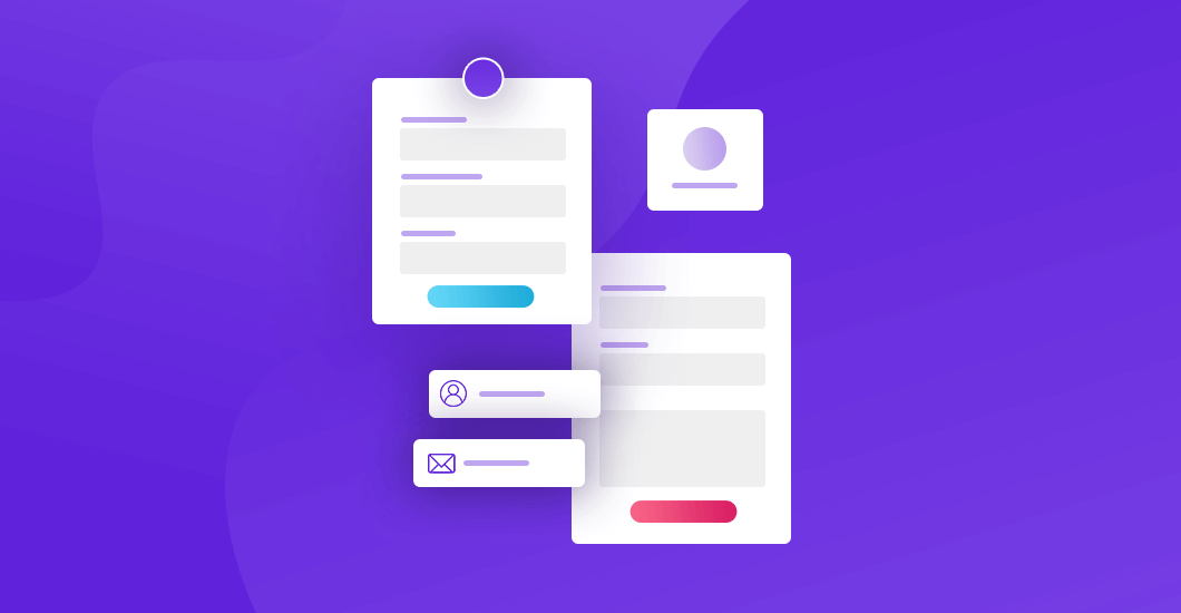
Must-Have Fields for Contact Form
Full name, email address, and a message box! These three are common fields on every contact form.
Some other fields the page should have are:
- Subject/Reason of the message: This field summarizes the subject or reason for the message. You can redirect the message to the right department. Implement this as a drop-down field, a prediction of possible reasons, or company departments as options.
- Name of the company: This is for B2B businesses. The audience reaches you on behalf of their own business. Knowing their company name gives you extra time to research them.
- Preferred contact time: Ask your prospect the right time and method to contact them for a response.
- Contact number: Despite the digital age, phone calls still work. Give your leads the option to speak with your representative directly by phone.
- File submission: Sometimes, prospects may need to send you a file through the contact form. Sometimes, issues can be quickly resolved on the basis of these fields.
- Unique ID: This refers to a combination of numbers and letters as Customer/Case ID. It is generated automatically for each submission, making it easy for you to track every query.
- Social Handles: Allow people to easily engage with you on social media for quick communication.
In addition, set an expected response time to inform them how long they should wait until they hear from you. If you do not operate 24/7, then let people know when they should get in touch with you.
Step 2: A Call-To-Action (CTA) On Your Site
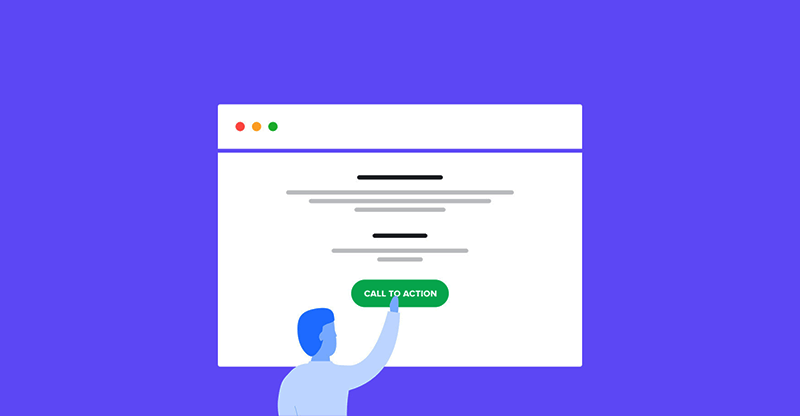
Every page on your site should have an enticing CTA, and the contact page has no exception.
Note: Make sure you keep the caption different; otherwise, your content would sound overly promotional.
We prefer a mix of CTA buttons across your web pages and blog posts. Link those CTAs off your contact us page. CTAs should fuel your lead generation strategy, leading your visitors down the funnel from landing on your site to contact.
Whether that is your email address, contact number, or a CTA button at the bottom of your form, you must provide multiple methods to contact you.
Showcase Your Brand Personality
The page should reflect your brand personality because it is the first interaction between you and your customers. When it comes to the design, the contact page should fit your site’s overall appearance and feel. This means you should be just about a query form.
Instead, your contact page gives visitors an opportunity to communicate with you. So, be creative with the design and copy of it. Keep the language simple-to-understand and clear. Be playful with the page to entice visitors to call you, send an email, and fill out the form right away. Just make sure the page should be concise and creative without hindering people from actually contacting you.
Keep the Page Organized
If you have multiple functions or departments, then you may need different methods of contact.
To avoid complexity, make sure you keep it simple for your users. Organize it in a way to ensure that visitors can find exactly what they are looking for in a hassle-free way.
Organize your contact us page in categories to help visitors find and use their preferred method of contact.
Cover the basis by including a “General” or “Other” category for those who might be looking for something else that is not on the list.
Optimize Your Contact Page with SEO
Unfortunately, most designers and digital marketers forget the contact page when they are thinking of keywords and keyphrases. But this page can also elevate your site’s overall SEO. So, put your SEO efforts on this page also by including rich text, images, maps, and meta descriptions.
Some proven waves to SEO optimize your contact page are:
- The contact page is a perfect real estate for adding images. It makes your page look visually appealing and boosts SEO.
- Add a video from your company’s employees and a testimonial from a happy customer.
- Using Google’s standard and street maps help with SEO, especially with location-sensitive queries.
- Add a “thank you” to the bottom of the page.
Make it easy for customers to find the page.
A perfect page is not all about an impressive design but to get found easily. If people cannot find it, there is hardly any way for them to reach you. So, help them find you easily. Include a compelling call-to-action (CTA) in both the top navigation and footer of the website. Don’t hesitate to include a CTA on your about page. Use commonly used terms like support, help, and contact us on your page.
These terms are easily recognizable to customers. Make sure you choose a phrase that is different from other links in your navigation. For example, using both “help” and “contact us” for different pages can frustrate those who need to talk to support.
Keep your Contact Team in Mind
A good contact page improves the customer experience and helps the customer service team be productive and save time. The first metric to evaluate service teams’ success with the page is the number of responses needed before resolving an issue. If the initial query lacks enough information, the number often increases.
To make the right information accessible to the service team, do the following:
- Automatically route the lead to the right team: Set up segmentation rules to automatically send emails to different employees according to the keywords in queries.
- List appropriate options: Give people an opportunity to help themselves before they reach you for extra support. Add links to an FAQ page to reduce pressure on your customer service team. You can also add automated chatbots for self-service.
- Prompt for additional context: Add a field “anything we need to know?” to your contact page to collect more information from your prospects. This may put your team at ease.
Contact Page Mistakes to Avoid
Some mistakes could be detrimental to UX and customer experience on your site. So, make sure you avoid the following mistakes on your page:
- A lengthy form: Keep it precise and short. Avoid all unnecessary fields.
- Unclear, fancy labels: “Get in touch” is easier and more actionable than “let’s talk business.” So avoid strange and confusing field names and CTA captions. Instead, keep these simple and straightforward.
- Outdated information: Moving your office to a new location? Redesigning your website? New sales reps? Update your contact us page for every necessary update and accurate information.
Finally, avoid crappy captchas or elements that could distract people. Do not ask for too much personal information from your prospects. Be polite and easy to your customers.
Important Questions to Ask When Designing Your Contact Us Page
Though there is a long list, the most common and important questions to ask when planning your contact page are:
- What channels would your customers like to use to connect with you?
How could you gain customers’ trust and confidence in you before actually speaking with you? - How can you reflect your unique personality through your contact page?
- What can you do to eliminate friction points in a prospect’s journey to contact you?
This is all about understanding your audience, their needs, and expectations from you. Make sure to involve the customer service team and gain their feedback to design an excellent page.
A well-designed contact us page is very beneficial to your company. It not only improves the customer experience but also helps your business.
So do not make the contact page an afterthought in your web design process. Use this valuable tool to ensure that customers always reach you as and when they need it.
Navkiran Dhaliwal
Navkiran is an experienced technical writer with 10+ years of industry experience. Her writing skills and technical knowledge may be confirmed by reputed clients all over the world.
Get 10% discount with coupon code ESTATE10










0 Comments