Tips On How To Create The Best Real Estate Website
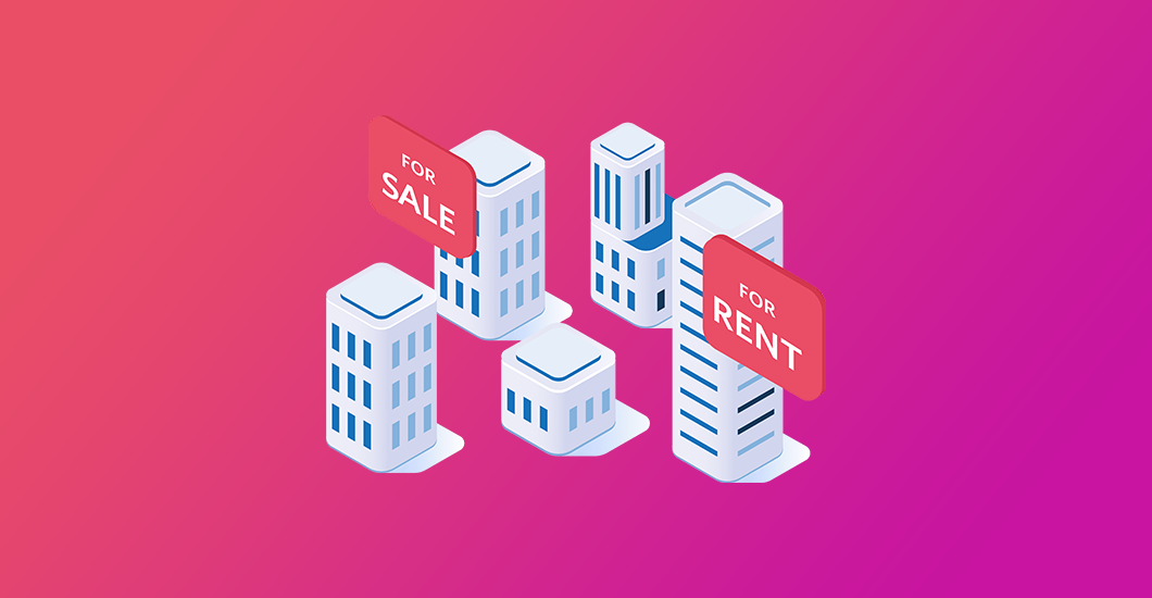
No matter where you are in the world, the real estate industry can be very competitive. Hence, your real estate website design should not only be attractive but fully functional as well if you want your business to survive and succeed.
Moreover, if you’re new in the real estate business, you may find yourself a little lost in terms of how to optimize your SEO. Likewise, you may not be sure about which content to utilize, how to keep your visitors engaged, drive traffic, and more.
Unlike other niches, real estate is very specific. Although you’re offering different houses with different styles, your website has only one goal, which is to sell properties. In this article, we will share with you the best real estate web design tips and practices that can help leverage your website and achieve your goal of success.
If you’re on the process of building a website or looking to amp your current one, you want to check out our top real estate themes for WordPress.
Whatever your design skill level is, you can start designing the perfect graphics for your needs in no time by simply following these 20 epic tips for non-designers.
It Should Be User-Friendly
When building a website, regardless of your industry or niche, the golden rule is it should always be user-friendly.
So what does it mean? It means that you need to consider every aspect of a website that may make it convenient and easy for visitors to use. These include everything from its navigation menu to page loading times.
Just like with any type of website, your real estate website should provide your potential clients with a positive and pleasant experience. Furthermore, they should feel the need to spend a substantial amount of time on each page.
You don’t want your website to annoy them and click exit even before finding out what they need. Also, you don’t want them to abandon your site to check out your competitors.
Use Stunning And High-Quality Images
Research shows that human brains process visual images faster than it can process text. Hence, it’s vital to showcase beautiful, high-quality images of the houses you’re selling. Doing so can help entice potential clients to do business with your company.
Also, it’s very challenging to sell anything online using awful pictures. Your clients may get the wrong impression over the property and look over it completely. If your site doesn’t have an amazing image gallery, it’ll be missing an essential element. So make sure to use detailed, high-res images since it’s a crucial part of the overall design of your website.
Think Quality Over Quantity
It’s tempting to just create pages after pages that contain generic information because it’s easier. But making your real estate site insightful, engaging, and user friendly for your site visitors if far more important.
Remember that most of your audience will be new sellers and homeowners. Thereby, if you want to keep them on your site, it should have dedicated pages instead with relevant step-by-step guides that can help and talk them through the entire process.
It’s also advisable to include a blog on your site where you can post content that your target market will find useful. Also, sharing your knowledge will show that you’re an expert in your field. Plus, your visitors will keep coming back if your layouts are easy to use, intuitive, and looks professional.
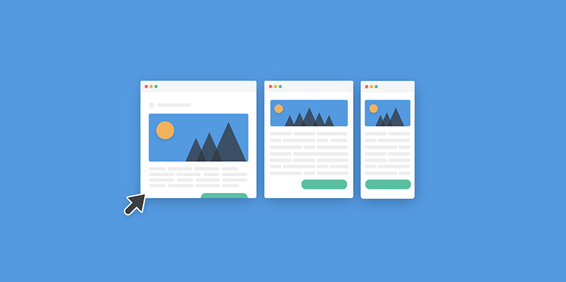
It Should Be Mobile Friendly
Almost everyone these days can’t live without their mobile phones. We use it to check just about everything online, including hot properties on sale. So it goes without saying that when planning your web design, you should keep mobile users in mind.
Real estate clients are out and about. They’ll go from one house to the next as they find them. This means that they’d want a quick and convenient way to lookup details about a specific property using their smartphones. Hence, if your current website is not mobile-friendly, then you need to do your homework right now before your competition closes the deal.
The Need For Speed
Your real estate website will contain plenty of images and information. This, in turn, can affect its loading times, which is bad for user experience. If your site is pretty slow, both your high-paying and possible clients will most likely abandon it.
Additionally, Google and other search engines don’t like websites that load slow. Hence, your search result ranking will get affected as well. Having said that, you should always look for ways on how to improve its speed.
Fortunately, there are some ways on how you can make your website load faster. However, one of the best ways is to optimize your images by reducing its size. You can find plenty of free tools available online that can condense image files without compromising its quality.
Simple Navigation
In terms of real estate web design, you don’t have to make the navigation fancy. The key here is simplicity and straightforwardness, which is something that many websites seem to struggle with.
It’s okay for certain websites to play around and experiment with their web design. However, it’s a whole different story with real estate pages, which should be professional and simple. Although a professional page layout is a tad boring, in the end, you’ll benefit from it.
Furthermore, you need to think about the type of audience you have. In most cases, your site visitors would simply want to find what they want right away and leave your website. So make sure to build a site with a simple design and straightforward functionality to prevent confusing your potential clients.
Create Area Profiles
People searching for a new house usually have an idea of the exact area where they want to live. It’s rare for real estate site visitors to come to your website and search properties by state.
Creating an area profile is beneficial for both you and your audience. Buyers don’t want to look at every property. So you’ll be able to speed up the search process by providing buyers with specific communities and neighborhoods you serve.
What’s more, area profile pages are also a chance for you to obtain some relevant SEO through links, keywords, videos, and URLs containing a particular neighborhood.
Integrate Social Media
Your visitors will be able to share your listings and interact with your site if you’ll incorporate it with your company’s social media accounts. So ensure that every page has social sharing icons or buttons to provide your visitors with a clear way to follow your business. Likewise, your social media posts should include relevant links back to your homepage to help drive more traffic.
Include Testimonials Of Past Clients
Testimonials are a great way to drive leads to your site and convert them into customers. They show the positive experiences of your past clients and how satisfied they are with doing business with you. You can use all the adjectives you know about how exceptional you are in your field, but people are more likely to believe the word of a happy customer 90% of the time.
With that said, considering including your testimonial page with images represent your market. One of the best practices to remember is to use photos of the properties you’ve sold before.
One of the steps you need to take as a realtor to help your business is to have an effective and successful real estate website. It’s an excellent opportunity for you to attract new clients while telling your unique story. So make sure to follow these tips that can help in the growth of your real estate business. And if you find this article helpful or want to share something, do not hesitate to leave a comment below.
Aileen Cuaresma
Aileen is a Technical and Creative writer with an extensive knowledge of WordPress and Shopify. She works with companies on building their brand and optimizing their website. She also runs a local travel agency with her family. On her free time, she loves reading books, exploring the unknown, playing with her two adorable dogs, and listening to K-pop.
Get 10% discount with coupon code ESTATE10








0 Comments