How to create Flip Box Effect in Divi
Flip Box effect is a nice and interactive animation that can be applied to content boxes to make them more appealing and engaging. It’s a great way for showcasing products, services, events and actually anything we can imagine that requires an image and description. In this tutorial we will show you how to achieve that effect with a few lines of custom HTML and CSS.
Flip box effects are one of the most requested Divi features I see in the Facebook groups. But unfortunately Elegant Theme’s still haven’t added them as a module to use within the builder. Luckily for us though, they’re fairly simple to create with a little bit of HTML and CSS, and in this tutorial we will show you how to do that in a few simple steps.
Sneak Peak
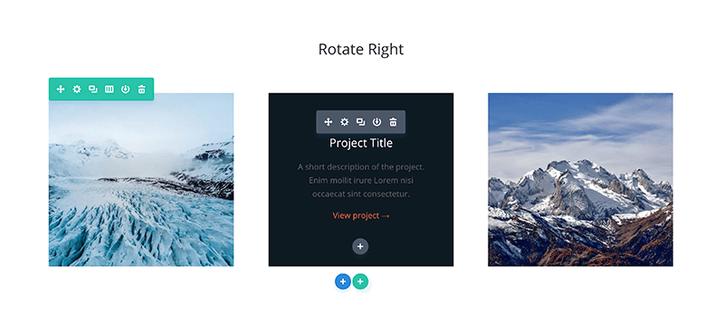
Here is a sneak peak of the module we will be building today.
Download Free Divi Sections .JSON file
You can follow this tutorial or download ready to use .json file with several sample sections that you can import to your Divi Library and use in no time! Subscribe to download free section →
Create a section
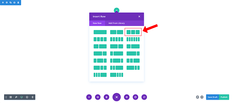
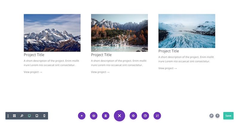
Create a new section and add a row with 3 columns.
Add text module and HTML
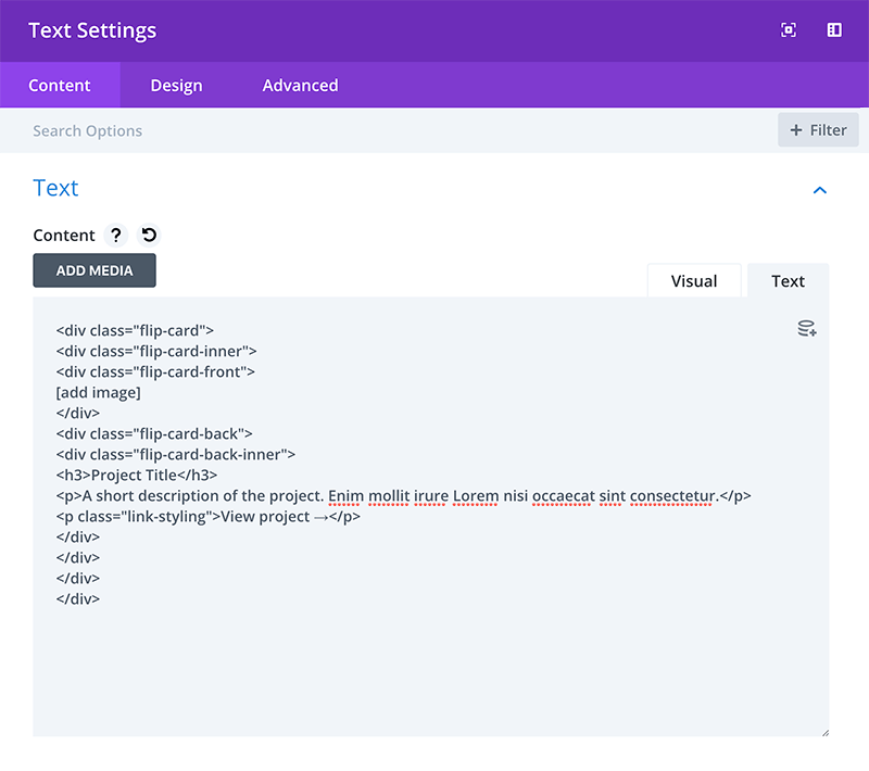
Add a text module, make sure you’re on the “Text” tab, then paste in the following html:
|
1 2 3 4 5 6 7 8 9 10 11 12 13 14 15 |
<div class="flip-card"> <div class="flip-card-inner"> <div class="flip-card-front"> [add image] </div> <div class="flip-card-back"> <div class="flip-card-back-inner"> <h3>Project Title</h3> A short description of the project. Enim mollit irure Lorem nisi occaecat sint consectetur. View project → </div> </div> </div> </div> |
Customise HTML
For the frontside: In the space marked [add image], replace with an image from the media library using Add Media button. Make sure the image is at least 400px wide.
For the backside: Look for the part of code which looks like this:
|
1 2 3 4 5 6 7 |
<div class="flip-card-back-inner"> <h3>Project Title</h3> <p>A short description of the project. Enim mollit irure Lorem nisi occaecat sint consectetur.</p> <p class="link-styling">View project →</p> </div> |
Then replace the following
– The text which says “Project Title” inside the h3 tag
– The description text directly below which starts with “A short…” inside the p tag
Add in link (optional)
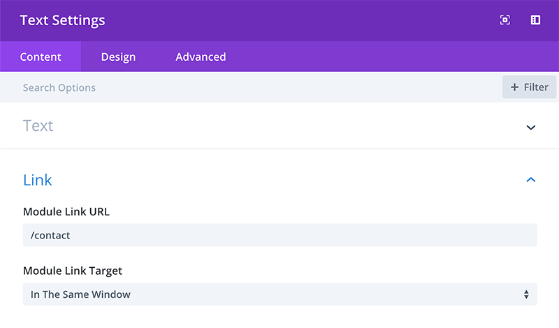
If you’d like to turn the flip card into a link, you can add in a module link to the text module.
Choose which flip direction
You can choose 4 different directions for the flip: left, right, up, down.
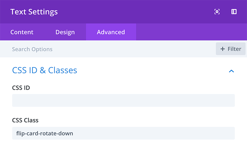
Add the following class into the css class box in the advanced tab of the text module:
• Left: flip-card-rotate-left
• Right: flip-card-rotate-right
• Up: flip-card-rotate-up
• Down: flip-card-rotate-down
Add in other boxes
Copy and paste the text module into the other two columns, then repeat step 3-4 to customise each flip card. Then save the layout.
Add custom CSS
Add the code below into your child theme style.css (or the Custom CSS tab of your Divi Theme Options):
|
1 2 3 4 5 6 7 8 9 10 11 12 13 14 15 16 17 18 19 20 21 22 23 24 25 26 27 28 29 30 31 32 33 34 35 36 37 38 39 40 41 42 43 44 45 46 47 48 49 50 51 52 53 54 55 56 57 58 59 60 61 62 63 64 65 66 67 68 69 70 71 72 73 74 75 76 77 78 79 80 81 82 83 84 85 86 87 88 89 90 91 92 93 94 95 96 97 98 99 100 101 102 103 104 105 106 107 108 109 110 111 112 113 114 115 116 117 118 119 120 121 122 123 124 125 126 127 128 129 130 131 132 133 134 135 |
/* Set height of card. The image is set to cover, so increasing the height won't distort the image.*/ .flip-card { height: 300px; perspective: 1000px; -webkit-perspective: 1000px; } /* This container is needed to position the front and back side */ .flip-card-inner { position: relative; width: 100%; height: 100%; text-align: center; transition: transform 0.8s; -webkit-transition: transform 0.8s; -webkit-transition: -webkit-transform 0.8s; transform-style: preserve-3d; -webkit-transform-style: preserve-3d; } /* Position the front and back side */ .flip-card-front, .flip-card-back { position: absolute; width: 100%; height: 100%; backface-visibility: hidden; -webkit-backface-visibility: hidden; } /* Add background to front incase image doesn't load */ .flip-card-front { background: #0D1B22; } /* Set the image to cover, so if you increase height it won't skew image. Image height and .flip-card height should be the same. */ .flip-card-front img { height: 300px; object-fit: cover; } /* Style the back side */ .flip-card-back { padding: 40px; background-color: #0D1B22; display: table; } /* Vertically centre align text on back */ .flip-card-back-inner { display: table-cell; vertical-align: middle; max-width: 300px; } .flip-card-back h3 { color: white; margin-bottom: 10px; } /* Color the view project text to look like a link */ .link-styling { color: #F56640 !important; } /* Reverse back of card so is correct orientation after flip */ .flip-card-rotate-left .flip-card-back, .flip-card-rotate-right .flip-card-back { transform: rotateY(180deg); -webkit-transform: rotateY(180deg); } .flip-card-rotate-up .flip-card-back, .flip-card-rotate-down .flip-card-back { transform: rotateX(180deg); -webkit-transform: rotateX(180deg); } /* Flip animation on mouse hover - rotate right */ .flip-card-rotate-right .flip-card:hover .flip-card-inner { transform: rotateY(180deg); -webkit-transform: rotateY(180deg); } /* Flip animation on mouse hover - rotate left */ .flip-card-rotate-left .flip-card:hover .flip-card-inner { transform: rotateY(-180deg); -webkit-transform: rotateY(-180deg); } /* Flip animation on mouse hover - rotate up */ .flip-card-rotate-up .flip-card:hover .flip-card-inner { transform: rotateX(180deg); -webkit-transform: rotateX(180deg); } /* Flip animation on mouse hover - rotate down */ .flip-card-rotate-down .flip-card:hover .flip-card-inner { transform: rotateX(-180deg); -webkit-transform: rotateX(-180deg); } /* Responsiveness - turns off the flip animation on mobile and layers the text over the image with a background overlay.*/ @media (max-width: 980px) { .flip-card-rotate-left .flip-card-back, .flip-card-rotate-right .flip-card-back{ transform: rotateY(0deg); -webkit-transform: rotateY(0deg); background-color: rgba(13,27,34,0.5); } .flip-card-rotate-up .flip-card-back, .flip-card-rotate-down .flip-card-back { transform: rotateX(0deg); -webkit-transform: rotateX(0deg); background-color: rgba(13,27,34,0.5); } .flip-card-back p { color: white; } .flip-card-rotate-left .flip-card:hover .flip-card-inner, .flip-card-rotate-right .flip-card:hover .flip-card-inner{ transform: rotateY(0deg); -webkit-transform: rotateY(0deg); } .flip-card-rotate-up .flip-card:hover .flip-card-inner, .flip-card-rotate-down .flip-card:hover .flip-card-inner { transform: rotateX(0deg); -webkit-transform: rotateX(0deg); } } |
Mobile Version
The mobile version of this layout is set to overlay the background text over the front image.
The reason being as there’s no text on the front, users might think it’s just an image and not think to click it, therefore missing the text on the back.
If you’d like to have the cards active on mobile though, it’s an easy fix. You just need to do the following:
1. Remove the media query from the CSS. The part you need to remove is highlighted below.
2. If you’re using a module link, remove it
3. Reply the “View project” text on the back with a link
And that’s it!
CSS to remove:
|
1 2 3 4 5 6 7 8 9 10 11 12 13 14 15 16 17 18 19 20 21 22 23 24 25 26 27 28 29 30 31 32 33 34 |
/* Responsiveness - turns off the flip animation on mobile and layers the text over the image with a background overlay.*/ @media (max-width: 980px) { .flip-card-rotate-left .flip-card-back, .flip-card-rotate-right .flip-card-back{ transform: rotateY(0deg); -webkit-transform: rotateY(0deg); background-color: rgba(13,27,34,0.5); } .flip-card-rotate-up .flip-card-back, .flip-card-rotate-down .flip-card-back { transform: rotateX(0deg); -webkit-transform: rotateX(0deg); background-color: rgba(13,27,34,0.5); } .flip-card-back p { color: white; } .flip-card-rotate-left .flip-card:hover .flip-card-inner, .flip-card-rotate-right .flip-card:hover .flip-card-inner{ transform: rotateY(0deg); -webkit-transform: rotateY(0deg); } .flip-card-rotate-up .flip-card:hover .flip-card-inner, .flip-card-rotate-down .flip-card:hover .flip-card-inner { transform: rotateX(0deg); -webkit-transform: rotateX(0deg); } } |
Bonus: Flip Cards Module!
But what if you don’t want to touch any code, but still want to create flip cards using the Divi builder? Well, you’re in luck! B3’s Divi Flip Card plugin does just that!
Not only can you easily achieve the look from the tutorial above all within the Divi builder you’re familiar with, there’s also a whole load of additional features to make your flip cards even more stylish and unique.
Once you’ve bought the plugin, it’s as simple as installing it, then you’ll have access to the “Flip Card’ module in the builder and you can start creating your own flip cards today!
Andy Hooke
Andy is a self-taught web designer who now specialises in the Divi theme. He comes from a html & css coding background, and enjoys taking these skills to see how far he can customise Divi and create websites which don’t look like your standard Divi websites.
Create beautiful blurbs with Divi Flip Cards
Let’s celebrate! We have a sweet deal for you! You can get the best flip box plugin for Divi with a 10% discount! Use the coupon code DFC10 at checkout!








Love this and want to purchase, but could you provide some info on how this works with mobile? Since 50% of traffic is in that arena, that would cement my purchase decision. thx
Hello Kathy! Thank you for your comment!
The Divi Flip Cards works on mobiles. After user tap on the box, it animates to the back card. Good approach for make it even more mobile friendly is to place icon/link/button on the front card, so users know that there is something more. Hopefully this helps 🙂
Can I use that in a 6 columns module?
Hi Paolo, yes, it will work with 6 columns layout!
Really cool effect! I have a doubt that I can’t figure it out
Is there a way to set the height? In my case I have some cards with a vertical format. Using this effect crops the image to an square. Can that be changed?
Thanks!
I’ve been trying forever to find a flip card code that will work, because my site is hosted through my university’s WordPress so plugins and such are really limited, but this worked perfectly! Took less than five minutes to set up and is very easy to customize and work with! Thank you so much!
Is there any way to add a background image for both the front and back cards?