The old saying goes, “Success is the hangover of failures”. Failures happen, in fact they happen a lot, and they are obvious every now and then.
Minimizing the impact of failure is the key; something which is a success today may turns into a failure tomorrow. To make a thing / an idea more successful tomorrow we need to think ahead of time. This is essential to make pace with new generation produce; the technology and people. A home or business is not enclosed within four walls made of bricks and mortar anymore. Success is defined by how many people visit your website, appreciate your efforts, put up reviews and ask for a product or service.
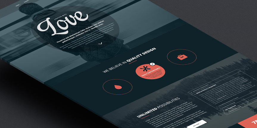
Many website fails due to the lack of adequate designs. Here are some tips, tricks and suggestions to prevent your web design from failure.
Put in Appropriate Details
How much is too much? There is no fixed formula. Often, web designers put everything on the home page itself. Let the visitors in. Your website home is like a Restaurant Menu. Anyone can check it but hungry stomachs will place an order. Infusing a sense of hunger into website visitors is the job of web designers. Any design made for any purpose must be tried and tested first among friends and co-workers before making it live.
Appropriate Background
A Colour Scheme is one of the essential aspects of website design. An attractive background will keep the audience glued to the screen. Do not select a background that is uneasy on the eyes. Also, the website background should be in accordance with the purpose. For example, you can go with a Grey background for a knowledge sharing / tricky website. Also, the age of your audience matters in selecting a background; younger people prefer vibrant colours, whereas for a more senior audience prefer a more conservative and plain colour scheme. Give it your best shot.
Balance Matters
The background colour pattern, the right selection of font, images and graphics are all key ingredients to encourage an audience to browse a website. Anything mismatched will lead to distraction.
Do not overdo Emboss and Bevel
Many web designers overdo with emboss and bevel to make it impressive. Too much of anything is not good. It feels boring beyond a certain level and invites distractions. This is same as the keyword stuffing technique that has been happening for many years.
Inept Design
No matter, how much efforts you made in the selection of the colour pattern, font styles and media, a clumsy design will be powerful enough to send away an audience. Nobody likes a cluttered home or to live in a space with less air. Give your website a fresh vibrant look. Also the colours and graphics should match well with the website text.
Go with the trend
A website should be designed keeping the latest design trends in mind. Remember, technology hasn’t always been the same as it is today. Maybe an ancient website you follow is great. But you are designing it today to meet the demand of the future. Everything; style, colour, pattern and text should meet the tastes of upcoming audiences.
Spend Time on Research and Brain Storming
The Web Design is not only about putting everything in a folder and telling the robot to publish. Most people think in this way. However, before embarking on a web design mission, brainstorm with your colleagues, friends and Peers. Spend Time on Research and Brain Storming to prevent web design failures.


