16 Great Examples Of Websites Built With The DiviEstate Child Theme
The DiviEstate child theme is used by real estate agencies to power their businesses worldwide!
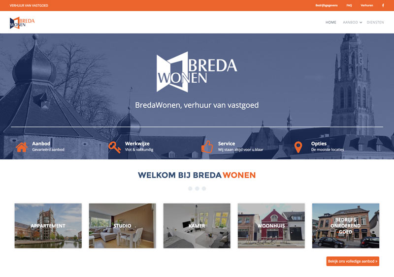
Breda Wonen
This Dutch real estate agency’s website uses only some of the DiviEstate features. This is how a DiviEstate-based site looks with a boxed layout. On the homepage, property categories are displayed. Each of them leads us to a property listing page with the selected category. The properties are displayed with the attractive hover effect on property images.The colors of the website are unique and match Breda Wonen’s company branding.
This website uses boxed layout. On a homepage we can see property categories. Each of them leads us to property listing page with selected category.
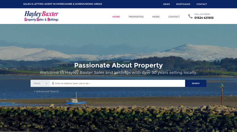
Hayley Baxter Properties
Hayley Baxter’s website uses the whole power of the DiviEstate theme. Their homepage has the property search bar and the property image slider to instantly give customers what they are looking for.
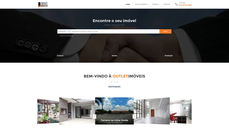
Outlet Imóveis
This Brazilian real estate agency puts emphasis on utility. Their homepage uses the DiviEstate property search bar, the image slider, and an overview of newly added properties. In the menu we can navigate to see specific category properties listings.
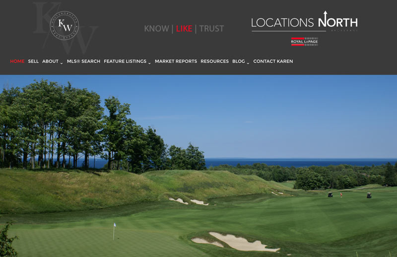
Collaborative Real Estate
This is another real estate website which uses only selected functions of the DiviEstate theme. This website uses the SoldPress plugin to display properties from the MLS system. The advanced DiviEstate property management system and custom modules have been used for adding and displaying featured properties only.
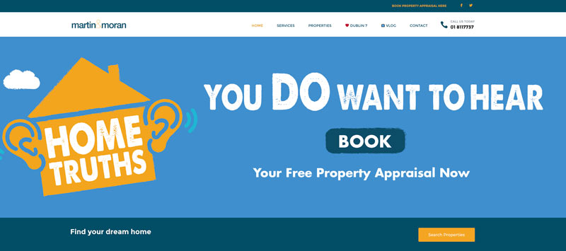
Martin & Moran
Martin and Moran are a team of Irish real estate agents. Their website is using DiviEstate in yet another way. The homepage has many core modules, i.e. the property image slider, advertising text with a CTA, and agent profiles. They have also added their own touches by providing testimonials and a video.
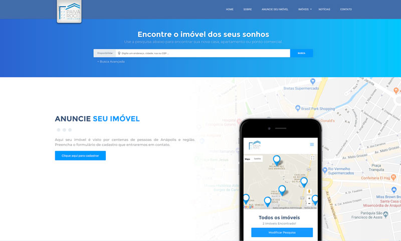
Paiva Roci
It’s another website which puts its own unique spin on the DiviEstate theme. They have mixed different elements to achieve a splendid effect. The homepage features full-width image slider, property listing, property search, and blog.
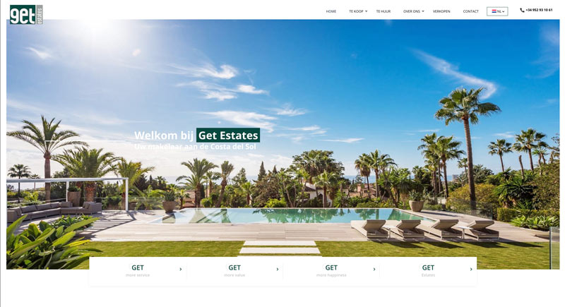
Get Estates
This Spanish real estate agency uses DiviEstate, too, although you’d hardly be able to say so at a first glance. KUDU CONCEPTS, the web design company which has built this website, has done a lot of custom work here. The searching module and the property listing module from DiviEstate have been adapted to the client’s requirements, as well as the single property page. We are impressed by the effects!
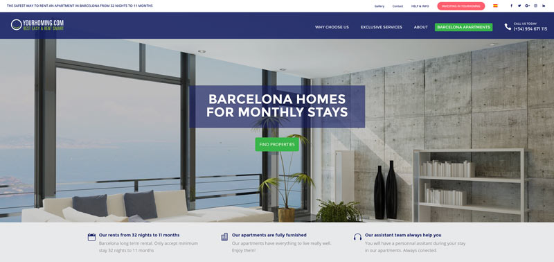
Your Homing
This website offers exclusive apartments for rent in Barcelona. On the homepage, we can see the hero image that leads to apartment listings. The single property page has been adapted to suit the needs of Your Homing company. New features have been added, including a calendar showing which dates have been already booked, and a tabbed area with Features and Highlights sections.
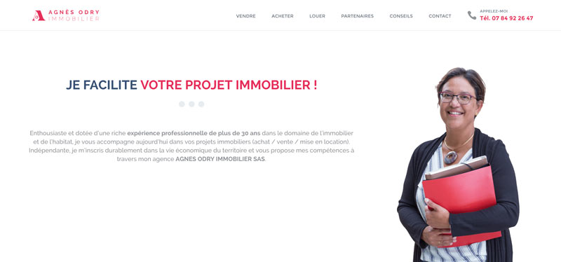
Agnès Odry Immobilier
Here is another sample of a DiviEstate website using boxed layout. Guys from Octoprint web design agency have done an incredible work here. They definitely know what visual identity is, and they have used all visual assets to build a unique and functional website for Odry Immobilier from France.
This website uses the fixed menu header, map, and property listing. It also makes use of the news page – all in the characteristic color theme. The back-to-top button in red looks fetching!
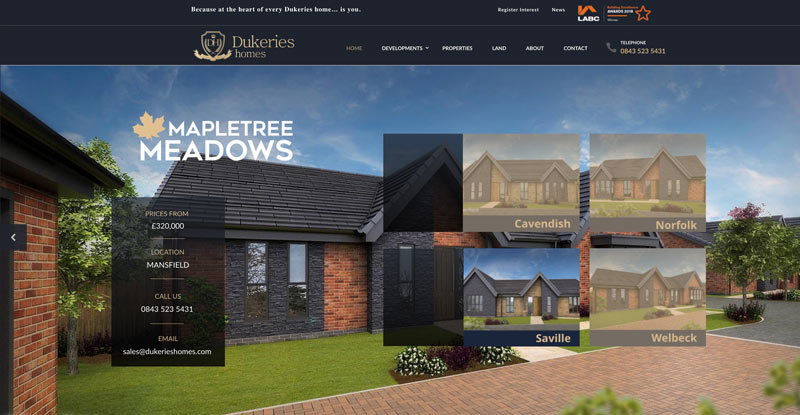
Dukeries Homes
This adaptation of DiviEstate in graphite and gold looks very luxurious. Dukeries homes build luxurious family homes, and they are using DiviEstate to showcase their former, current, and planned developments. This use of DiviEstate – and the look – is unique. We especially like the Interactive Homepage Slider which has been created using the Smart Slider 3 plugin.
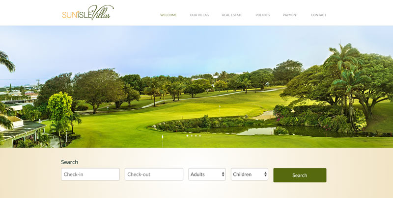
SunIsle Villas
SunIsle Villas in Barbados offer luxurious properties for sale. They also rent out villas for luxurious holidays. This website uses an integrated system for booking apartments online.
Daniella Gold
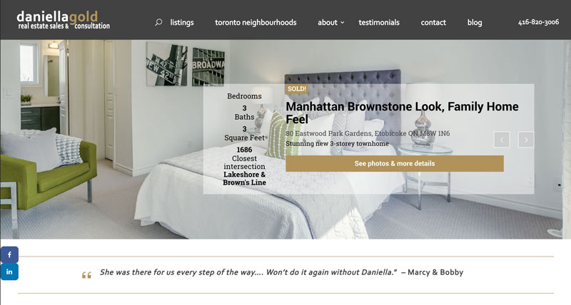
This website uses the DiviEstate Property Slider and the Agent profile modules on the homepage. The Property Listing page uses the right sidebar where we can also see the Agent module, a contact form, and an Instagram feed gallery.
Alex Ottawa
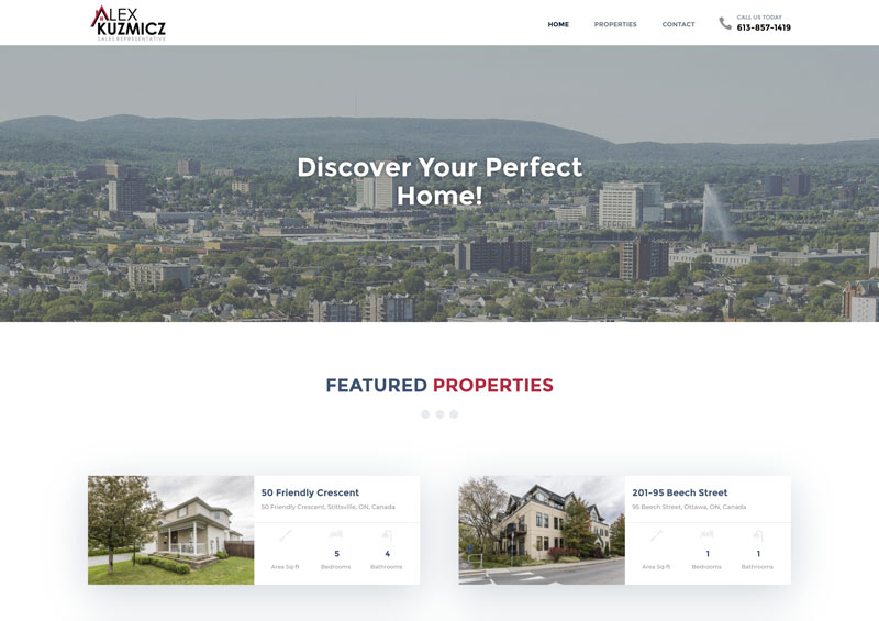
This minimalist look is achieved by putting featured properties in the spotlight! This website uses also the DiviEstate CTA, and the properties page with a map. It’s a clean, transparent look.
Home Sweet Home
HSH is a property development company based in Mexico.Their website is very simple and to the point. The homepage features an image slider and properties listing with the awesome DiviEstate hover effect. They also have a map and a short advertising text on a nice map background.
OR Bienes Raices
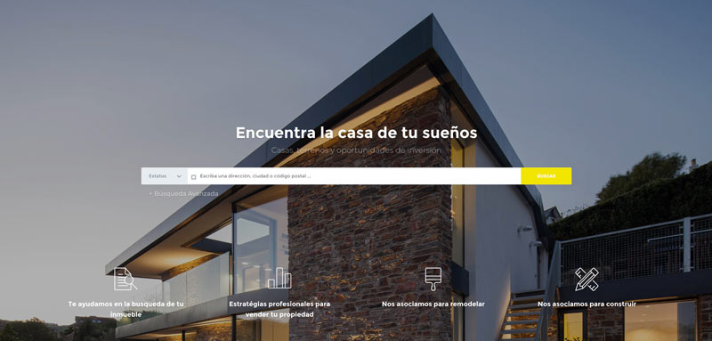
This real estate agency’s website uses the Search Bar homepage. The homepage is built using DiviEstate elements, such as the property image slider, agent profiles, the CTA and newsletter subscription. The website also uses the custom DiviEstate blog module.
Touched Reality
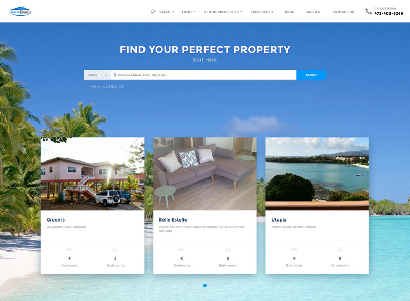
Touched Reality offers properties and lands for sale and rental in Grenada, Spain. This website retains the original DiviEstate color theme! It uses a lot of DiviEstate modules and pages.
Which one is your favorite? Let us know in the comments below!
Edyta Gaida
Edyta, also known as Englishwriterka, is a Copywriter and a Creative Writer. She takes pride in creating the textual identity of Polish brands abroad. In her free time, she writes a Young Adult novel in English and takes care of her family, which has now four members, including a puppy. She is Silesian, lives in Poland, writes in English, and loves all things Korean. The world is her mollusk.
Get 10% discount with coupon code ESTATE10








0 Comments