25+ Awesome Websites Using The Testimonial Slider Plugin
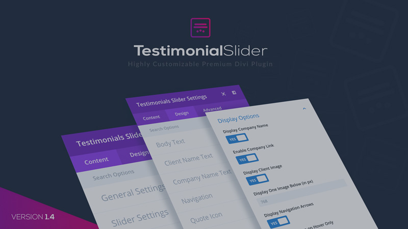
Testimonial Slider plugin is highly customizable, making it one of our most popular Divi Plugins. In fact, it’s even featured on Elegant Themes and listed as one of the best testimonial sliders by the Divi Cake blog.
So what makes this plugin so awesome? First, it lets you add three custom modules to the Divi Builder, including Testimonial Slider, Grid Slider, and Filterable Grid. It’s fully compatible with the Divi Visual Builder as well, which means you can customize it to fit the brand color and style of your website.
Secondly, it makes the entire process of adding, editing and managing your testimonials as simple as it can be. You can easily create your custom Testimonials tab where you can enter essential information about your clients. The best thing about it is that aside from your home page, you can display any pages of your site using it.
What’s more, the Grid Slider module features the Coverflow Effect with three controls. With this feature, you can change the shadow overlay color, depth, and the angle of the testimonial boxes to make the reviews stand out even more.
Watch Testimonial Slider in action
With all these incredible features, no wonder over 3,000 users, and counting, have already purchased and used it on their Divi sites. And below, you can find some examples of how you can use, and make the most of Testimonial Slider:
Easywater
The Testimonial Slider module with a star rating and navigation of Easywater is simple yet effective. Aside from feedback from past clients, ratings are a great way to add credibility to your products and services. And instead of a plain background, they use an image with an overlay, which showcases the versatility of the plugin.
ITC
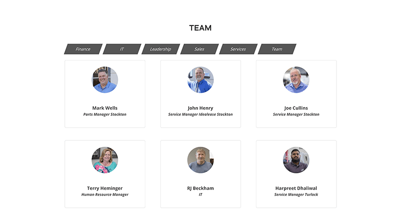
You can use the plugin not only as a way to show customer testimonies like with what ITC did here. They became creative and utilized the Filterable Testimonials module with images on the about page to list their team members. And the result is clean, attractive, and easy on the eyes.
Fabian Peter
Fabian Peter is a Divi website that utilizes the Filterable Testimonials grid view. Aside from feedback and details, they also incorporated it with photos of their clients to establish trust. The overall look is professional, clean, and simple.
Kompania Informatyczna
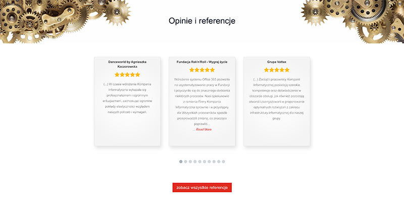
The Grid Slider module with a star rating and arrow navigation is used on Kompania Informatyczna. If the testimonial is quite long, there’s a read more link below it, which will bring you to the feedback’s dedicated page. Shadow is added to each testimonial box to make it stand out even more.
Invisible Connections
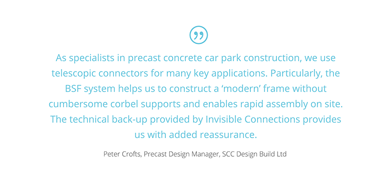
Invisible Connections make use of the Testimonial Slider with a custom quote on the top of the feedback. They also set it to transition automatically but ensuring that you’ll have enough time to read the entire review. The colors of the font are customized as well to fit well with the overall theme of the site.
Line Ottica
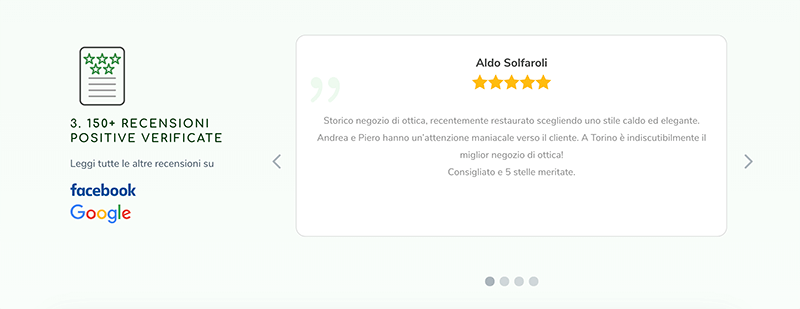
Here, Line Ottica has the Testimonial Slider in the right column with navigation arrows and star rating. On the left column, they put a link to their Facebook account and Google Reviews where potential clients can read more positive feedback about their products and services. This is quite brilliant since you’re also directing clients to a platform where they can interact with you more.
Hicons
Showcased on the website of Hicons is the Testimonial Slider module with navigation where the background is customized. The font used here is simple and readable against the background. What’s good about creating a design like this is how well it stands out from all the information the site contains.
Chess Edwards
Chess Edwards placed the Testimonial Slider in one column with a star rating and arrow navigation. There’s also a read more link below long reviews, which will open in a new tab when clicked. At the bottom, you’ll find photos of the client with an overlay effect. Clicking it will bring you to the next testimonial. On the other hand, the second column contains a quote from the website owner as well as a photo of himself and his clients.
Whole Being Institute
Here, you’ll see the three-column Grid Slider in action. It also features a star rating and moved image above content. And instead of using a solid color, a gradient effect is applied to go along with the theme of the entire Whole Being Institute website.
Empress Crow And Rabbit
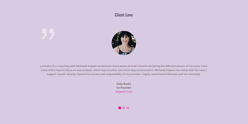
The Empress Crow and Rabbit Divi site has a massive feedback section on its home page. In fact, it’ll almost occupy your entire screen. They employ the Testimonial Slider module here with navigation and place a bigger than usual photo of the client at the top. And to balance the design, a light, solid color, and a simple font is applied to its background.
Glanford Painting
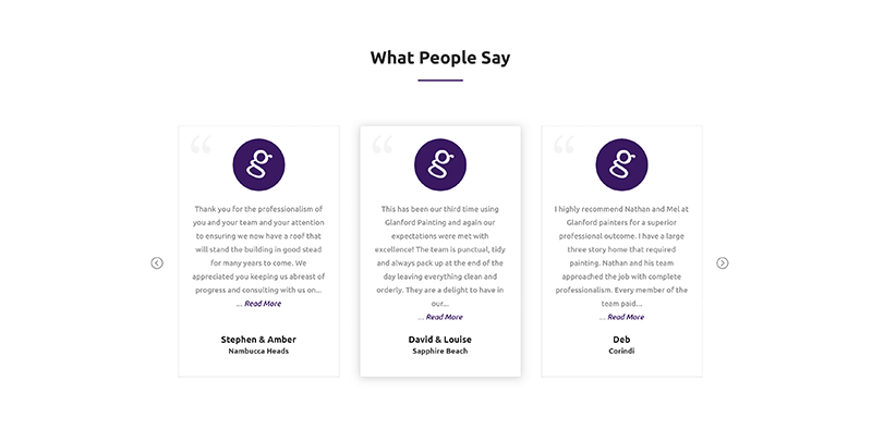
Simple and beautiful. That’s how Glanford Painting designed their site’s feedback section using the three-column Grid Slider with arrow navigation. Additionally, they use the image of their logo on top of each testimonial instead of client photos. You can also find a link below the content where you can read the rest of the review.
Annie Wright Psychotherapy
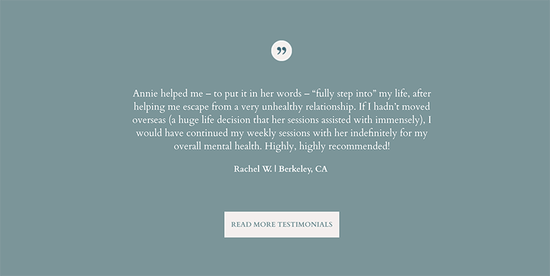
The style of the Testimonial Slider they did at Annie Wright Psychotherapy is just as calming as the entire website itself. They chose to use a solid color for the background and classic font. At the top of the content, you’ll find a quote, while at the bottom, there’s an animated CTA button to read more. But what makes this slider stand out is how smooth the transition of the testimonials is, adding to the tranquil feel of the site.
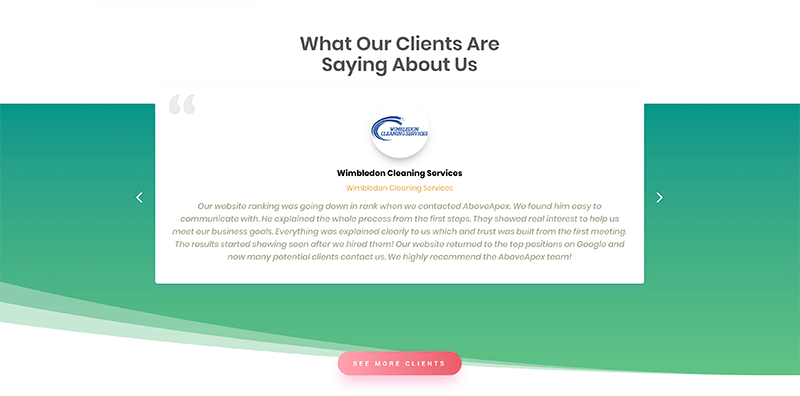
Above Apex
Above Apex is a digital marketing Divi site showcasing the Grid Slider with the new 3D Coverflow Effect and arrow navigation. Each feedback has the logo of the companies they’ve worked with at the top. Showing new clients that you’ve done business with reputable companies can also help establish trust in your business. And if you’re working in a highly competitive industry, you’ll benefit from something as cool as this effect. It’ll show them that you have the skills and creativity they’re looking for.
Arnold Partners
If you’re running a strategic CFO company like Arnold Partners, client feedback is just as vital as how you present it. On this Divi website, they utilized the Testimonial Slider with square images at the top and the content overlapping the quote icon. Under each image, they also put a few words or phrases for the client. The result is an engaging testimonial section that looks professional.
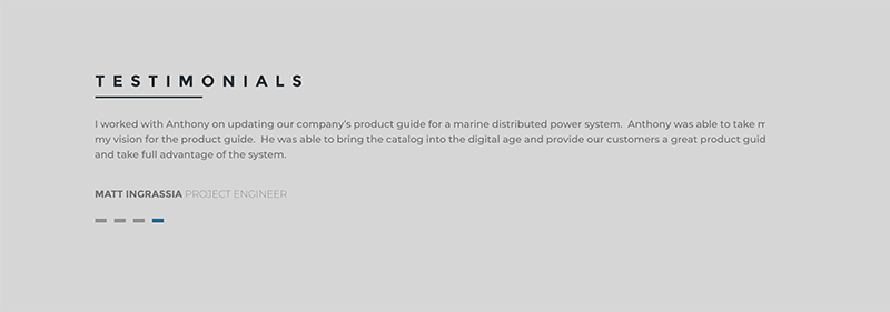
Anthony Storo
The page of Anthony Storo shows how well you can customize the plugin to make the Testimonial Slider module suitable for your brand. Every element of the testimonial is the same as those on the site, from font styles to its color palette.
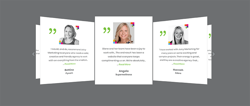
Juicy Marketing
You can make all sorts of styles with our Testimonial Slider plugin. It’s highly versatile, and the possibilities are endless. You can make it fun while still maintaining a professional look like what Juicy Marketing did. They incorporate the Grid Slider module with arrow navigation, square images, and 3D Coverflow Effect. And to make it even more eye-catching, they use a bright green color for the quote icon, which complements well with the gray and white background combo of the slider.
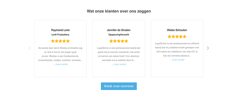
Lups Online
Lups Online is an SEO company that opted for a modest “what our customers say about us” section. They used the 3 column Grid Slider module with a star rating and link below the content. And the golden yellow color of the star rating is what will immediately catch your attention. The clean look of the testimonial fits perfectly with the aesthetic of the site.
Kit Cummings
Another way to utilize this Divi plugin is to present your offerings or services creatively, similar to what Kit Cummings did. Instead of client feedback, the Grid Slider contains their featured programs with a CTA button below the content. And to make sure you don’t miss it, they put a diamond shape with a solid color on top of the testimonial boxes. The result is a simple yet stunning and highly readable, informative element.
Caspian Group
The Glider Slider Module took center stage on the Divi website of Caspian Group with a star rating and took it to the next level. They incorporated it with the 3D Coverflow Effect and combined it with custom background images and texts. And instead of the usual white, they opted for a darker color for the box. The design is modern and complements the entire site.
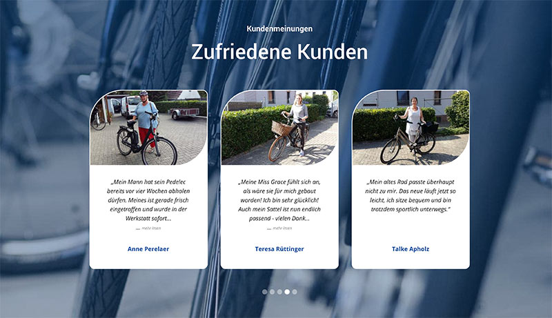
Zweirad Kliem
In the satisfied customer’s section of Zweirad Kliem, the Grid Slider is applied for showcasing product reviews over an image background with overlay. The customer image at the top occupies almost half of the boxes, which is also a good way of showing how you value your clients. To make the testimonial boxes stand out against the busy background, they outlined them and rounded out the edges.
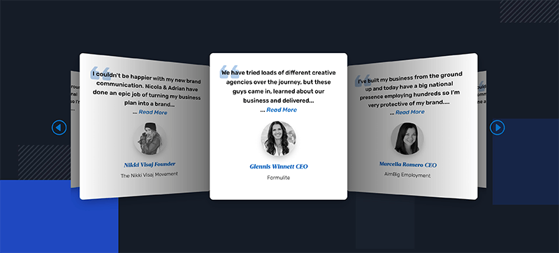
10Kreative
10Kreative brings brands to life, and our Testimonial Slider Divi plugin breathes more life into their website. The Grid Slider module with square boxes in white and rounded edges make a striking contrast against the dark background. On the other hand, the application of the 3D Coverflow Effect showcases inventiveness and creativity. They also included a read more link under the content, as well as a custom black and white image of the clients.
Amerigo Casadei
Video testimonials are more effective than words and images. It’s also interactive and a subtle way of informing your potential clients that you also have a YouTube channel where they can get updates. Amerigo Casadei took advantage of this by placing thumbnail videos of his clients in the Testimonial Slider in grid form. You also have an option to watch it as is or in full screen.
Write On Time
Write On Me enhances its reputation by using the Grid Slider in three columns with arrow navigation. You can also see the customization prowess of the plugin on this website. Aside from customizing its color scheme, they also styled the images with an outline and black and white color. Doing so ensures that the Testimonial Slider coincides with the website’s theme.
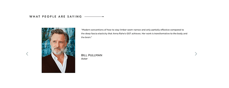
GST Body
We crafted this Divi plugin with the branding of your business in mind as well. Hence, it’s highly adaptable and customizable. For instance, GST Body designed the Testimonial Slider with custom arrow navigation, just like with the other elements of the page. They also included a custom asset at the top, adding to its contemporary feel. Additionally, they placed a good-sized image of their clients alongside their review.
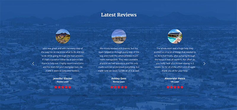
John Z Team Home Loans
John Z Team showcases the latest reviews of their services using the Grid Slider with transparent background, image, and star rating. The red color of the star rating and white color of the content of the testimonial is the perfect finish this USA-themed Divi website needs.
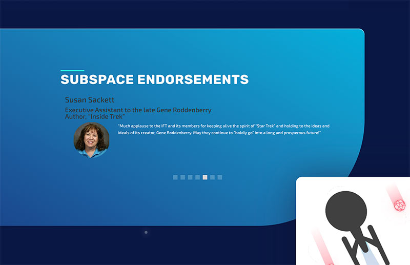
Trek Federation
Trek Federation’s website is quite savvy and features plenty of advanced elements. And a site like this needs an extremely versatile and customizable plugin to showcase client feedback and referrals uniquely. So to ensure this vital section stands out, they use the Testimonial Slider with the image of their clients in one column with a light gradient and client image. On the other hand, the other column features a couple of images over a custom background.
Richard Pruzek
If you’re a web designer like Richard Pruzek, how you present your website is just as crucial as your client’s feedback. That’s why, you want every aspect of your page, including its testimonial section, to show your potential clients why they should work with you. Pruzek did just that by utilizing our Testimonial Slider module with star rating and simple animated navigation. His aesthetics are modern and straightforward, which is also applied in the testimoial’s design.
A Testimonial Slider can help attract new customers as long as you present it in a modern, mobile-friendly, and beautiful manner. Keep in mind that the main job of your site is to ensure that your products or services stand out from your competitors. And you can do that by using a Testimonial Slider plugin for Divi that you can customize to fit your brand and preference.
Aileen Cuaresma
Aileen is a Technical and Creative writer with an extensive knowledge of WordPress and Shopify. She works with companies on building their brand and optimizing their website. She also runs a local travel agency with her family. On her free time, she loves reading books, exploring the unknown, playing with her two adorable dogs, and listening to K-pop.
Use coupon code SLIDER15 at checkout!














0 Comments