How to Customize Divi Person Module and Add Hover Effects
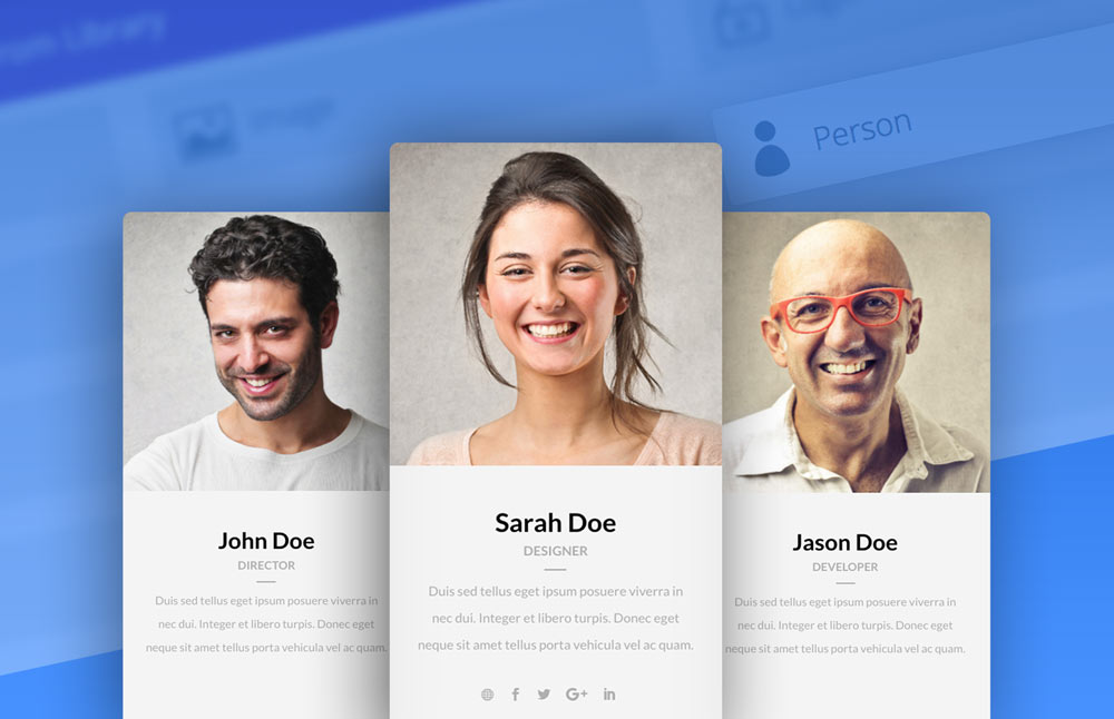
Divi Person Module allows you to add team members, persons to your website with ease. It has several useful features built in. We can add name, title, image, short description and social media links.
In this tutorial I will show you how to add a hover effects to the profile image and social media links and also how to add a little divider below the title. To follow this tutorial you will need Divi Theme by Elegant Themes installed.
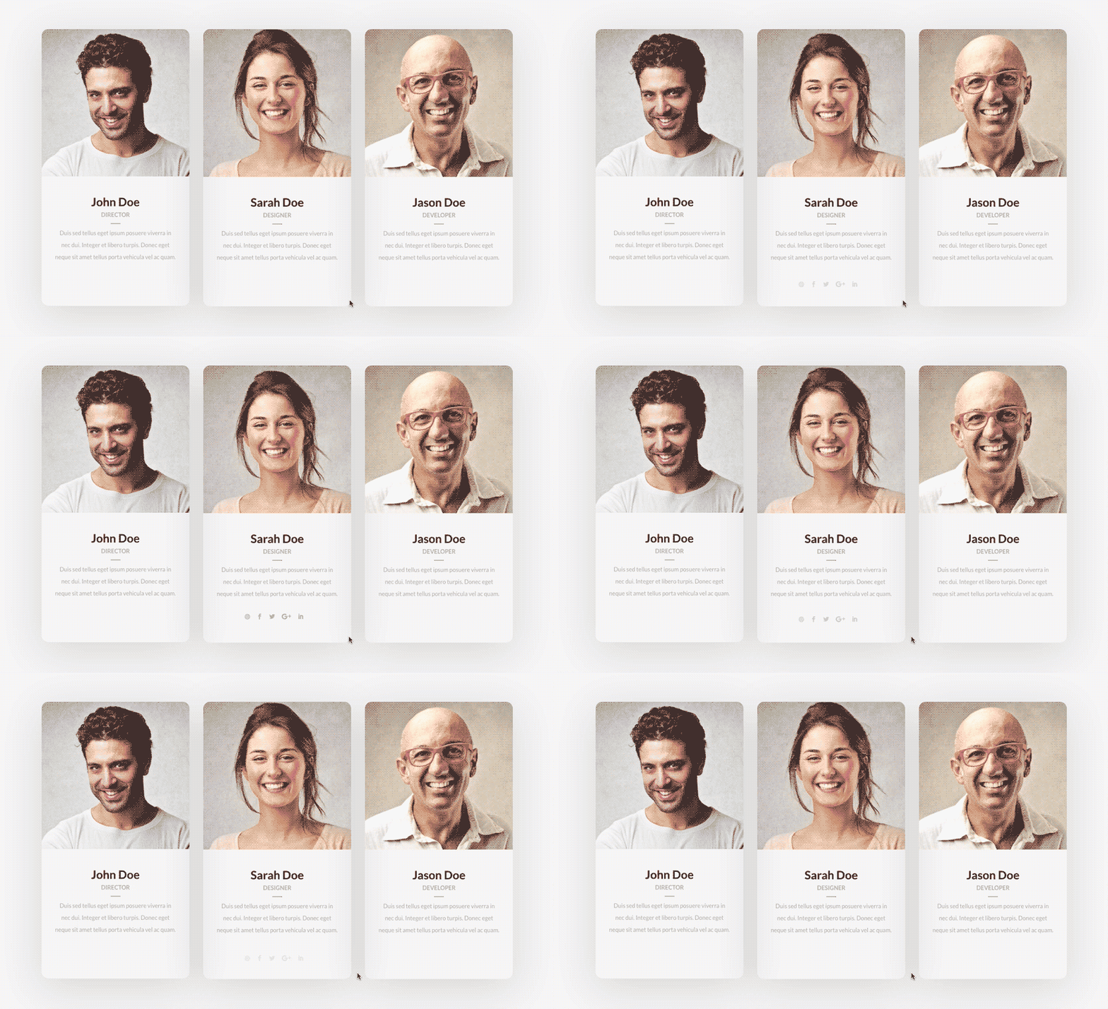
We will add zoom in/out effect to the profile image and we will hide social media icons by default and will make them slide up on mouseover only.
Let’s get started.
Adding row, columns and Divi Person Modules
First thing we need to do is to add row and columns to the page we want team members to be displayed. After that we add Person Module to each column and fill up the fields in the module customizer.
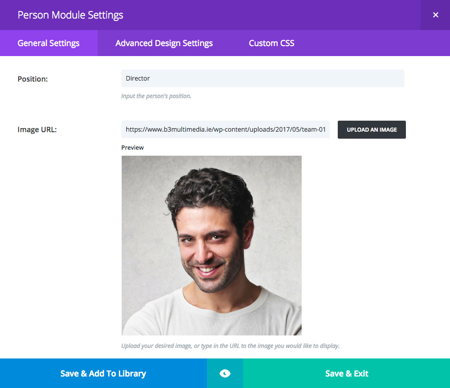
We add name, title, image, social media links and short description to each module. It is recommended to use the same size images for each person module. For this tutorial I will use square images 400px width and height.
Adding custom class to each Person Module
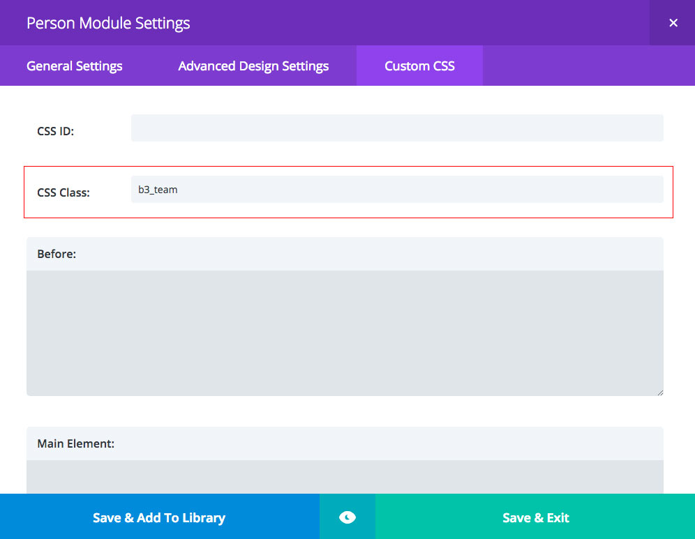
We will be applying custom css to our modules. To make it working we need to add custom class to each Person Module we have created in previous step, so our changes will be applied correctly. To do that open Person Module Settings and go to Custom CSS tab. Use b3_team class in CSS Class filed. Save & Exit. Repeat the same steps for all other Person Modules you have on your page.
Adding custom CSS to Divi Theme Options or Child Theme stylesheet
In previous step we have applied custom css class to each Person Module. Now we will be applying CSS rules to person image, title and social media icons. This code can be added to Divi/Theme Options/Custom CSS but it is recommended to use child theme for this purpose. You can find more information about creating child themes on Geno Quiroz’s blog.
Copy the following code and paste it to your child theme style.css file or to Theme Options Custom CSS section.
|
1 2 3 4 5 6 7 8 9 10 11 12 13 14 15 16 17 18 19 20 21 22 23 24 25 26 27 28 29 30 31 32 33 34 35 36 37 38 39 40 41 42 43 44 45 46 47 48 49 50 51 52 53 54 55 56 57 |
.b3_team .et_pb_team_member_description { padding:30px; text-align: -webkit-center; } .b3_team .et_pb_member_position { text-transform: uppercase; font-size: 13px; font-weight: 600; } .b3_team .et_pb_member_position:after { content: ' '; display: block; width: 20px; margin: 5px 0 0; border: 1px solid; } .b3_team:hover .et_pb_member_social_links a { opacity:1; transform: translate(0px, -15px); -webkit-transform: translate(0px, -15px); -ms-transform: translate(0px, -15px); transition: all .4s ease-in-out; } .b3_team .et_pb_member_social_links a { opacity:0; margin-top: 20px; transition: all 0.4s ease-in-out; } .b3_team:hover img { -ms-transform: scale(1.00) !important; -webkit-transform: scale(1.00) !important; transform: scale(1.00) !important; transition: all .5s cubic-bezier(0.170, 0.690, 0.470, 0.995); } .b3_team { border: none !important; border-radius: 15px !important; overflow: hidden; width: 100%; position: relative; z-index: 1; transition: all .3s ease-in-out; box-shadow:0 20px 150px rgba(0,0,0,0.2); } .b3_team img { transition: all .5s ease; -ms-transform: scale(1.03); -webkit-transform: scale(1.03); transform: scale(1.03); -webkit-transform-origin: bottom; -moz-transform-origin: bottom; -ms-transform-origin: bottom; -o-transform-origin: bottom; transform-origin: bottom; } |
And that’s it!
Hopefully you enjoyed this tutorial and it was a fun to make this module working differently than default Divi Person Module. If you have used this on your website or on your client’s website please share url in comments below. I would love to see how you use it in your project.
Maciej Ekstedt
Maciej is the founder and CEO of B3 Multimedia Solutions. He is a self-made web designer and marketing expert, and he loves his job so much that he barely leaves the office. He transforms creative ideas into effective strategies for his company and for his clients. Maciej is fascinated by the phenomenon of megalopolis. He notices patterns and details which make up the whole thing, and he uses these skills in his work.
John Doe
Director
Sarah Doe
Designer
Jason Doe
Developer
Get 10% discount with coupon code ESTATE10









my pictures have a padding around them? How can I fix that?
Hi Mike, thank you for your comment! It seems like images you are using are too small or other css is applied. Can you please make sure you are using images at least 400px width and height? Also url would help 🙂
oh sorry…though I put it in there….
http://www.piney.meexmedia.com/church-staff/
Mike, it looks ok on my end. I don’t see padding issue around images. If you still are experiencing issues please send email to [email protected]
Wow, thank you. This really does look great. Looking forward to using this on our next website build 🙂
Loved your blog design. And that’s a really nice tutorial!
Thank you Andre! I’m happy to see you here and always welcome! 🙂
Many thanks, Maciej, for making this valuable module and your tutorial to implement it available to our Divi group.
That looks great! But how did you add the website icon to the social media icons in the demo? The Divi person module doesn’t have that option, and the db_pb_team_member_website_icon class you use for the globe icon in the demo isn’t in the css above either.
Hi John-Pierre,
Thank you for your comment. That’s true. Website icon is added to the Person Module by Divi Booster plugin and this is not a part of this tutorial. Thank you for notifying. I have removed the icon from Live Preview section.
Cool, thank you! I didn’t know Divi booster could add that. I think ET should update that module and allow you to add that + all social media accounts you can also add with the social media module + custom options with a custom icon. There is always something to which for 🙂
Awesome tutorial! Thanks for the CSS Code.
When I implemented this my names and positions are not centered, they are to the left.
https://allenlawfirm.com/meet-taf/
Hi Micah,
Indeed, there is some CSS issue. Please add the following code to your stylesheet:
.b3_team .et_pb_team_member_description {
display: block;
}
Very nice. Clean and well executed post as well. Thank you!
I really like what you did here. I am using it, or trying, but everyone has different sizes and this is annoying me.
Do you know how to make it even? Or maybe a code to become a dropdown, click on the name and it slides out? (I don’t know if it’s clear)
Hey Rita, you may want to set “Equal Heights” for columns in row settings. You could also tweak padding for each member, so finally each box has the same height. You should also try Geno’s tutorial: https://quiroz.co/slide-in-slide-out-person-module-content-with-jquery/
Hello, when I scrolled down, I saw your Section expand. How is this accomplished?
Thank you in advance
Hi Reggie,
You can find tutorial on ET website: How to Create an “Expanding” CTA like Elegant Themes
We will be also releasing Expanding CTA plugin shortly with all settings built-in so stay tuned! 🙂
Thanks, I’ve just used this for a happy client.
I’ve been trying to make this work, but my client has 5 people, so I have one row of two and one row of three.
The row of two cannot expand on a larger screen without a white box around the right of the image.
Do you know how can I make them look equal?
Hi Rebecca,
You just need to upload bigger images, so they fill out the space on higher resolutions too.
Maciej, I like what I see so far, but I am having two problems. First, the advice you gave to Rebecca is not working for me. I have the identical situation, but simply uploading larger photos does not seem to fill the space. Also, in the second row where I have the three people, when I hover over the columns, the rounded corners become square.
The site is still in the VERY early stages of development, but you can see what I’m talking about.
Can you please tell me what I can do to fix these two problems?
Hi Paul,
This is quite old tutorial and hasn’t been updated since a while, but it should work. Based on what I can see, you have still too small images to display them in 2 column layout. Please try to upload bigger images. For 2 columns they should have 600px width.
Regarding border radius, you can set it in module settings. Please go to Design tab and Border. Add 10-15px border radius and it will be fine 🙂 Hopefully this helps!