Create The Best Lawyer Website
If you’re a budding lawyer, there are many challenges and obstacles your law firm will experience. There are many tasks you need to perform, such as client intake and employee management to make your legal service successful.
Putting up a reputable lawyer website is one of the key ingredients for the success of your practice. Luckily, web design has come a long way. There are tons of exceptional free layout kits and pre-made templates to help and get you started. Also, there are website builders that allow you to get your business up and running online in no time.
But before you get excited and start designing your website, you need to understand what your goals are. You also need to determine the suitable steps you need to do to get there. From attracting potential clients to providing relevant information to your colleagues or potential clients, coming up with a strategic plan when creating your law firm website is vital.
Almost all law firms today have websites. However, it is surprising that only a few of them are search engine friendly, provide excellent user experience, and are able to maximize conversions. You can avoid their mistakes though and make your lawyer site stand out from the rest of your competition. Simply follow our complete guide here, which covers everything you need to know to ensure your practice will achieve online success.
The Basics
Come Up With The Right Domain Name
You can skip this step if you’ve already established your presence online since you probably already registered a domain name.
A domain name is the unique online address that you’ll use to identify your law firm online. It’s what users will type in their web browser to get to your website.
Before setting up your professional-looking lawyer website, you need a domain name first. Usually, domain names cost between $2 to $5 or less if you opt to pay yearly.
How Do I Choose The Perfect Domain For My Law Firm?
Keep in mind that whatever domain name you choose will be used on every correspondence of your business both offline and online. So make sure to take some time to think of your options. For most companies, the domain choice is obvious. An example is Google, the creative minds of the company probably did not spend a lot of sleepless nights pondering on their Google.com domain name.
As a rule of thumb, use the name of your company or business. However, it can be quite challenging for law firms since their business names are long. Therefore you may need to put more thought into the selection process. Do not just repeat your company’s name and add a .com on its end.
When selecting the perfect domain name, keep the following things in mind:
- Be memorable. Keep it short and simple but with a punch.
- Make it brandable. Remember you’ll use it in all of your marketing efforts.
Another element you can consider is keywords. Some firms today incorporate their URLs with their focus keywords as search engines can give it considerable weight. For example, if you’re a family law firm based in California, you may consider registering the domain Californiafamilylaw.com instead of the name of your firm. This can help boost the SEO of your law firm but it’s quite hard to find short domain names like this today.
What About Extensions?
Normally the best extension to go for is .com or .net since they’re the most common and memorable. You may also opt for a country code top-level domain (TLD). So if your firm is based in Canada, use. ca so that potential clients will know your firm is Canadian.
Choose The Best Website Hosting Service
Hosting service is another basic component that you’ll need before you can start setting up your site. You’ll need it to connect your website online and make it visible to your target audience.
A word of advice, hosting services are not created equally and as the saying goes, you get what you pay for. Choose a premium service that cost around $10 to $20 a month instead of a $5 per month deal.
If you’re a bit tight on budget, you’ll probably get tempted to get the cheapest option, but it may not provide you with the speed or reliability that your law firm site needs. These factors are vital as they’ll have a massive impact on user experience.
Avoid free hosting services as well. They usually offer limited bandwidth and storage space and have slow loading times. Plus they may require you to run ads on your website, which will come off as unprofessional. You’ll drive your clients away to your competitors if you have a slow site combined with many ads.
The bottom line is, if you want quality service, do not hesitate to shell out a few dollars for it.
Pick The Best Platform
Gone are the days when almost every website was built by professional web developers armed with coding skills. It’s a time-consuming process, not to mention how expensive it is. Thanks to the emergence of user-friendly platforms, designing high-quality websites has become considerably cheaper and more straightforward.
Web designers are still in demand these days, and most professional sites still use their expertise. However, just about anyone with some technical knowledge can create one.
There are Content Management Systems or CMS such as WordPress that require little to no coding knowledge. They’re easy to use, thus, allowing you to manage the content of your business yourself.
You have plenty of platform options, but the most popular ones aside from WordPress are Drupal and Joomla. WordPress accounts for over 26% of websites on the internet, Drupal is about 2.6%, while it is 2.2% for Joomla.
Why Should I Use WordPress?
Drupal is highly popular among seasoned coders. On the other hand, you need advanced technical knowledge to use Joomla. WordPress is the platform of choice for many business owners because of the following reasons:
- It’s very easy to use even for newbies.
- It’s highly customizable. It comes with a lot of available themes that you can customize to suit the feel and look you have in mind.
- It offers a wide range of plug-ins allowing you to supply your website with extra functionalities like subscription or contact forms.
- You can download and install it for free.
Planning And Preparation
Website Planning
Planning your lawyer website can help ensure that you will not overlook any areas or features of your business. Considering every aspect and requirement of it is similar to creating a blueprint before constructing a building.
If you don’t have any clear plan, you may see yourself leaving plenty of assumptions, which will result in miscommunication. It will also more likely lead to an incoherent, poorly constructed law firm site. You will be able to avoid missing deadlines and additional restructuring by creating a plan with a clear objective and direction.
Design A Website Map
A sitemap is a clear, simple, and yet brilliant way to start your site plan. It illustrates your website goals, and it’s easy for a web designer to understand it as well.
The best way to kick things off is by opening a Google docs sheet where you can write down every page you envision for your law firm site. Here are the pages you can consider:
- Areas of Practice
- Attorneys
- About or About Us
- Location
- Contact
- Testimonials
- Case Studies
- Blog
- Anything else that you think your site visitors will find useful and relevant
Assign Content To Each Page
Once you have your sitemap, it’ll be easier for you to identify the type of content for each page of your site. Make sure to consider the requirements of every page, and then decide if you should include videos, images, copes, or any means to convey your message effectively. Use your intuition when planning your content for maximum effectiveness, only you will have an idea, of what will best engage your target clients.
Create A Mock-Up Evaluation Process
Once you’re happy with the site map of your law firm website, web designers usually provide a mockup of its design for assessment. You will then evaluate the overall design aesthetic of your site and analyze how it manifests your business to your potential clients.
At this stage, if you have any concerns, don’t hesitate to raise them so your designer can provide with either an explanation or present alternatives before deciding on a final design. Paying attention to the core layout and elements of your site is crucial as well as changing these later will be much more complicated.
Check the calls to action or CTAs and analyze whether your intended clientele will find them appealing. Make sure that you are 100% happy that all of its elements, aesthetics, design, and brand consistency adhere to your marketing goals.
Legal Advice: Key Elements Of Great Lawyer Web Design
Intuitive Navigation
Make your navigation system consistent, clear, and simple, throughout your attorney site. Allow your visitors to get to their destination with as few clicks as possible. The significant factor you need to address here is how long until your potential clients can access essential information.
Limit the items of your main navigation menu or bar to seven, which is the magic number of things that people can hold in their short-term memories.
You may want to check the websites of other law firms as well and compare your site’s ease of navigation to theirs. Also, try to evaluate a variety of designs to determine their weaknesses and strengths, and then incorporate the best ones into the design of your site.
It’s never enough for your attorney site to have compelling design and content. If you want to succeed online, make sure you know and understand how to make your website look professional.
Keep Your Design Simple And Clean
One of the most common problems of lawyer websites is overloading the site with information. Having an extensive coverage of your services is great, but do not fit everything on your homepage or landing pages. The last thing you want is to overwhelm your site visitors and risk not only losing their interest but also them going over to your competitor instead. An ideal solution to this issue is using white space.
White space, also called negative space, is an empty space on web pages that can aid in drawing focus to its elements like CTA or copy. It doesn’t necessarily have to be white. It will vary depending on the design of your site. It simply has to be empty to lessen clutter and improve the visual hierarchy on your page.
You can demonstrate the value of various page elements to your audience by utilizing design wisely. It can also enhance comprehension and hold the attention of your visitors longer. Keep in mind that the goal of the majority of your pages is to obtain the interest of your potential clients and guide them towards your CTAs to establish contact.
Come Up With A Compelling Headline
Your site visitors need to know exactly what you’re offering via your headline since there are plenty of legal areas of expertise. Once a visitor lands on your law firm website, he should have a clear idea right away if you’re the right solution to his problem or situation. Doing so will give your audience the most valuable piece of information they need immediately.
To create an appealing headline, consider these characteristics:
- Make sure it’s easy for your visitors to know what you’re offering. You’ll risk losing their interest if things are vague.
- Unique Value Proposition or UVP
Show off any offerings that set you apart from your competitors to your potential clients. Your message should leave a lasting impression on their minds while they’re considering other options within your area.
Additionally, you also need to optimize your title and headline to drive the much-needed organic traffic to your site.
Create Relevant And Effective Content
Providing your visitors with high-quality, informative, and persuasive content can help convert your attorney site traffic into potential business. Make sure to offer your visitors content with real value and always get your point across clearly.
When planning your content, keep the following qualities in mind:
- Communicate concisely and clearly, and utilize words sparingly. You may end up decreasing your conversion rate and putting off any interested party if you don’t do so.
- Use customer-centric words like you and your as much as possible, while keeping our and we to a minimum. You want to emphasize that your focus is to provide a solution to the problem of your client. Highlighting any features of your law firm that sets you apart from the rest, such as large settlements, years of experience, or significant cases, which are just as valuable.
- Mix up your site’s formatting with things that can help your potential client grasp information easily such as italic and bold texts, bullet points, lists, and clear subheadings. The majority of online visitors usually scan content before reading it fully, so make sure it stands out to enhance the communication between you and your readers.
Strong CTA
A strong CTA can help direct any interested visitor towards a point of contact, which can also convert your traffic into new clientele. Create a CTA throughout the longer pages of your lawyer site, ensuring that it stands out from the entire content. Also, avoid confusing your clients on where they need to go.
Consider the following factors when creating a strong CTA button:
- You don’t want to put off potential clients by placing your CTA too early on your site. Let them understand your proposal first, and then provide them with relevant information. Place your CTA where they can fully see its significance, and consider using white space to help draw their attention towards it.
- Make it big enough so that your visitors can see it. But avoid ruining the aesthetic of your page by making it too big. With that in mind, you should also avoid underselling yourself by making it too small.
- Make your CTA pop-out. Use a color scheme that contrasts the design of your page so that visitors will notice it.
Only Use High-Quality Media
You can spice up the design of your lawyer website and keep the attention of your site visitors with visual elements.
- Your pictures should be created professionally and with high-resolution. Using low-quality images, including logos, will reflect poorly on your business.
- Slideshows and Videos. You can effectively grab the attention of potential clients with well-thought-out and high-quality moving images. According to 98% of consumers, videos are helpful when making their final decisions to purchase online. However, videos can reduce the loading time of your page which can increase its bounce rate, so compress your visuals using video compression tools.
If you don’t have any photos available, you can use high-quality free stock photos from credible sites. These images have high resolution, and you can use them for commercial purposes at no cost.
Trust Indicators
Build the credibility of your practice in your visitor’s eyes with trust indicators rather than making them have to take your word for it. These are a crucial part of all attorney websites, where your likely client is searching for a dependable and reliable option.
You can use the following common trust indicators on your landing pages:
- Client Testimonials. This is one of the most powerful ways to create trust. If possible, try to include your past client’s full name, job title, and company to further improve your testimonials’ credibility.
- Reviews and Ratings From Google, Nolo, Yelp, And Avvo. You can also demonstrate the credibility of your law firm through these platforms. Most online users already see these sites as trustworthy, and external reviews and ratings are more reliable since they are independent of your site.
- Statistical Evidence. Hard facts hold more weight than your words, and they don’t lie. Make sure to include essential and impressive stats in your headline or subheadlines. You can also make them prominent in your copy, ensuring to reference any resources as a back up for your claims.
Optimization
Keep your keyword count on each page to one and a max of two. One of the biggest misconceptions is that you can optimize a page for several keyword phrases. Separate your practice areas with their pages so that you can optimize every page for various keywords.
Mobile-Friendliness
More and more people nowadays are using their mobile devices to perform searches online instead of desktops. Aside from keeping SEO in mind, Google uses the mobile-friendliness of a site as one of its ranking factors. So not making your site mobile-friendly can hurt its chances of ranking high in search engine results.
Use The Best Law Firm Website Templates
The best thing about using a WordPress law firm template instead of custom building your site is that they are finely crafted specifically for your business and easily accessible. They’re also more cost-effective, cheaper to create and maintain.
These law firm templates for Divi can help kick-start your lawyer website easily. They are rich in functionality with well-thought-out structures and a user-friendly interface, making them simple to use and modify to suit the brand of your firm.
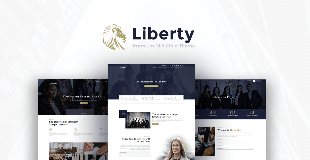
Liberty
This highly customizable, professional, and clean-looking Divi Child Theme is the ultimate theme for lawyers, attorneys, and legal services. It is mobile-optimized and responsive, so you know your attorney website will look beautiful on all types of displays. The theme features eye-catching hover effects in which you can showcase your case studies, galleries, practice areas, and so much more. It also comes with 30 custom-designed icons which you can easily integrate with your website.
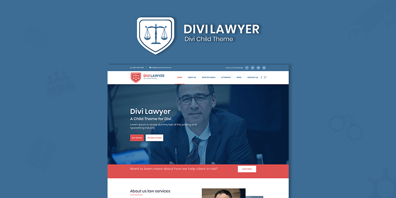
Divi Lawyer Child Theme
This theme can provide your law firm site with a modern design. You can easily install it with one click and you’ll have it up and running in no time. You will be choosing from its six professional modern design pages for lawyers. The lawyer theme includes a custom-designed testimonial slider, blurbs with hover effects, integration with Divi Overlays, Divi Bars, and Divi Mega Pro.
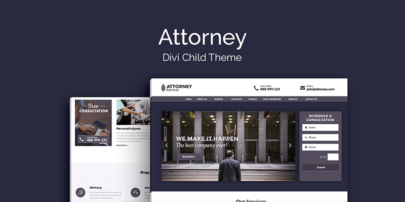
Attorney Theme
This premium theme is a great choice not just for lawyers or attorneys, but for advocates and legal organizations as well. You can start advertising your business and attract potential clients right away as this theme bypasses the hours you’ll spend in the web designing process. It features CTA and clicks to call buttons, custom consultation forms, high-quality professional design, contact page templates, a header slider, and more.
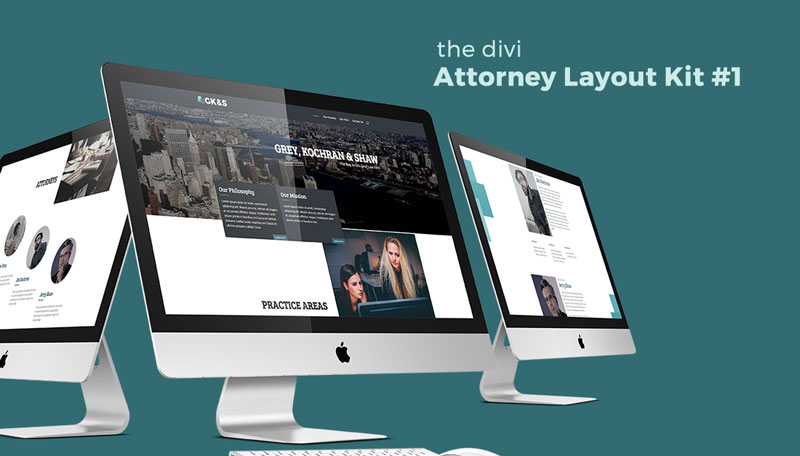
Attorney Layout Kit
This free Divi layout kit is specially designed for attorneys, law firms, agencies, and practices. You can customize it with just about anything you want to make it suitable for your firm. It includes four custom pages that can help get you started such as Home, Our Practice, Our Firm, and Contact.
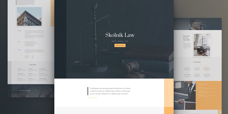
Law Firm Layout Pack For Divi
This free layout pack is a clever solution for promoting your practice online. It’s well-organized and comes with easily adaptable relevant content. Its pages are professional and clean with a horizontal margin that shifts on sections throughout to expose additional color blocks for a unique and subtle design touch. The theme also features images that are beautiful and will work well with any gradient overlay to match the brand of your business.
Designing the best lawyer website or overseeing its creation can be challenging and intimidating. However, you can avoid mistakes and pitfalls by following the law firm website strategic plan you have in place. Build an excellent website that will work great not just for your law practice but for yourself as well.
I know, this is a long post. But we want to cover every aspect as much as possible to help your law firm achieve success online. Don’t forget to share your thoughts by leaving a comment below!
Aileen Cuaresma
Aileen is a Technical and Creative writer with an extensive knowledge of WordPress and Shopify. She works with companies on building their brand and optimizing their website. She also runs a local travel agency with her family. On her free time, she loves reading books, exploring the unknown, playing with her two adorable dogs, and listening to K-pop.
Start Building your Legal Services Website with Liberty!
We have a sweet deal for you! We are offering a huge sale! You can get our latest Liberty Divi theme with a 20% discount! Use the coupon code LIBERTY20 at checkout!






Great article
Thanks
welcome Eric 🙂