Introducing the Best Color Combos for your Modern Websites
Colors on your website have a huge impact on your visitors. They invoke specific feelings and motivate the choices people make.
These days, jewel tones and bright colors are trendy. Muted shades and warm blues still remain trustworthy for almost any kind of website. To make things easier, you can draw inspiration from the following color schemes and level up your next design project.
So, let’s get started.
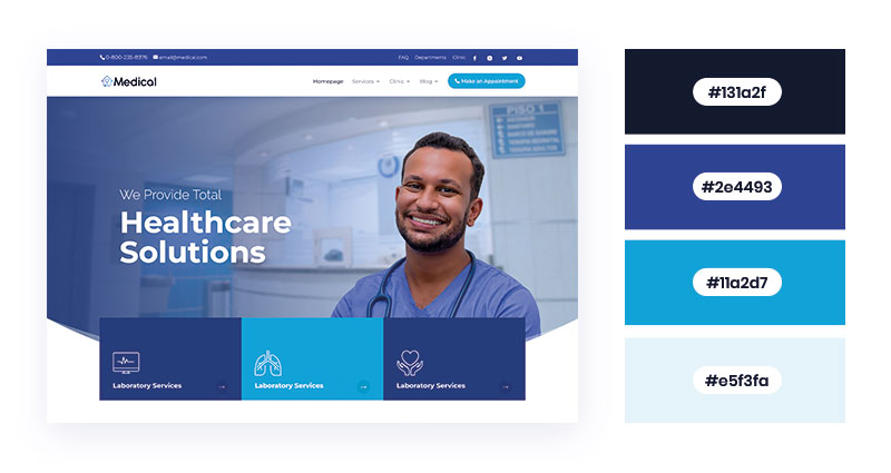
White Background, Blue Foreground
White-&-blue is a calming yet confident combination that gives a sense of cleanliness, completion, wholeness, impartiality, and hope. The white-blue color palette has been long associated with healthcare sites. But it’s also suitable for banking, finance, real estate, and other businesses that prioritize customers’ trust. You can use different shades of blue, and even incorporate some other complementing shades like green, black, and yellow.
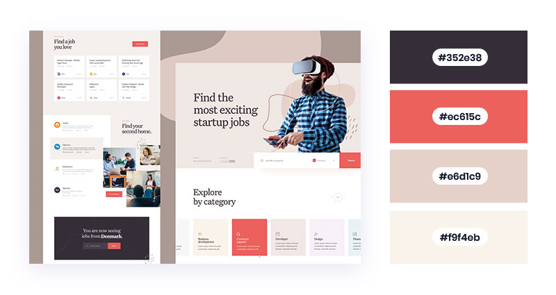
Dark Fossil and Dressy Rose
Grey, in general, implicates balance and neutrality. While Fossil grey has a pink undertone, Rose grey has a moderate red touch to it. These characteristics make them a perfect combination for practical domains. You can use these varieties for websites of restaurants, hotels, eCommerce, and hospitality businesses. You can also include them in tech-related websites or service pages.
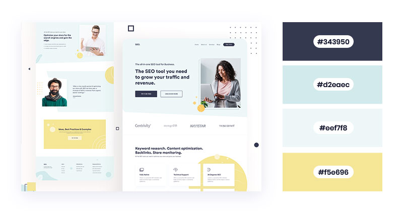
Embrace Minimalism with White & Aqua Blue
The combination of aqua blue and white is versatile, serene, and soothing to look at. The sporadic yellow sections along with aqua fronts in between amalgamate well together. This minimalist design practice is appropriate for any website with a modest approach. You can try this combination for online tools/service pages or pediatrician/healthcare websites.
Different Shades of Purple
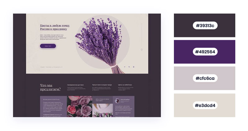
Purple symbolizes creativity, sophistication, and wisdom. In web designing, they are often used within graphic themes. The engaging and luxurious quality of purple ensures more people are drawn towards the website. Its versatile shades make an outstanding pick for websites providing premium quality services. It’s also great for personal websites, beauty product websites, landing pages, blogs, and e-commerce websites.
Soothe Your Eyes With Plain White and Pistachio Green
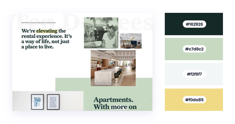
Pistachio green has a slight yellowish touch to standard green. The soft and muted shade implies prosperity and progressiveness, just as its mother shade. Besides nature and health, green is an appropriate shade for service industries. You can add this color scheme to websites offering rental services, cleaning services, gardening services, etc.
Burst of Muted Shades
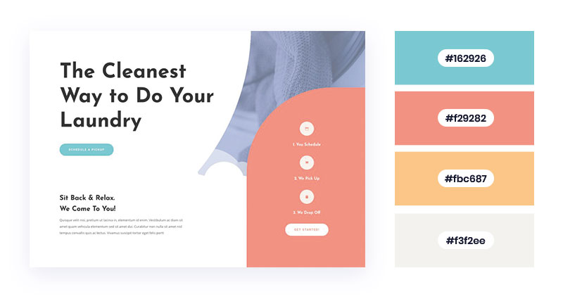
Muted shades are the colors of contemporary, modernization, and efficacy. They depict originality and innovation while rendering a serene look to the websites. You can use these shades for websites concerning the youth. Besides, you can try them for websites offering cleaning or laundry services, appliance stores, and pet care services.
The Humble Blue and Sophisticated White
Blue color implies confidence, professionalism, and intelligence. When blue is combined with white, it renders a crisp yet intellectual appearance to the website. You can use the iconic combination for websites providing technical assistance, tools, financial services, and other business. It is also suitable for medical centers and cruise services.
Balance Your White with Neutrals
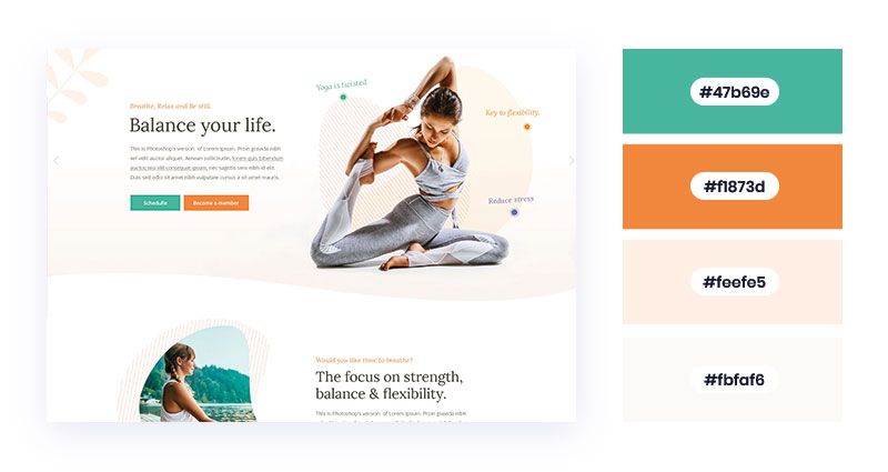
White and neutral shade signifies wholesomeness, peace, and reliability. It amalgamates well with occasional vivid hues like green and orange. Thus, it’s worth using this contrast for fitness and well-being websites. The colors also make an excellent choice for websites offering grooming services, dance classes, personal/official websites, and tutoring services.
The Classic Palette – Royal Navy and White
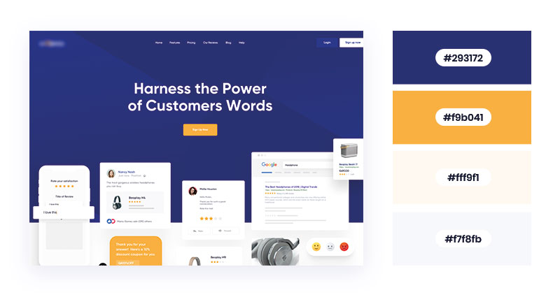
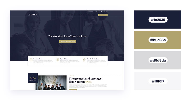
The fusion of navy blue and white depicts composure, elegance, and style. The blends of navy background and white frontal render an entrepreneur vibe. You can also include gold yellow within the CTAs and buttons to attract visitors. These shades will make a perfect website for businesses, companies, and agencies.
Bright Power of Green Tinted with Vibrant Hues
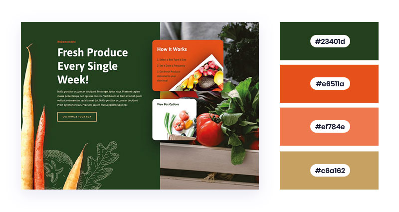
Green, when combined with colors like red, orange, and yellow, looks amazingly vibrant. Besides nature, green and other bright colors indicate the food industry also. Thus, you can incorporate these shades for websites offering food delivery services, grocery services, or online supermarkets. These colors are also appropriate for personal websites and blog pages.
The Iconic Yellow with Navy and White Frontals
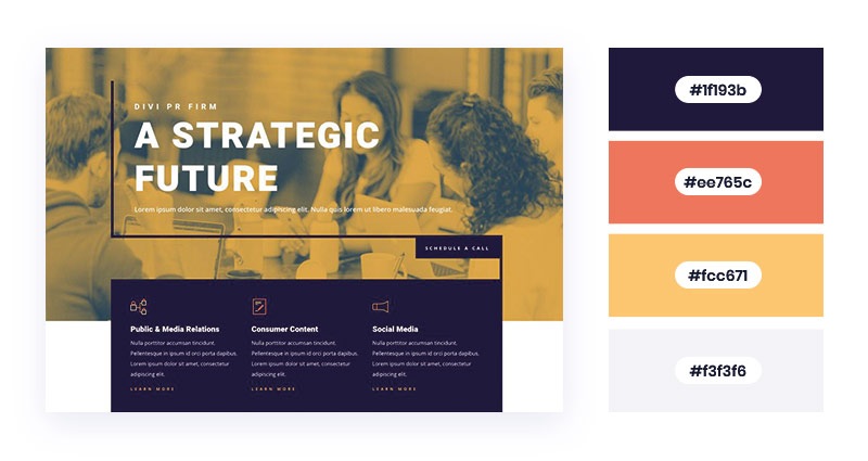
Yellow is the color of optimism, creativity, and enlightenment. Similarly, blue symbolizes serenity, inspiration, and stability. The blend of both with a hint of white makes a perfect combination for educational websites. You can use this color palette to design websites for institutions, coaching centers, colleges, and schools. Bright yellow and white is also a great fusion for fast-food chain websites (example: McDonald’s).
Merge the Subdues with Tortilla Brown
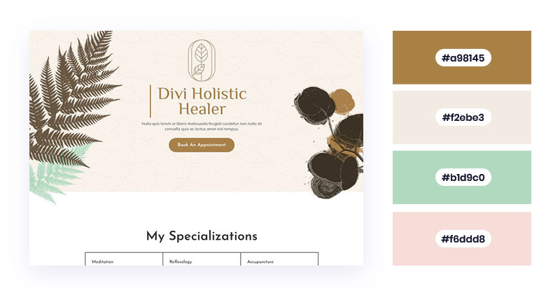
For websites, brown indicates stability, simplicity, and balance. Likewise, light subdues signify subtleness and purity. The wholesome and earthly amalgam is good for websites dealing in spa services, body massage services, and environmental-friendly products. You can also use this color scheme for organic skincare-specific pages, advertising websites, startup home pages, and NGOs.
50 Shades of Tranquil Green (with a Hint of Black)
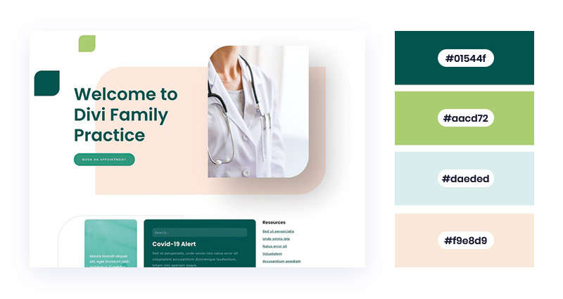
Green and black is a powerful fusion with an impactful approach. While green symbolizes freshness and prosperity, black signifies elegance and sophistication. The combination is popular among healthcare and medicines/drug selling websites. As green mirrors nature, you can add this contrast in websites of eco-friendly organizations. You can also include them in money and finance websites.
Relish the Mother Nature with Green and White
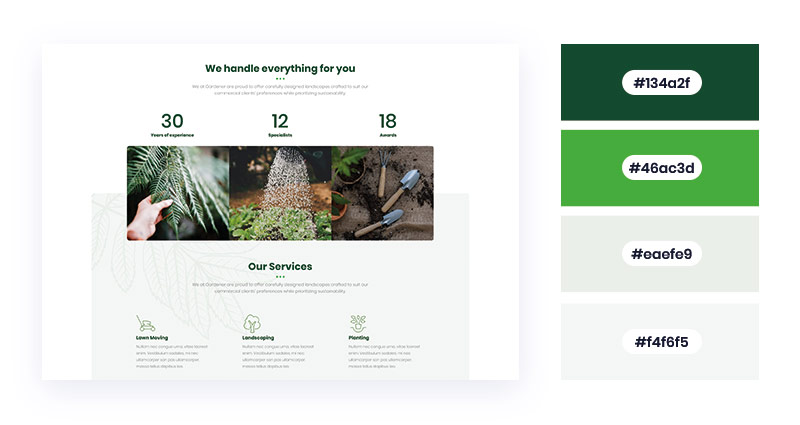
Green indicates freshness, harmony, and nature. Similarly, white signifies perfection and neutrality. Both these colors make a great addition for websites offering eco-friendly, scientific, healthcare, culinary, and tourism-specific services. It’s also appropriate for financial institutions and Non-governmental organizations. You can incorporate dark green open-source fonts and white backgrounds to make the layout even more pleasing.
The Tales of Cobalt Blue!
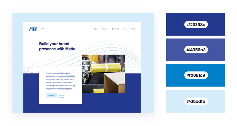
Blue is a universally-preferred color that implies trust, wisdom, and inspiration. Besides being a favorite color of designers’ and color palette generators, blue shades are present on almost every website (in some form). However, they are most common among websites offering tech-friendly services and tools. The iconic combination of blue and white is present in popular websites like Facebook and LinkedIn.
Blend the Light Blue with Lively Tangerine
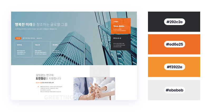
Darks shades with lively tangerine color signify creativity, vibrance, and reliability. Tangerine belongs to the orange family, which denotes cost-effectiveness and good customer service. Additionally, the hint of blue shows seriousness and power. Thus, you can use these colors for corporate companies’ websites, e-commerce websites, support pages, and product pages.
Hues of Grey with Harmonious Sea Green
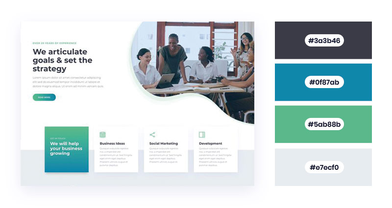
Grey is the color of balance and neutrality. Likewise, sea green implies freshness and serenity. It’s worth using these shades for websites of startups, advertising, trading/investing platforms, and service providers. If you have a website that renders business support, SEO services, or social marketing, this combination will make a great choice.
The Standard Achromic Shades with Occasional Brights
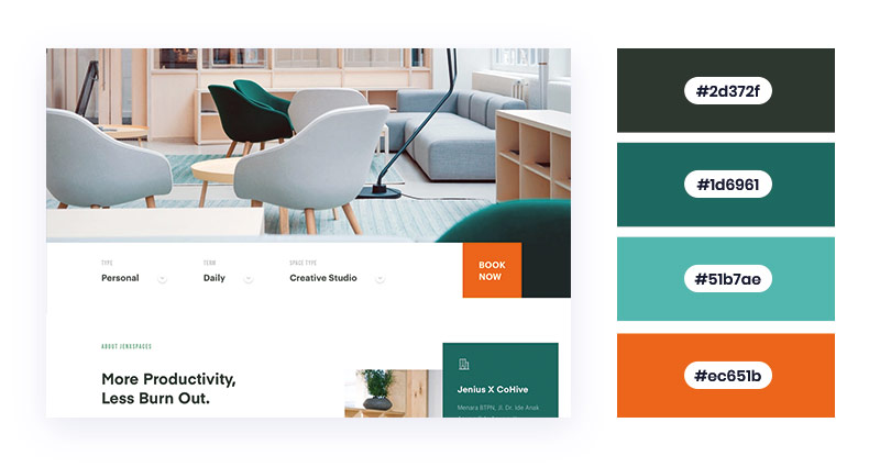
Achromic color like white fuses well with sporadic brights like green and orange. The enchanting white looks pleasant and basic in the background. Also, the dynamic shades are suitable for highlighting the important parts and CTAs. You can try this combination for websites selling furniture, home decor, canvas, or similar products.
Pink Punch with Warm White
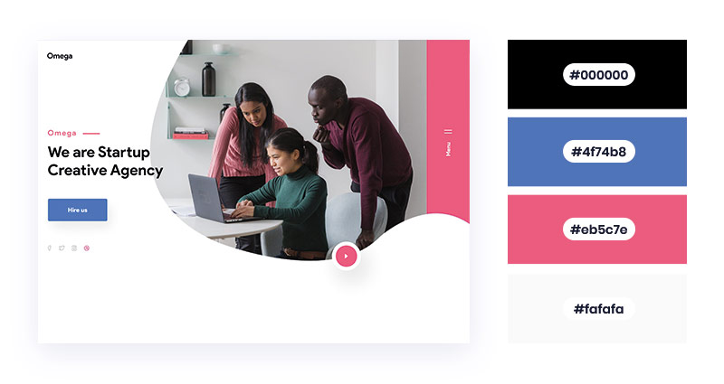
Pink Punch is beyond the versatility of the typical pink shade. Its occasional appearance renders a pure, mid-tone, and cheerful touch to the website layout. The addition of warm white makes the combination even more captivating. You can try this fusion for websites of startup agencies, fashion shops, or corporate bodies.
Lily White with a Hint of Cyan
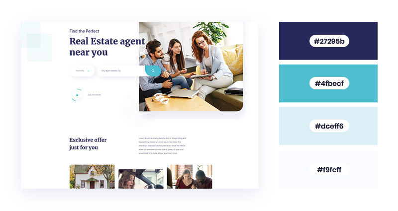
The composed fusion of white and cyan gives a positive, inspirational, and relaxing touch to the website. As these hues render a sophisticated look, you can engage your website visitors and earn sign-ups. You can fuse these palettes for websites providing real estate or sales-related services. They are also suitable for designing agency websites, informational pages, and services pages.
Classic Black and Ballerina Pink
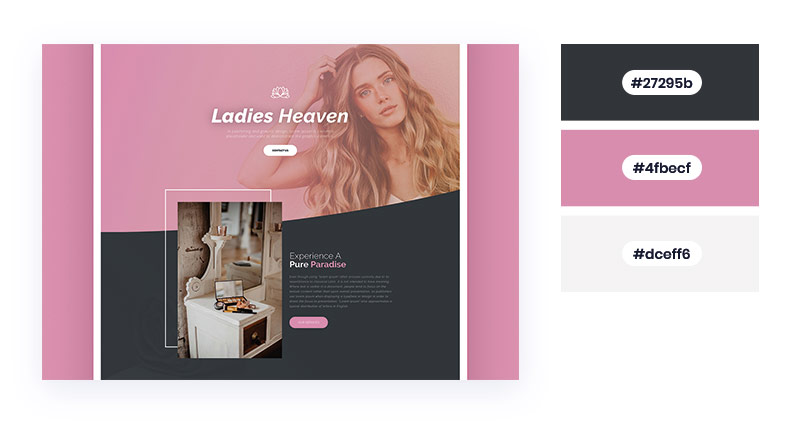
The iconic combination of black and pink implies elegance, poise, and charm. While pink justifies nurturing womanhood, black manifests a symbol of class. Both these shades are popular in the fashion industry. That’s why it’s worth using them for websites selling feminine products, cosmetics, and opulent clothing. The flawless fusion is also suitable for luxurious retailers.
Hopefully, the above inspirations ease your process to find the right color palette for your website. Choose colors that best reflect your brand personality.
Navkiran Dhaliwal
Navkiran is an experienced technical writer with 10+ years of industry experience. Her writing skills and technical knowledge may be confirmed by reputed clients all over the world.
Create beautiful blurbs with Divi Flip Cards
Let’s celebrate! We have a sweet deal for you! You can get the best flip box plugin for Divi with a 10% discount! Use the coupon code DFC10 at checkout!






Why not some color schemes for those running their browser in dark mode?
That’s a good idea. Some dark color schemes would be a great addition to this collection.