8 Top Examples Of Software & Technology Websites Built With Divi
Are you looking for some design and layout inspiration for your next project? The following are some of the best examples of software & technology websites created with the help of Divi. They are not only beautifully-made but have all the functionalities of what an exceptional website should have.
Divi is more than a WordPress theme. It comes with numerous features and an easy drag-and-drop builder that can take your website game whole new level. Any newbies or professional designers will surely enjoy this powerful site builder. Additionally, it will give you that power to build stunning designs for your software and technology website smoothly and efficiently.
Additionally, it’s a premium WordPress theme that’s not only flexible and versatile but comes with interactive functions as well. It offers a wide array of features that will surely benefit any software & tech site. It’s an excellent theme that a lot of tech-savvy individuals and web designers are utilizing today to create their websites.
RemindMe Care
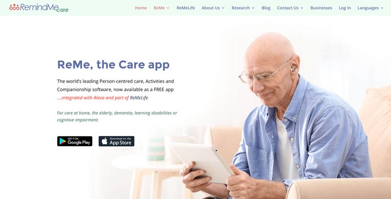
RemindMe Care is a website dedicated to its ReMe, the Care app. It’s a very informative Divi tech site, where you’ll find all the info you need about the app on the home page. Nonetheless, it doesn’t look and feel cluttered and loads pretty fast. The color scheme is also easy on the eyes.
The top of the page features a simple drop-down menu. The other pages also maintain this simplicity combined with nice images. Overall, it’s a pretty straightforward website that highlights the reasons why you need to get the app.
Workhub
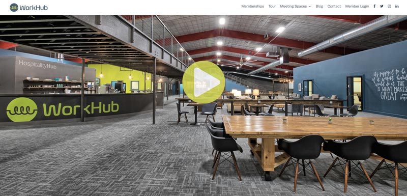
Workhub is a membership-based online working space for startups, small businesses, and freelancers. The software and technology site opens up with a full-width image with tagline and CTAs. The image itself will get your attention right away and will make you want to learn more about the company.
The top menu includes links, such as meeting places, membership login, and blog, that pop up in a new window. On the other hand, clicking memberships, contact, or tour, will direct you to its location on the home page.
The modern Divi website also features images with the play video button. At first glance, you’ll think that they’re actual videos, but upon clicking, it’ll open up to the link of the real video, which is brilliant.
Every element of this site is well-thought out, from its choice of fonts and colors to its layout. Even its footer design is beautiful, clean, and highly readable.
Assignar
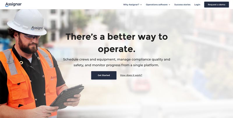
Assignar is a Divi site for a construction operations software. Its header showcases a full-screen image with CTA, information, and a link on how it works. A rating of the software follows it and another CTA for customer feedback.
The next section of the page contains the feature of the software with client testimonials and more CTAs. Afterwards, you’ll see a list of contractors the company is working with, and then a form if you want to request a demo of Assignar.
The great thing about this site is how it guides clients on the next steps they should take. It also makes excellent use of white space in all the right places.
Starfish Reviews
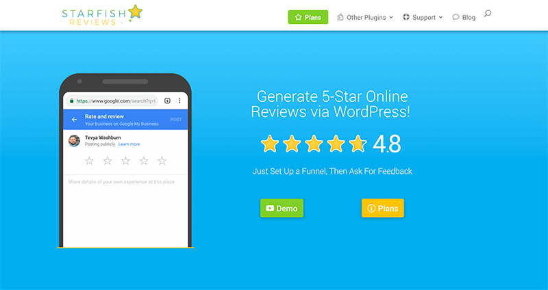
Starfish Reviews is a WordPress plugin that can help your products or services generate reviews. The entire site is colorful but not overwhelming. And immediately, you’ll know that it’s a fun and lively one.
Upon landing on this software and technology Divi website, you’ll be greeted by a full-screen header that features a couple of animations and CTAs. Following this are sections utilizing the power of Divi blurbs. Each section is divided using a layout that has a wave-like pattern, with colors alternating from white to bright.
You won’t have trouble finding any information about the plugin as everything is laid on the main page, including price plans. CTAs are also strategically placed throughout the site. And if you miss anything, just head on to its helpful footer, where you can find links to popular content, company information, and social media.
Design Leadership
Design Leadership is a design community that brings the best design leaders across the globe to share and learn together. And you’ll surely get a sense of this just by looking at their stunning website.
The contemporary tech site utilizes a full-screen background image with a description of what the community is all about, as well as a CTA to join them.
Scrolling down reveals an impressive list of companies that have participated in their events. You will then be given a sneak peek of their summits and social gatherings. This section uses alternating images and text explaining what you can expect from these events. The website makes great use of both colors and Divi font combination. It also has a very unique and fresh design.
OnPointe Risk Analyzer
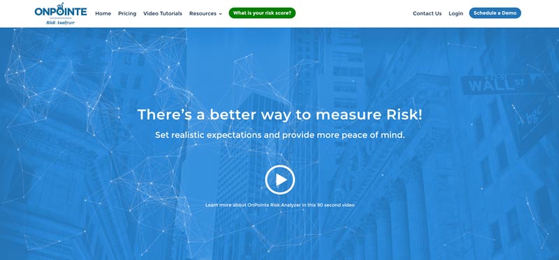
The Divi website of the toolbox software, OnPointe Risk Analyzer looks very professional, down to its font pairing and color palette. One of the most interesting elements of this software site is its header, which features a subtle yet mesmerizing animation. It also has information about the service and YouTube video link in an overlay. When you click on this, the video will pop-up explaining the product further. And aside from essential links, the main menu includes a CTA button as well.
If you prefer to read, simply scroll down and you’ll find details about the toolbox, including its features. The section after this shows client testimonials. It is then followed by a CTA for scheduling a demo. The layout of the other pages is also professionally made and minimalistic.
Airglow
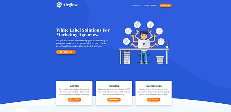
Airglow is a white label solution that can help marketing agencies and marketers grow their services. Its website is a standout right away, thanks to its full-screen blue background with a cool cartoon image. It also includes information and a CTA to get started.
Next to this is a set of simple Divi blurbs about the industry they serve and CTAs as well. It is then followed by a list of their services with their rocket logo in the middle. The next section briefly explains what makes the company different from its competitors, how they work, and the benefits of choosing their business. Its last part is a massive footer with their offer and a link to book consultation.
This a good example of a one-page site where all information is packed in a single page, but still manages to load pretty fast.
Ropeye
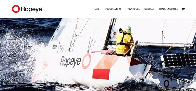
The contemporary website of Ropeye may be minimal, but it’s definitely attention-getting. First, it uses a pretty cool, action-packed animated header. It also contains the company’s tagline, which appears word for word with each transition. Secondly, the images are vibrant and high-quality.
The content of its home page is also minimal. It contains a photo of a yacht with lines directing to the part where you can use their products. Below you’ll find a CTA button that will direct you to a list of all their offerings.
Everything about the site is minimalistic and clean. The product/shop page is also simple. It only contains a brief description of the item and an add to cart button. Likewise, it has a link where you can download the product sheet if you want more detailed info.
These are some of the best examples of software and technology websites built with Divi. We hope these motivate you to kickstart your next project today. Let us know what you think, and if you spot an awesome Divi site or two, share them by leaving a comment below.
Aileen Cuaresma
Aileen is a Technical and Creative writer with an extensive knowledge of WordPress and Shopify. She works with companies on building their brand and optimizing their website. She also runs a local travel agency with her family. On her free time, she loves reading books, exploring the unknown, playing with her two adorable dogs, and listening to K-pop.
Get Divi Icons PRO today!
We have a sweet deal for you! You can get the best icon plugin for Divi with a 10% discount! Use the coupon code DIVIICONS10 at checkout!






Hi Folks! Regarding to your last blog post about tech & soft & web design agency webiste built with DIVI, We will appreciate if you check our new company homepage https://studionine.pl . Thanks in advance and greetings from Poland 😉
Hi Pablito will do and you’re welcome thank you 🙂
https://www.satismeter.com/ also uses the Divi Theme 🙂
Thanks a bunch, Thanks a million. Keep it up!