Watch Out For These 12 Hottest Web Design Trends For 2020
This is the year that designers will be more adventurous with their designs while giving previous styles a new twist. It will also be about experimenting with new and diverse techniques. Popular styles are also here to stay, such as gradients, bold fonts, bold colours, and asymmetrical layouts.
Web design trends 2020 is going to be an exciting blend of the growing technology and graphic design’s visual side. But whatever change this year brings, your list should always be about enhancing user experience.
So without further ado, here are the top web design trends you need to watch out in 2020. Not only will these provide you with a clear and clutter-free website, but your visuals and content will be rich as well. Likewise, it’ll ensure that your site looks stunning and stay current.
Oversized Type and Elements
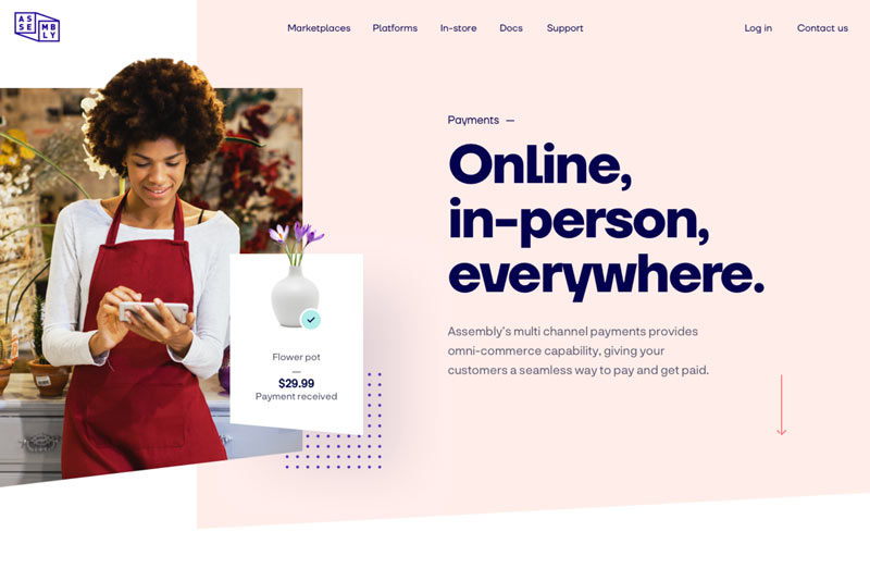
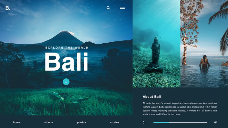
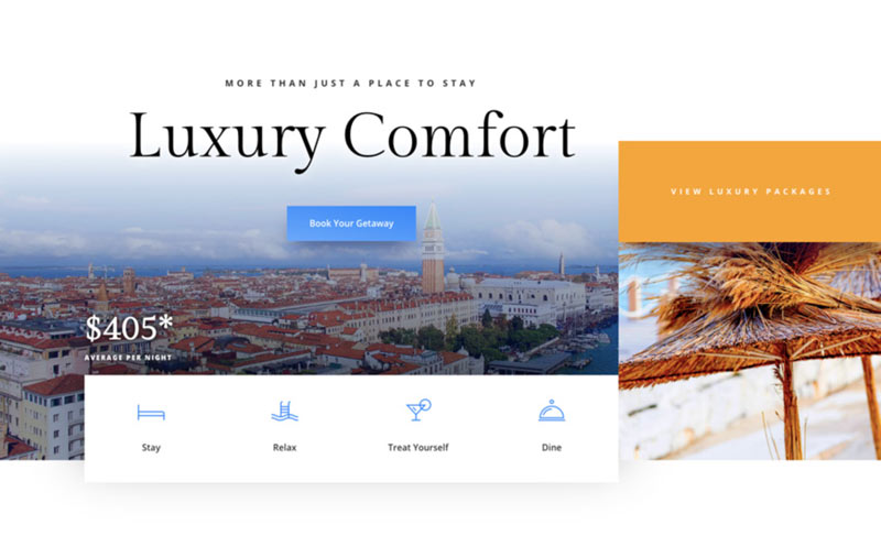
It’s easier to communicate your message clearly and directly striking and large elements. You can apply this degree in design to almost everything on your page, including fullscreen videos and images and big, bold fonts. You can even make the menu icons of your site oversized.
Enlarging these elements will catch the attention of your visitors right away. As a result, it’ll help them understand what your website is all about from the get-go. But to make this trend work well, the design elements on your every page must be kept at a minimum. Remember that implementing too much of these on a single page can overwhelm your audience, leading to counterproductive.
One layout you can consider is pairing large typography with a fullscreen video or image. Doing so will make your message clear and effective. It will also ensure that you’re only delivering vital information that truly resonates and register with your target audience.
Assembly Payments by Filip Justić
Bali Web UI by Zoltán Czékmány
Resort Layout Pack by Elegant Themes
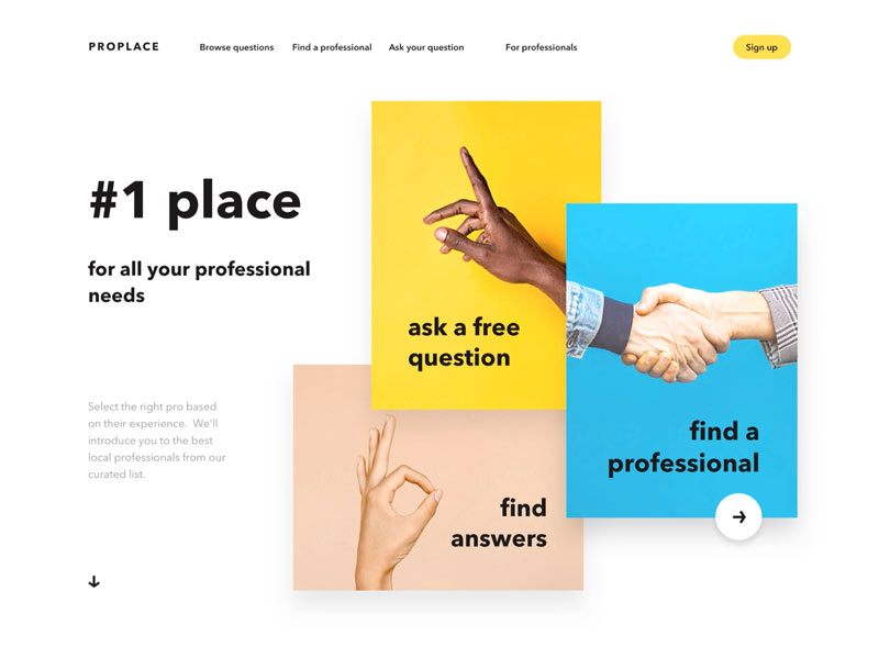
Solid Color Blocks
Thinking of splitting your page content into more components? You can do so with solid block colors. This will result in a unique array of rectangles and squares in various sizes and divided by color. Moreover, the design can show numerous messages at the same time, while maintaining an orderly style.
By placing several short lines of text or photo in every section, your readers will find it easier to understand these little pieces of information. Plus, if you want to make it even more interesting, colour the shapes in different shades in line with the theme of your site.
The trend is all about showcasing a set of elements in a layout that looks visually stunning. Nonetheless, make sure that the result will not seem like a random collage. The key here is ensuring that your colour blocks are cohesive and has a uniform composition. You want your entire design to still be intuitive and easy to follow. So you must align your colour blocks neatly to one another. Also, make sure that the images you’ll use complement each other.
Color blocks website concept by Lena Zaytseva
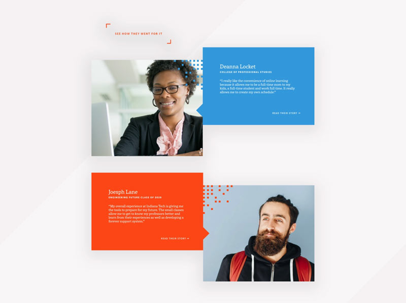
Student Testimonial Blocks by Litzy
Motion and Interactivity
We all know that anything that moves is engaging and will spark the interest of your site visitors. Human eyes are instantly drawn to moving elements, such as animations and videos. And so you can utilize this fact to control how your audience perceives your webpage.
The motion comes in different forms in terms of web design. There are fullscreen video headers, micro-animations, and even texts that move across your screen. You can make this web design trend 2020 work for your site, by thinking of which areas of it you want your visitors to focus more. However, not using motion correctly can be more of a distraction. So when you use it, make sure to place it in strategic areas that can aid the storytelling of your website.
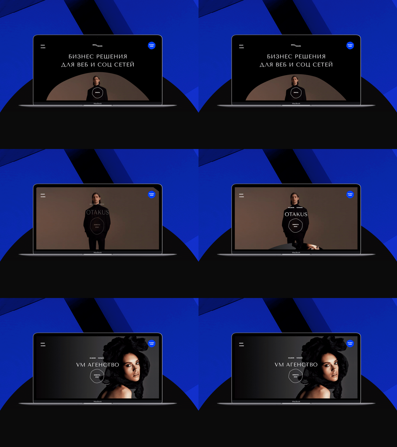
Breemark agency by Diana Kaganskaya
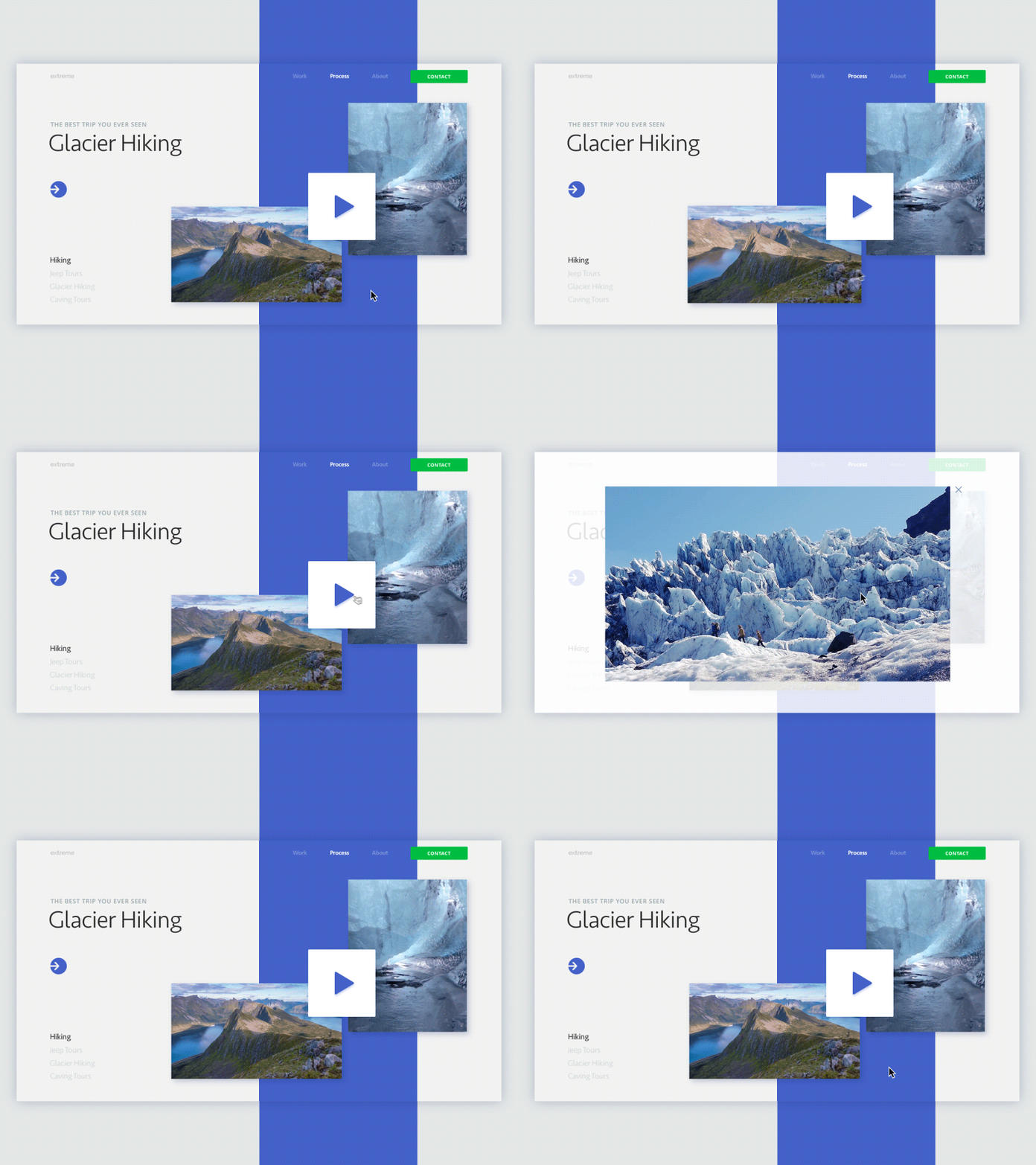
Website for an Extreme Travel Agency by Igor Pavlinski
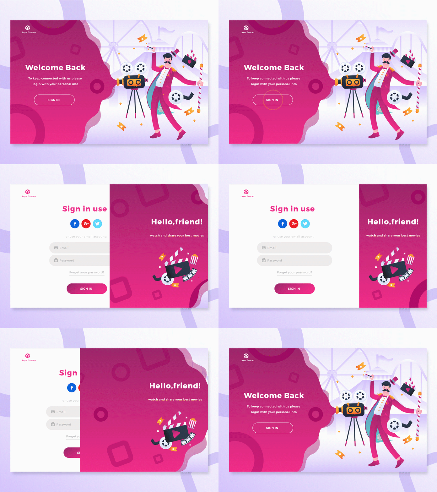
Login Page Illustration Exploration by Aliffajar
Tailored Illustrations
You’ll never run out of visual tools when you want your site to deliver a compelling story. Today, visuals are not only there to simply give color to your pages. You can use them to support the message you want to convey and to create a brand identity.
Certainly, placing an illustration in the right place can make a massive difference. For example, a musician’s site with plenty of artistic images sends out a different message in comparison to a spa website with zen-inspired visuals.
To build a consistent visual language that expresses the vision of your brand, make sure to take time when considering the illustrations you’ll use. Likewise, you may want to browse through these high-quality free stock photos where you can find images suitable to the specific needs of your brand.
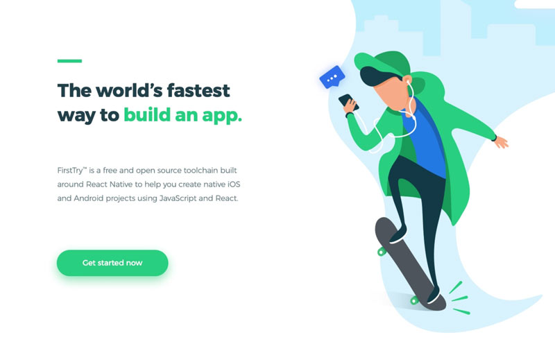
Effortless — hero illustration by Adrian Przetocki
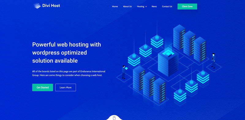
Divi Host by Divi Life
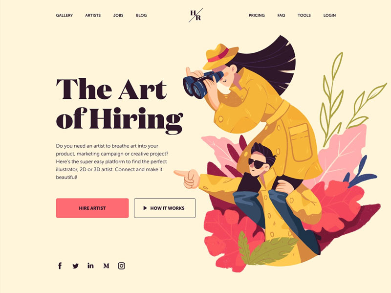
Hiring Artists Website Design by tubik
Asymmetric Layouts
A lot of websites these days utilize grids. Most web designers are obsessing about orderly fields and playing safe, which can be a bit dull. Don’t get me wrong, making your pages organized is a good thing. Nevertheless, in 2020, asymmetrical structures will receive adoptions leaning more towards brutalism and individuality. It will also be about creating fun and exciting unbalance.
Broken-grid compositions are particularly popular with personal websites. The reason for this is because of how unique they look combined with resolute assertiveness. However, you need to be careful with this trend, especially if you have massive amounts of live content. Using this style may lead to a not-so-positive web experience for your readers. So if you want to keep your audience happy, consider changing to more suitable yet personable web design.
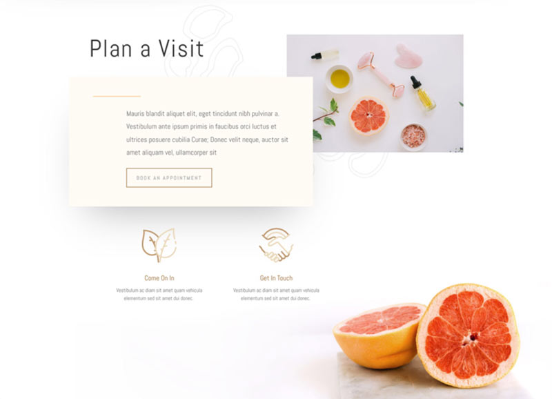
Massage Therapy Layout by Elegant Themes
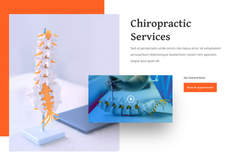
Chiropractic Layout by Elegant Themes
Soft Shadows, Layers, and Floating Elements
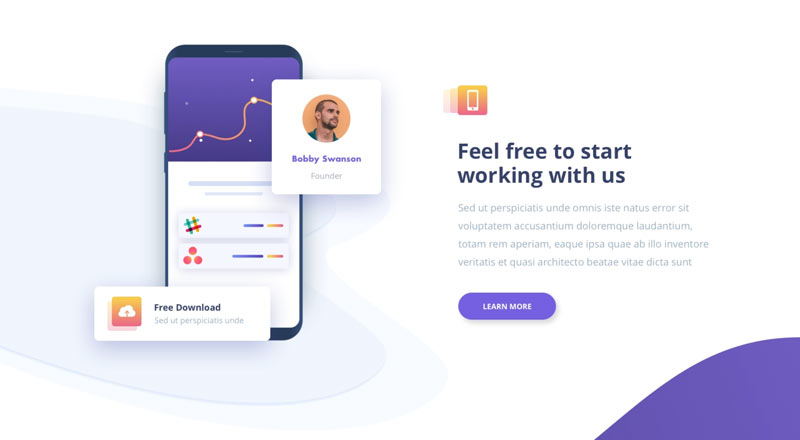
Depth plays a major role in this trend, which creates a pseudo-3D effect. As a result, your design will look more interesting and layered. Moreover, using soft shadows can help tone down the 3D effect. Combining these design elements can offer depth and interest to your website. And you’ll be able to achieve that 3D Lite look effortlessly as well.
Aside from graphics, you can also use it with your images and texts. And if you want to make your 2D layouts more appealing, layer soft drop shadows and layering elements. This effect will extend the depth of your layout and give it a lightweight feel. It will make it seem like the elements are floating over one another.
Treant – Homepage by Afterglow
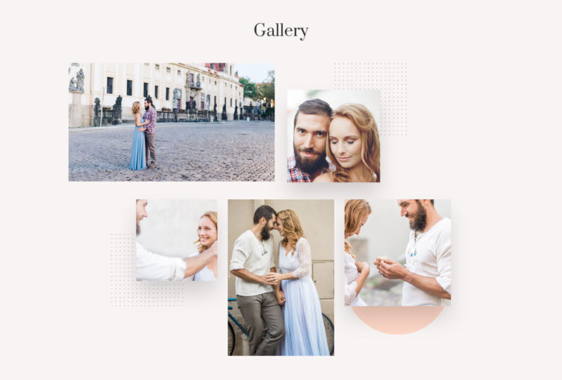
Wedding Engagement Layout by Elegant Themes
Bold Colors
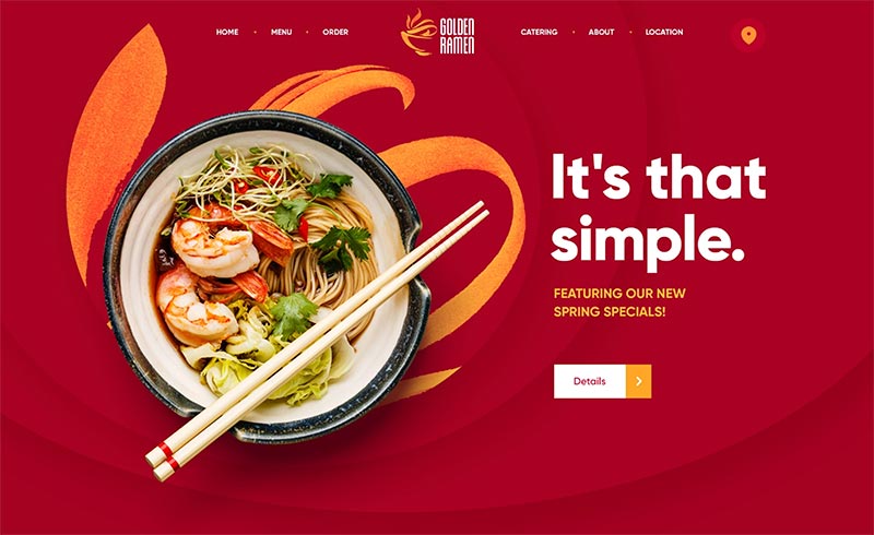
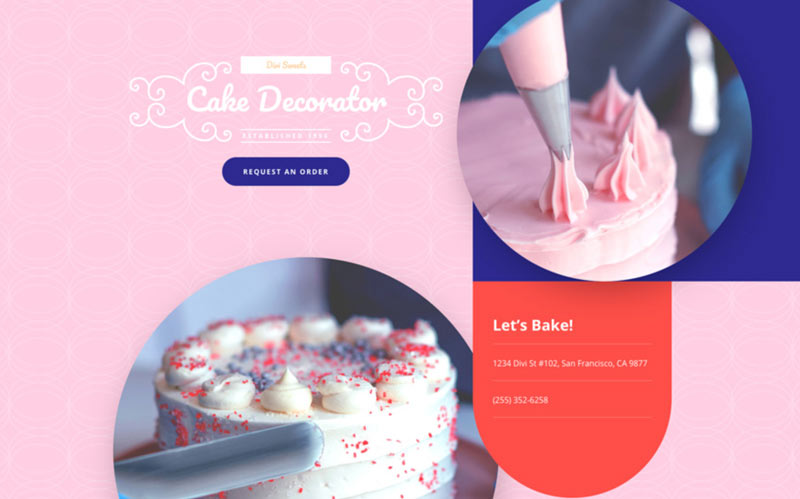
One of the biggest web design trends in 2020 is bold colours. Likewise, minimalism will have a role in this. Utilizing bold, vivid, and saturated colours can help make your brand shine. It will stand out from many companies that opted to use soft neutrals in the previous years. But make sure to use colour combinations that will not overwhelm the eyes of your visitors. Additionally, when choosing colours, keep in mind that it’s an extension of your brand.
Golden Ramen by Mike | Creative Mints
Cake Maker Layout Pack by Elegant Themes
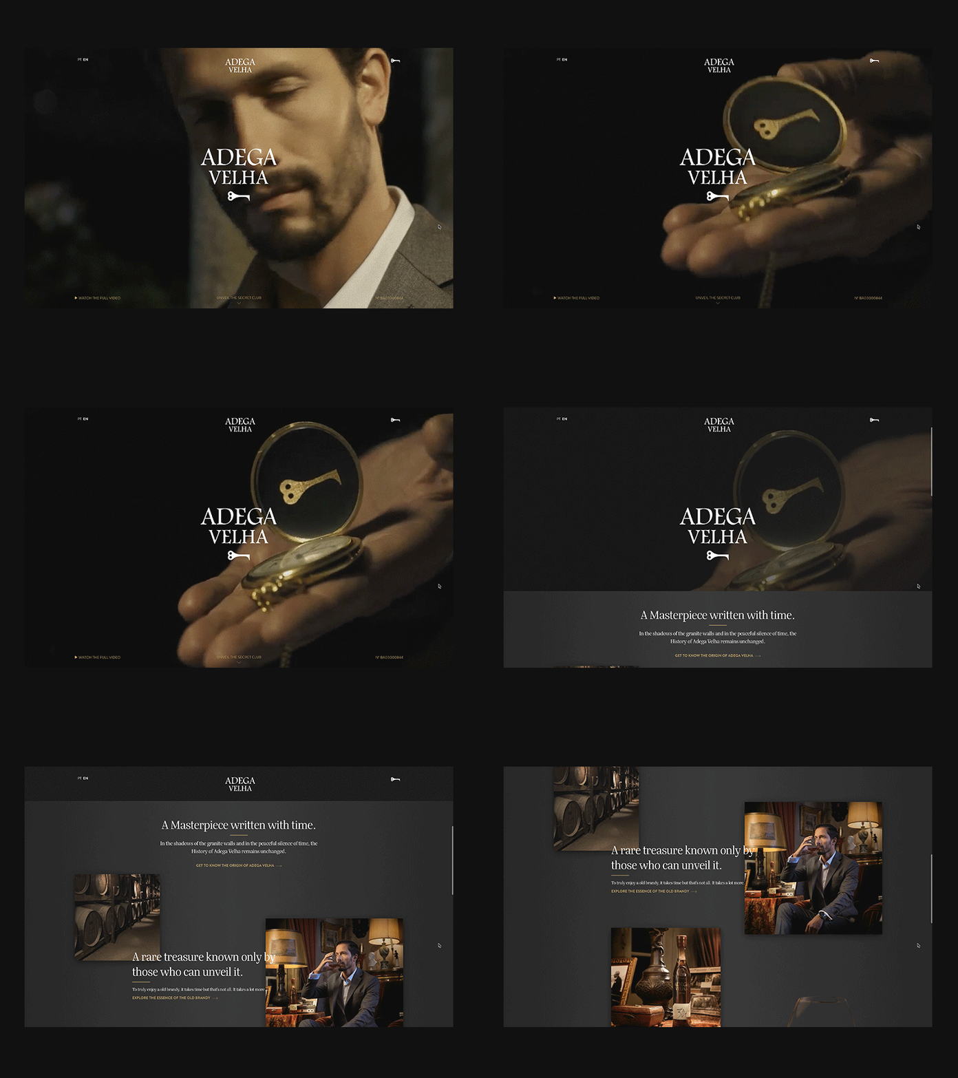
Dark Mode Design
From colorful minimalism to dark mode design, web design trends 2020 offers something for everyone. This trend is a hot topic, and we’ve seen discussions about its pros and cons almost everywhere.
Opting for dark mode can bring out your content, making it easier on the eyes. It’s actually a pretty excellent alternative for giving your visitors more pleasant user experience.
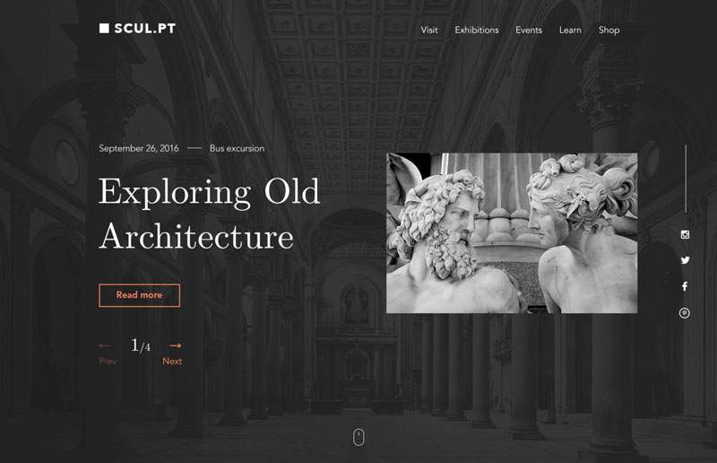
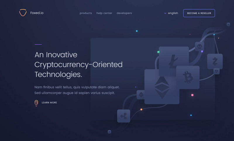
In 2019, big social media companies, such as Facebook, Instagram, and Pinterest, have jumped on board and made it mainstream. Furthermore, this web design offers a lot of functional benefits. These include increasing the battery life or your audience since it works well in low-light settings. So it’s going to be quite interesting how designers will utilize its powers this year.
Sculpture gallery concept by Valeria Rimkevich
Ladning Page by uixNinja
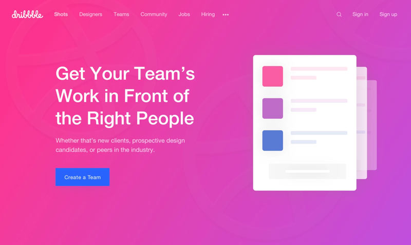
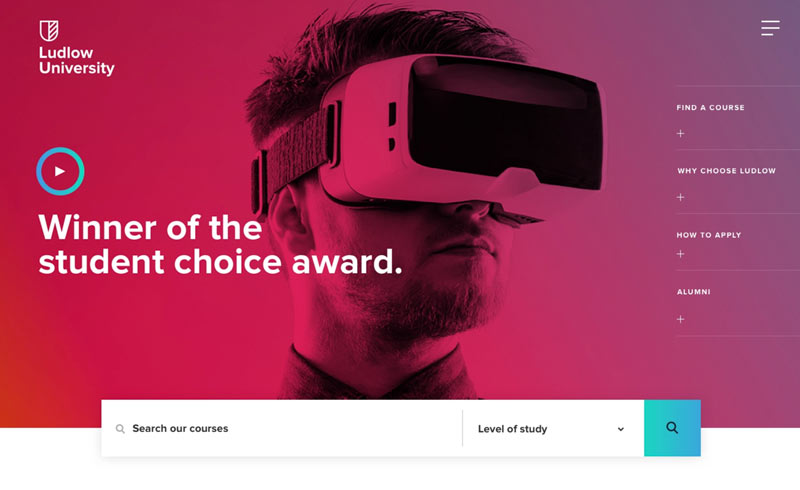
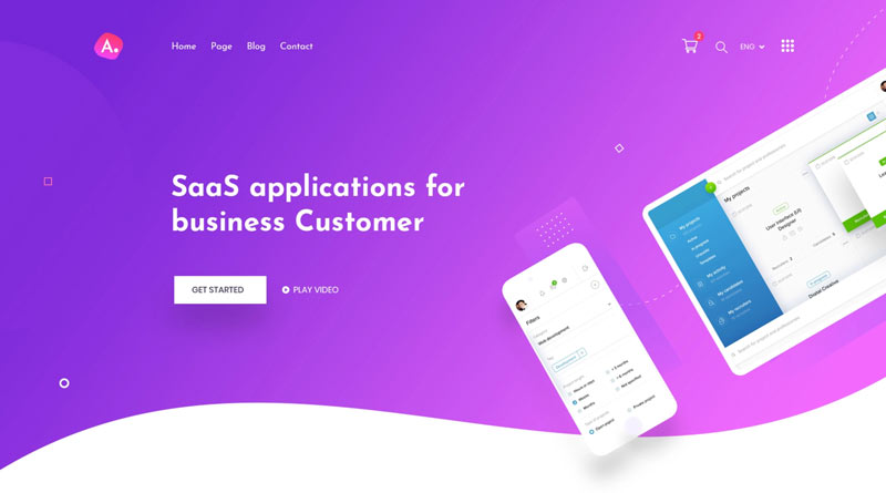
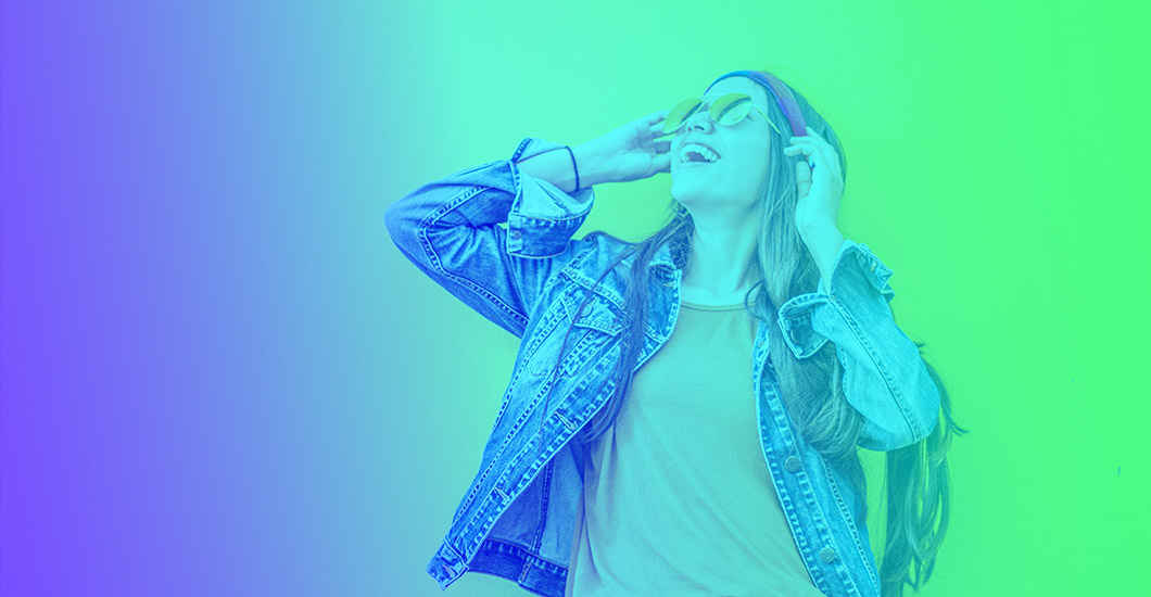
Gradients 2.0
Making another strong comeback this year is gradients. Throughout the years, we’ve seen ultra minimalism dominating product design. Web designers did everything they can to reduce the majority of their visual elements. They only place functional elements, key content, and other essential items on their pages. Also, they use excessive white space, which leaves users browsing sites with almost no colours. Even all interfaces look the same.
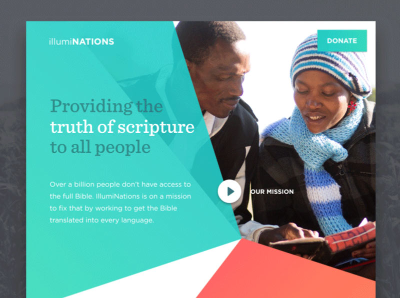
As users find these designs boring, designers began to explore different visual styles. And one specific style that made its way back in the spotlight is gradients. As we bid flat colours goodbye in 2018 and 2019, we welcome some depth in flat layouts with the help of this trend. Not only can it make your designs more appealing visually, but you can use it to build your brand.
Dribbble Team Page Redesign by Ashfak Ahmed Sayem
University Homepage by Chris Davis
SaaS Landing Page by Mahfuz Riad
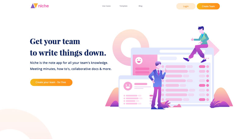
Geometric Shapes
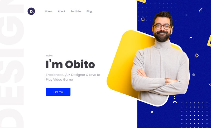
If you want a simple yet compelling asset to add to your site, then this is the perfect 2020 web design trend for you. Geometric shapes enable you to create more interesting visual components.
Although they are usually utilized to make visual dividers among sections, there are fascinating ways on which you can apply them. A lot of product teams utilize geometric objects to convey a certain feel on their site. If you want to give your layout a futuristic touch, use soft geometric shapes.
The trend also works nicely with some of the design trends on this list, including bold fonts and gradients. If you want to include geometric objects in your web design, nature is a great inspiration for finding the perfect shapes.
Niche Homepage by Nugraha Jati Utama
Personal Portfolio by Arifur Rahman Tushar
Bold Fonts
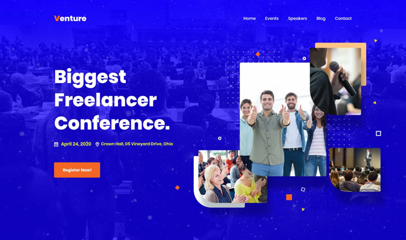
Most major companies use large bold fonts on their websites. The reason for this? Well, heavy typography can give your message more visual weight. It can also help direct your audience where you want them to focus first. In terms of aesthetics, bold typefaces also offer a contemporary and modern feel to any design.
Aside from improving readability, it’s also excellent for creating visual hierarchy and contrast. However, it’s crucial to keep in mind not to overuse this design component. The last thing you want is to overwhelm your readers. Ideally, it’s best to use it on your headers, subheaders, and short texts. And if you want to create more impact, use them in contrast with a neutral background.
Likewise, when choosing fonts, opt for simple ones, and use the power of font psychology. Readability should also be your main priority. Sans Serif typefaces are highly recommended because of their scalability.
Conference Landing Page by Arifur Rahman Tushar
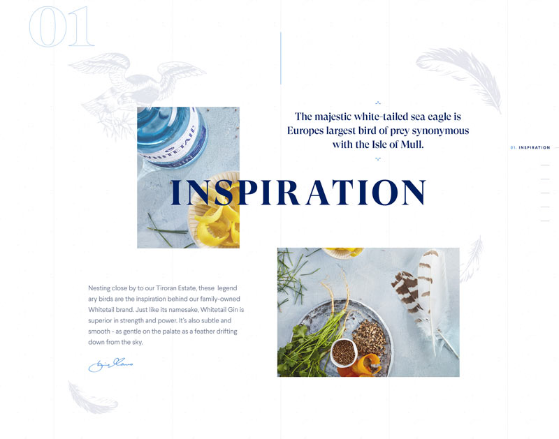
Gin Website by Louis Saville
Hero Video Headers
Image is one of the most vital components of your visual design. The reason for this is because it can help you deliver the main concept instantly. Videos can provide your site visitors with a more dynamic and live experience.
Before, when designers want to convey their ideas, they have to utilize static imagery. But thanks to today’s fast internet connections, you can provide your users with immersive movie-style experiences.
For your hero section, you can employ various video clips, which can range from a full-length preview clip with audio to a few seconds of looping video. This trend has the power to engage your audience. Usually, they’re also more than willing to stay on your page to watch these clips. That’s why in 2019, plenty of websites started using short video clips on their home pages. And we’ll continue to see this in 2020.
Header Video Interaction by Autumn Mariano
Homepage Hero Transition by João Torres
Aileen Cuaresma
Aileen is a Technical and Creative writer with an extensive knowledge of WordPress and Shopify. She works with companies on building their brand and optimizing their website. She also runs a local travel agency with her family. On her free time, she loves reading books, exploring the unknown, playing with her two adorable dogs, and listening to K-pop.
Use coupon code SLIDER15 at checkout!




Love this! Simple designs but beautiful!
Thank you so much for the update. I’m struggling to find an idea for my portfolio website https://qamaramin.com . Can you please suggest me some design trends for personal portfolio website?
Great article, lots of accurate stuff here that I’ve been noticing as well.
Glad you find it helpful thank you
Thank you. All ideas are great, and look like some of them follow the simple style reducing details and focusing on juicy info. Very nice list.
Hi Alden! Thanks…sometimes it’s those simple things that we tend to overlook that can make the biggest difference 🙂
I’ve found this information very helpful as many people can get help from your blog. I really appreciate your research and blog. Waiting for your next posting.
Really Useful article but can you update to 2021 ? I think you forgot to add the 3D illustrations
Hi Quamar 🙂 We have already published an article with web design trends for 2021 and I think you have missed it 🙂 Please check here – https://www.b3multimedia.ie/web-design-trends-2021/
I loved your blog and thanks for publishing this!! I am really happy to come across this exceptionally well written content. Thanks for sharing and look for more in future!!