Landscaper: A Free Divi Layout
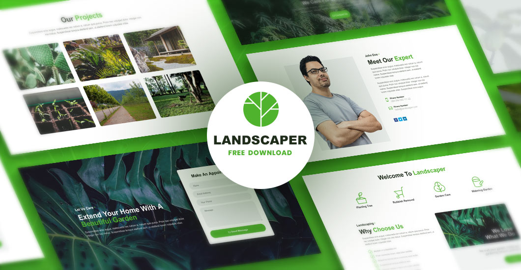
Landscaper layout is available for free and has been built for landscaping, gardeners, florists, groundskeepers and any other companies that offer related services. It can be of course easily customized and used for other businesses too. It will help you get your website up and running in no time!
Make a quick start to your next project
The Landscaper Layout is made to match any services website you might have in the pipeline. This layout has a page structure that’ll help you display the most crucial information about business and it will encourage visitors to get in contact with you using the contact form placed in the hero image.
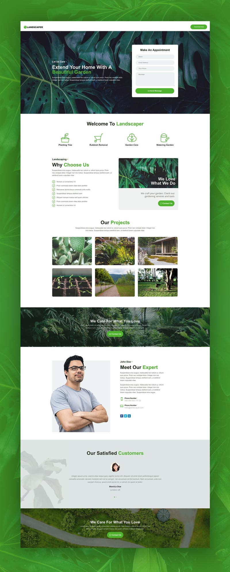
The Landscaper Layout is 100% responsive and has a clean and modern design. This layout comes with 8 custom designed sections. Each section has been well thought-out and carefully crafted with the latest web design trends in mind. It is not a complete website but rather gives a rough idea of the design. All sections and modules can be easily copied and used to build other pages.
Note: We have added the Code module with all custom CSS to this layout. You can find it on the very bottom. If you would like to use only specific sections on other pages, then it is recommended to add this all custom CSS to Divi/Theme Options/Custom CSS or style.css if you are using the child theme.
Requirements: The Landscaper layout requires that you have the Divi parent theme for WordPress installed. It is not included with this product.
What’s inside
- landscaper-divi-layout.json – this is a full Landscaper Layout that you can import to your Divi Library and use on your page.
Subscribe to download for free!
Installing Landscaper Layout
After Author layout pack is downloaded, you can add it to your Divi Library by following these steps:
1. Go to Divi → Divi Library → Import & Export → Import → Select the landscaper-master.json file
2. Create a new page and activate the Divi Builder
3. Click Load From Library→ Add From Library→ Landscaper Divi Layout – Full Layout
Getting Started
The Landscaper Divi layout comes with 8 custom designed sections that guarantee a great user experience. We have used the latest design principles, so that you can be sure that your visitors are going to love it! Each section/module has an attractive design and an intuitive layout.
Hero Image with Contact Form
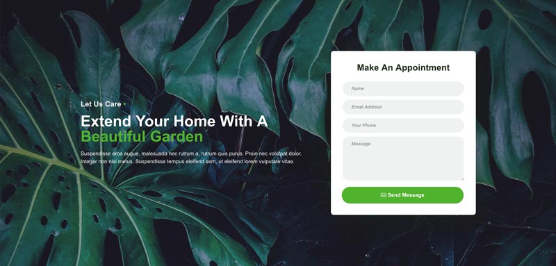
The Hero Section of this layout is clean and simple. We have used a nice background image with blending mode enabled. This section has 2 columns. In the first column we have a subheading, an eye-catching heading and description text. In the right column we have a nicely styled form that can be used for appointments, enquires and simple messages.
Icons Section
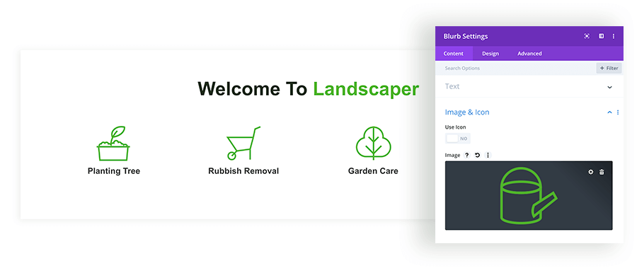
In the 2nd section we have a bold heading with 4 icons which can be used for displaying core services. We can easily change the number of columns or add more rows with more icons. We have used the Blurb module for displaying each service and custom icons which can be easily replaced with your own images.
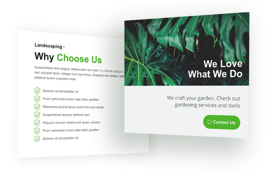
Why Choose Us with Contact Box
In this section we have 2 columns with a beautiful CTA box. On the left we can add a subheading, heading, description and multiple blurbs with icons suitable for displaying any features or advantages of using our services. In the right column we have a nicely styled Call-To-Action box where we can add an image,a text and a button.
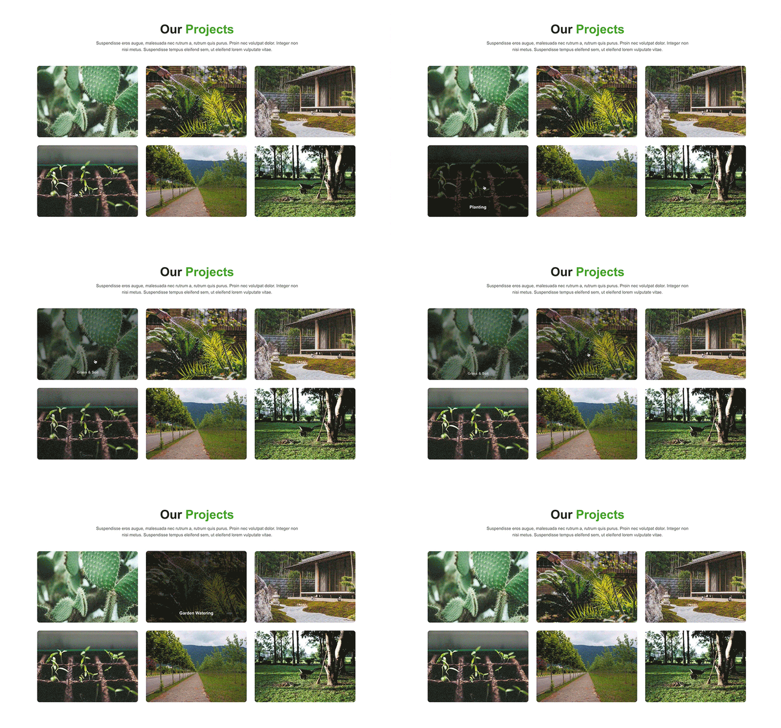
Portfolio
The Portfolio section is a very important part of all websites that offer services. In this section we can showcase our recent and previous works. In the Landscaper layout we have styled the default Divi Portfolio module, so it has a nice hover effect. When we mouseover, images get zoomed in and the title text shows up.
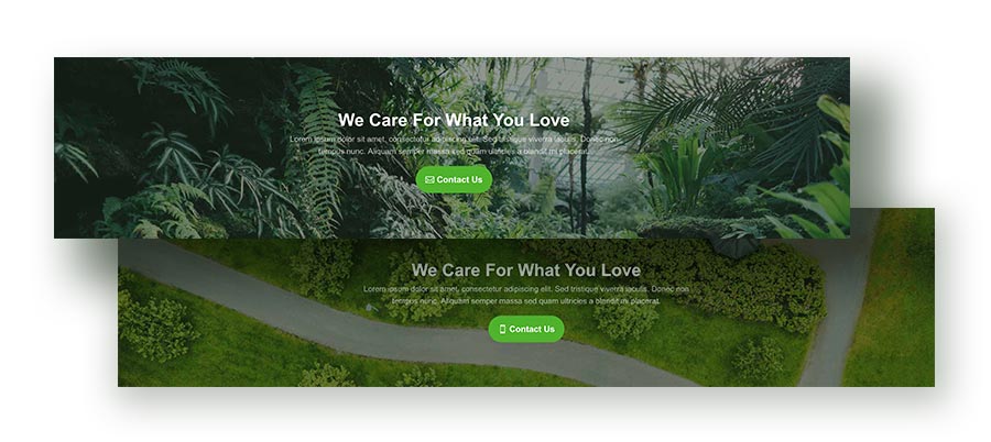
CTA Section
This layout comes with 2 CTA sections. One can be found just below the portfolio, and 2nd is placed at the very bottom of page. We can easily edit all texts and add our own background images.
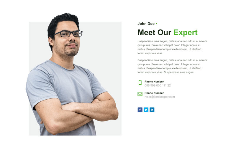
About Me
About Me section is designed to show a profile picture, description and contact details so users can easily connect by phone, email or social media networks. In the left column we have used a profile image with a transparent background and negative margins, so the shape of the man goes out of the column which has a grey background.
Testimonials Section
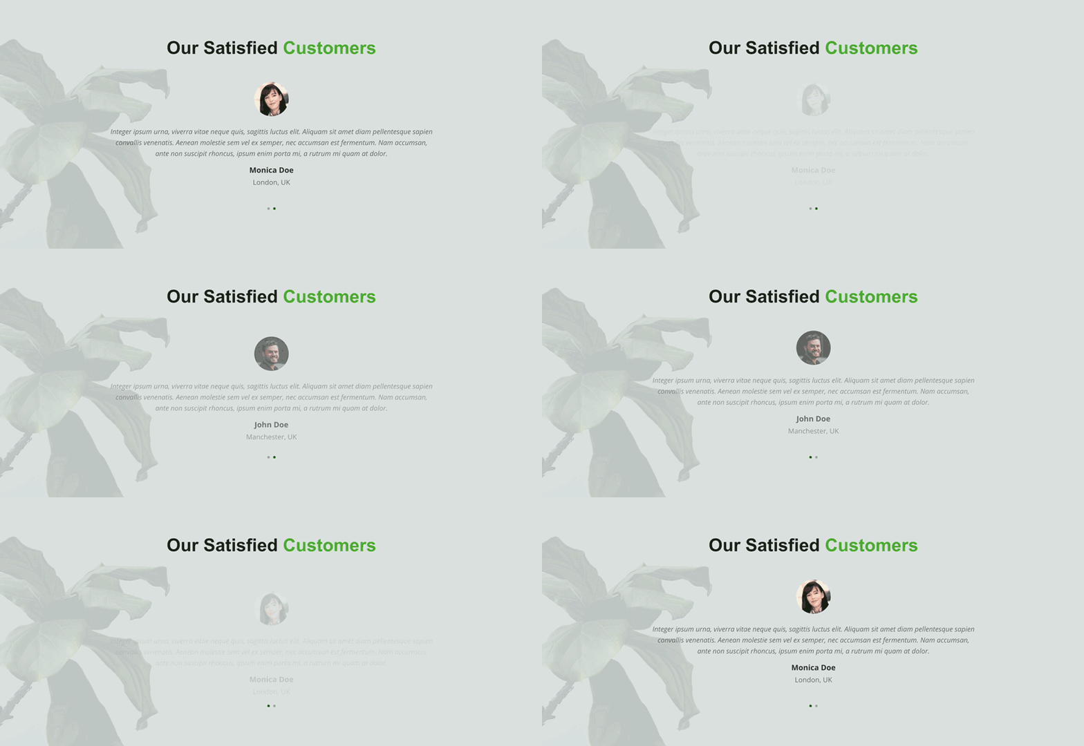
Testimonials are another important section that every website should have. For building this testimonial section we used Text and Image modules. Finally we added a subtle effect for the 1st Text module which moves up and the image gets a red border on mouseover.
Final thoughts
We hope you enjoy this layout and that it will save you time and jump start your next Divi website project. If you have any questions, please feel free to ask in the comments below.
If you’re ready to learn more about Divi and get more Divi freebies, make sure you subscribe to our newsletter so that you don’t miss anything!
Maciej Ekstedt
Maciej is the founder and CEO of B3 Multimedia Solutions. He is a self-made web designer and marketing expert, and he loves his job so much that he barely leaves the office. He transforms creative ideas into effective strategies for his company and for his clients. Maciej is fascinated by the phenomenon of megalopolis. He notices patterns and details which make up the whole thing, and he uses these skills in his work.
Start Building your Legal Services Website with Liberty!
We have a sweet deal for you! We are offering a huge sale! You can get our latest Liberty Divi theme with a 20% discount! Use the coupon code LIBERTY20 at checkout!






Very nice Maciej, looks great.
Thanks you!
Thanks! I’m glad you like it! 🙂
Thanks for such a good theme
Thanks for the layout pack!