Create Interactive Sections with the Reveal Effect and Divi
The built in Divi animations are great if you just want to add a bit of movement to your website quickly, but I find using the same fly-in or appear animations gets a bit boring after a while. Especially when every Divi site seems to be using the same ones. I’m a bit obsessed with finding different things I can add to my Divi websites to make them not look like a standard Divi site.
Recently I’ve noticed this method used on lots of websites and really like it! It’s a cool way to take a basic design and make it look premium.
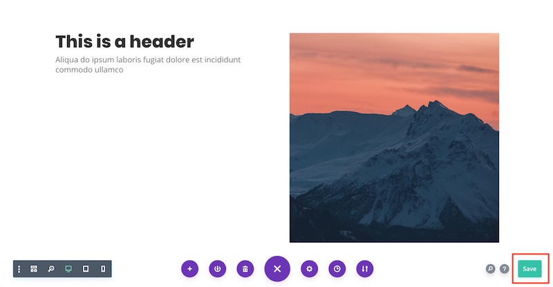
Checkout the Live Demo here. It’s essentially just a 50-50 layout with an image and some text, but the animation makes it looks really cool. If you’d like to know how to achieve the same look for your website, keep reading as I’ll show you how! I’ve tried to keep the technique as simple as possible so it’s easy to follow along.
Download Free Divi Section .JSON file
You can follow this tutorial or download ready to use .json file with sample section that you can import to your Divi Library and use in no time! Subscribe to download free section →
Setup the section
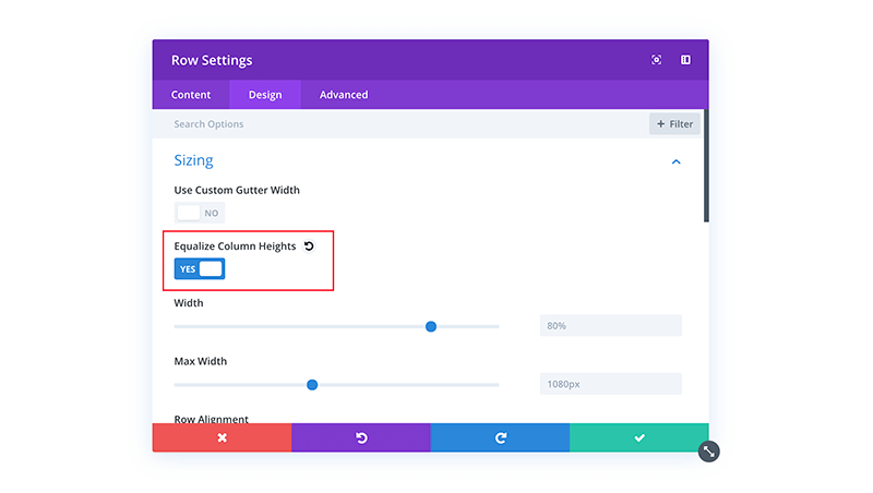
Add a section with 2 columns. In the Design tab of the Row Settings turn on Equalize column heights.
Add a text module
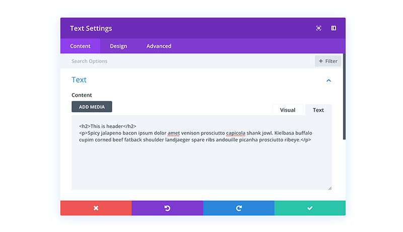
Add a text module to the left-hand column. Add your text content. For this example I added a h2 and some body text.
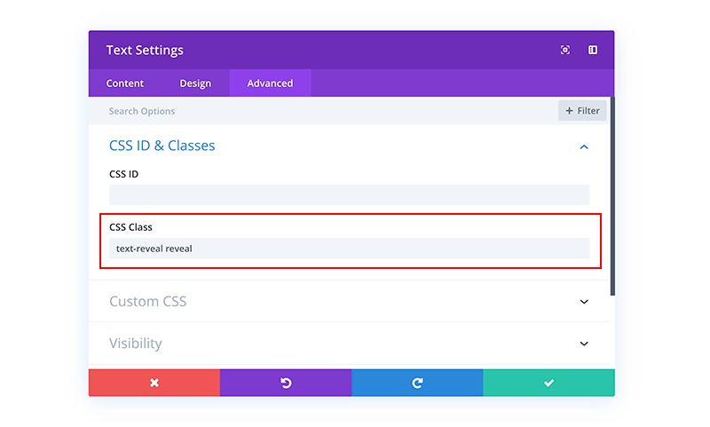
Then in the Advanced tab give it two custom css classes of text-reveal and reveal.
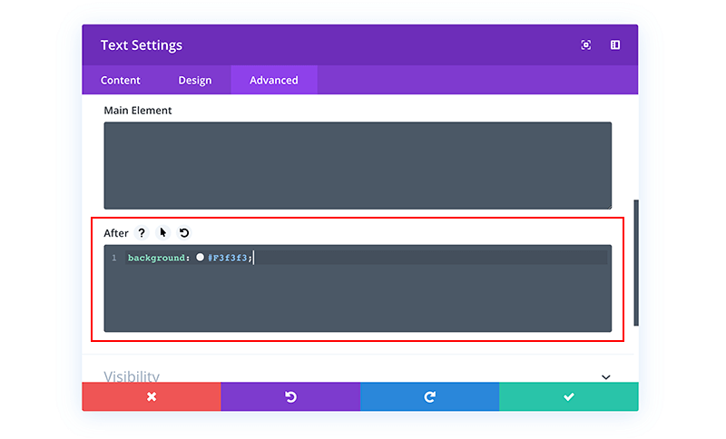
In the After box, give it a background colour. This is the colour that will appear briefly before the text.
e.g. background: #F3f3f3
Add an image
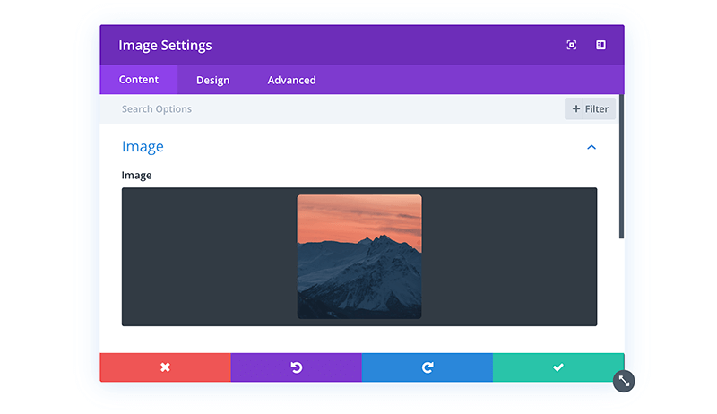
Add an image to the right-hand column.
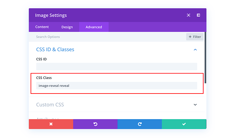
In the Advanced tab give the image two custom css classes of image-reveal and reveal.
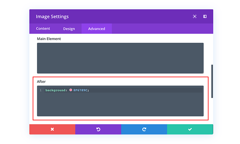
Then expand Custom CSS tab and in the After field, give it a background colour. This is the colour that will appear briefly before the image.
e.g. background: #f9574f;
Add another row (optional)
Clone the row and update the image and text box with different content. You can also change the background colour of the after element if you’d like to use different colours. In this example I’ve used 4 different colours for the images but kept the text the same colour.
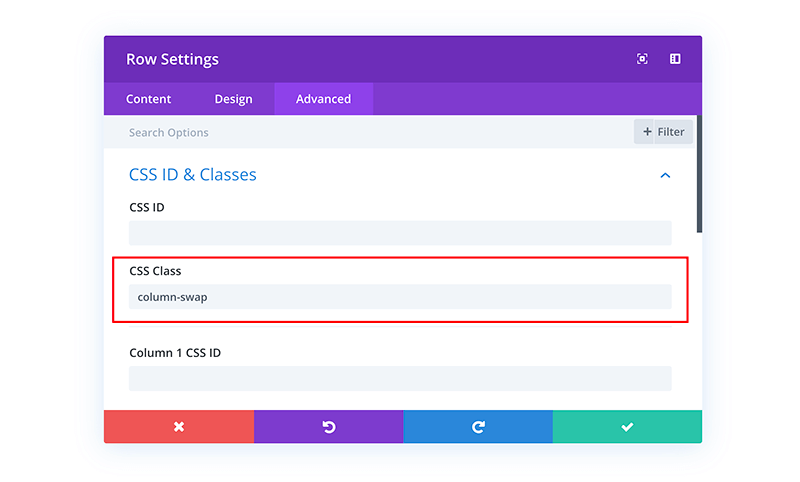
To make sure the text always appears on top of the image on mobile, add a class of column-swap to the row where the image is in the left-hand column.
Save the layout!
Add the CSS
Add the following css to your custom css in your theme options. This CSS will add the reveal effect, as well as vertically centre the text in the column, and reverse the order of the columns on mobile if you added the “column-swap” in the step above.
Note: The vertically centred text doesn’t display in the visual builder, but does on the front-end, so don’t worry if it doesn’t look centred when editing!
|
1 2 3 4 5 6 7 8 9 10 11 12 13 14 15 16 17 18 19 20 21 22 23 24 25 26 27 28 29 30 31 32 33 34 35 36 37 38 39 40 41 42 43 44 45 46 47 48 49 50 51 52 53 54 55 56 57 58 59 60 61 62 63 64 65 66 67 68 69 70 71 72 73 74 75 76 77 78 79 80 81 82 83 84 85 86 87 88 89 90 91 92 93 94 95 96 97 98 99 100 101 102 103 104 105 106 107 108 109 110 111 112 113 114 115 116 117 118 119 120 121 |
/*===== Image reveal on scroll =====*/ /* Image reveal effect */ .image-reveal img { opacity: 0; } .image-reveal.reveal img { animation: appear 1s linear forwards; -webkit-animation: appear 1s linear forwards; animation-delay: .5s; } .image-reveal:after, .text-reveal:after { content: ""; top: 0; left: 0%; height: 100%; position: absolute; } .image-reveal.reveal:after, .text-reveal.reveal:after { animation: reveal 1.5s cubic-bezier(0.1, 1, 0.5, 1) forwards; -webkit-animation: reveal 1.5s cubic-bezier(0.1, 1, 0.5, 1) forwards; } .text-reveal.reveal .et_pb_text_inner { animation: appear 1s linear forwards; -webkit-animation: appear 1s linear forwards; animation-delay: .9s; } .text-reveal.reveal:after{ animation-delay: 0.4s; } @keyframes reveal { 0% { left: 0%; width: 0%; } 50% { left: 0%; width: 100%; } 100% { left: 100%; width: 0%; } } @-webkit-keyframes reveal { 0% { left: 0%; width: 0%; } 50% { left: 0%; width: 100%; } 100% { left: 100%; width: 0%; } } @keyframes appear { 0% { opacity: 0; } 100% { opacity: 1; } } @-webkit-keyframes appear { 0% { opacity: 0; } 100% { opacity: 1; } } /* Centre the text vertically in the column */ .text-reveal { display: table; height: 100%; } .text-reveal .et_pb_text_inner { display: table-cell; vertical-align: middle; opacity: 0; } /* Reverse the order of columns on mobile with even spacing */ @media (max-width:980px) { .column-swap { display: flex; flex-direction: column-reverse; } .column-swap .et_pb_column:first-child { margin-bottom: 0; } .column-swap .et_pb_column:last-child { margin-bottom: 30px; } } |
Add the javascript
Without this javascript the effect will happen on all modules when the page loads, so if an image is half way down the page you won’t see the effect.
What this javascript does is trigger the effect when the module scrolls into the screen.
It’s also setup so if a user has javascript disabled in their browser, the modules will still load so users won’t miss any content.
If you’d like to use this effect on multiple pages then add the following javascript to the body box of the “Integrations” tab in you theme options.
If you’d just like to use it on a single page, you could also add it to a code module on that page so you don’t have to load it on every page.
|
1 2 3 4 5 6 7 8 9 10 11 12 13 14 15 16 17 18 19 20 21 22 23 24 25 26 27 28 |
/* Remove reveal class on load */ jQuery(document).ready(function() { jQuery('.image-reveal, .text-reveal').removeClass('reveal'); }); jQuery(window).scroll(function(){ inViewport(); }); jQuery(window).resize(function(){ inViewport(); }); /* Add reveal class when scroll into screen */ function inViewport(){ jQuery('.image-reveal, .text-reveal').each(function(){ var divPos = jQuery(this).offset().top, topOfWindow = jQuery(window).scrollTop(); if( divPos < topOfWindow+400 ){ jQuery(this).addClass('reveal'); } }); } |
Save and you’re done!!
This tutorial is really just a starting point to show you the technique, but there’s so much more you could do with it! You could add in some animation-delays and animate multiple elements in each section. Or even have a completely animated hero sections for when the page initially loads.
I’ll probably make some more complicated animations using this method in the future, so if you’d like to know when they’re available for download you can sign-up to the B3 email list today!
Safari compatibility
Do you want to use this effect above the fold? If so there’s a slight compatibility issue with Safari. But don’t worry! We have a work around. In Safari if the module is on the screen when the page loads (i.e. above the fold), then the animation doesn’t run in full for those modules.
To get around this, all you need to do is update the classes of which ever modules are above the fold to “image-reveal-af” and “text-reveal-af”, then also update the CSS and JS with the code below:
CSS:
|
1 2 3 4 5 6 7 8 9 10 11 12 13 14 15 16 17 18 19 20 21 22 23 24 25 26 27 28 29 30 31 32 33 34 35 36 37 38 39 40 41 42 43 44 45 46 47 48 49 50 51 52 53 54 55 56 57 58 59 60 61 62 63 64 65 66 67 68 69 70 71 72 73 74 75 76 77 78 79 80 81 82 83 84 85 86 87 88 89 90 91 92 93 94 95 96 97 98 99 100 101 102 103 104 105 106 107 108 109 110 111 112 113 114 115 116 117 118 119 120 121 122 123 124 125 126 127 128 129 130 |
/*===== Image reveal on scroll =====*/ /* Image reveal effect */ .image-reveal img, .image-reveal-af img { opacity: 0; } .image-reveal.reveal img, .image-reveal-af.reveal img { animation: appear 1s linear forwards; -webkit-animation: appear 1s linear forwards; animation-delay: .5s; } .image-reveal:after, .text-reveal:after, .image-reveal-af:after, .text-reveal-af:after { content: ""; top: 0; left: 0%; height: 100%; position: absolute; } .image-reveal.reveal:after, .text-reveal.reveal:after, .image-reveal-af.reveal:after, .text-reveal-af.reveal:after { animation: reveal 1.5s cubic-bezier(0.1, 1, 0.5, 1) forwards; -webkit-animation: reveal 1.5s cubic-bezier(0.1, 1, 0.5, 1) forwards; } .text-reveal.reveal .et_pb_text_inner, .text-reveal-af.reveal .et_pb_text_inner { animation: appear 1s linear forwards; -webkit-animation: appear 1s linear forwards; animation-delay: .9s; } .text-reveal.reveal:after, .text-reveal-af.reveal:after { animation-delay: 0.4s; } @keyframes reveal { 0% { left: 0%; width: 0%; } 50% { left: 0%; width: 100%; } 100% { left: 100%; width: 0%; } } @-webkit-keyframes reveal { 0% { left: 0%; width: 0%; } 50% { left: 0%; width: 100%; } 100% { left: 100%; width: 0%; } } @keyframes appear { 0% { opacity: 0; } 100% { opacity: 1; } } @-webkit-keyframes appear { 0% { opacity: 0; } 100% { opacity: 1; } } /* Centre the text vertically in the column */ .text-reveal, .text-reveal-af { display: table; height: 100%; } .text-reveal .et_pb_text_inner, .text-reveal-af .et_pb_text_inner { display: table-cell; vertical-align: middle; opacity: 0; } /* Reverse the order of columns on mobile with even spacing */ @media (max-width:980px) { .column-swap { display: flex; flex-direction: column-reverse; } .column-swap .et_pb_column:first-child { margin-bottom: 0; } .column-swap .et_pb_column:last-child { margin-bottom: 30px; } } |
Javascript:
|
1 2 3 4 5 6 7 8 9 10 11 12 13 14 15 16 17 18 19 20 21 22 23 24 25 26 27 28 29 30 31 32 33 34 |
/* Remove reveal class on load */ jQuery(document).ready(function() { jQuery('.image-reveal, .text-reveal, .image-reveal-af, .text-reveal-af').removeClass('reveal'); }); jQuery(window).scroll(function(){ inViewport(); }); jQuery(window).resize(function(){ inViewport(); }); /* Add reveal class when scroll into screen */ function inViewport(){ jQuery('.image-reveal, .text-reveal').each(function(){ var divPos = jQuery(this).offset().top, topOfWindow = jQuery(window).scrollTop(); if( divPos < topOfWindow+400 ){ jQuery(this).addClass('reveal'); } }); } /* Adds animation for elements above the fold - necessary for Safari compatibility */ function aboveFold(){ jQuery('.image-reveal-af, .text-reveal-af').addClass('reveal'); } setTimeout(aboveFold, 700); |
Let us know in the comments below if you liked this free tutorial and section! Your feedback gives us motivation to create new products and freebies. And if you have any suggestions about what we could make for you next, let us know!
Andy Hooke
Andy is a self-taught web designer who now specialises in the Divi theme. He comes from a html & css coding background, and enjoys taking these skills to see how far he can customise Divi and create websites which don’t look like your standard Divi websites.
Get Divi Icons PRO today!
We have a sweet deal for you! You can get the best icon plugin for Divi with a 10% discount! Use the coupon code DIVIICONS10 at checkout!






nice… it works like block reveal by Superfly 😉
Thanks Andy, its pretty cool.
I agree with your sentiment about looking to make Divi different and this help a lot.
I also appreciate the free download too 🙂
I’m glad to hear it was helpful 🙂
Thanks Andy. Beatiful section and interesting post.
Brilliant – thanks!
I’ve been playing around with viewport reveals lately and this is super-helpful.
Many thanks Andy!
Excellent tutorial and helpful download, very much appreciated.