15 Testimonial Page Examples You’ll Want to Copy in 2020
Of course, just like the design of your website, naturally you want to ensure that when it comes to your testimonials page, it’s vital that it stands out. A page that is plain and boring will do very little to make your customers feel like your brand is truly innovative and can offer them something unique. That’s why you need to ensure that your testimonials page really makes an impact, like these 15 testimonial pages below.
Desk
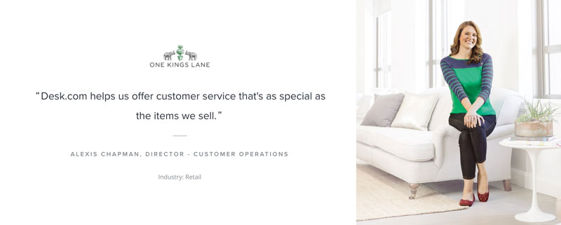
Something that’s wonderfully inspiring about the Desk testimonials page is the fact that a range of photos are displayed along with different quotes about what the client loved, complete with a summary of what the client liked about the service below.
Enable
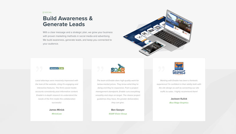
Enable, web design specialists, include a range of customer testimonials on their website homepage, which ensures that they are seen immediately when a potential new customer lands on their site.
Using a Testimonial Slider plugin has also helped to enhance the design and style of this page, making it more interesting and eye catching to look at.
Chow Now
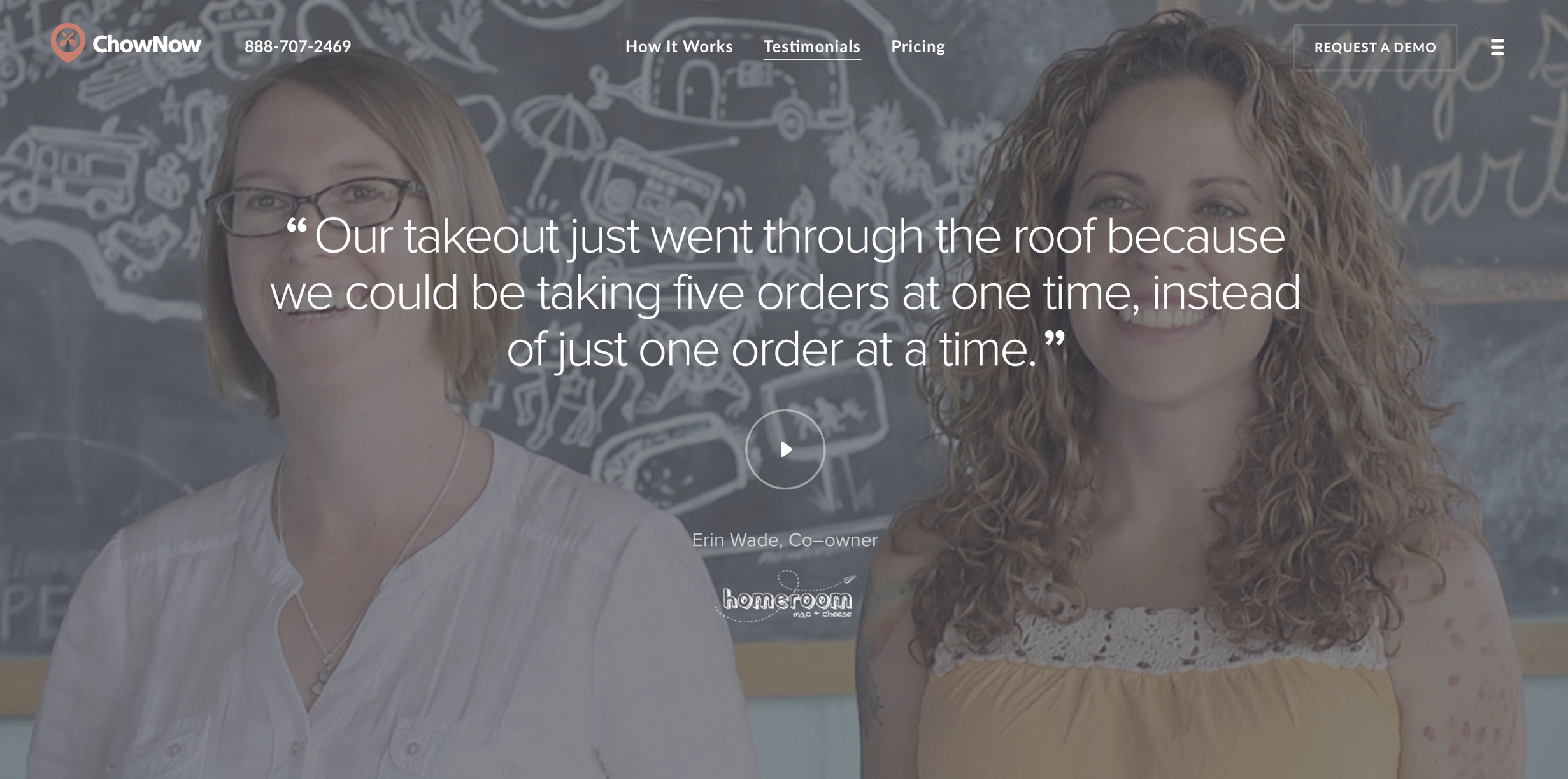
Not only is the Chow Now testimonials vibrant and interesting because of its design and layout, the fact that it features various video testimonials gives it an edge over many other similar pages. Very few customer testimonials are video, which means that Chow Now has a page that is wonderfully unique and seriously innovative.
Testimonial Concept by Kadir
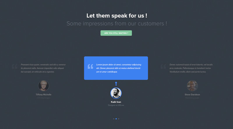
What’s inspiring about the Kadir’s testimonial section is the fact that it not only includes direct quotes from happy customers, but also the fact that it incorporates images. When an image is included, it makes the people behind the testimonials seem more ‘real’, which is a highly effective marketing technique.
Testimonial Slider Efect by Juskteez
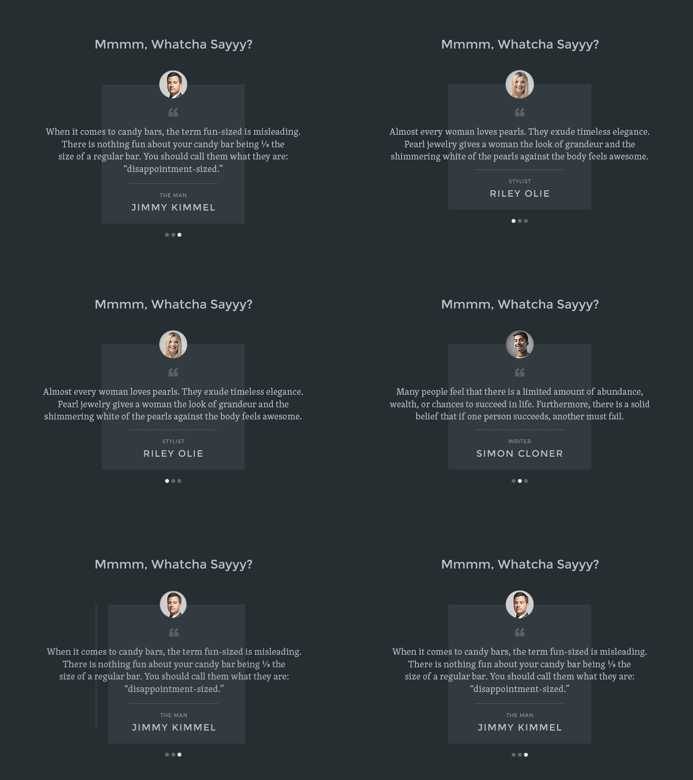
What is fantastic about Justeez testimonials page is the fact that it’s a mixed testimonials page featuring testimonials from various customers.
Elegant Themes
The Elegant Themes website uses video format testimonials to highlight some incredibly real stories that show potential customers exactly how the ultimate theme building company can offer them a service that is second-to-none in terms of quality. For a testimonial page that is quirky and unique, Elegant Themes is the company to take note of.
Kissmetrics
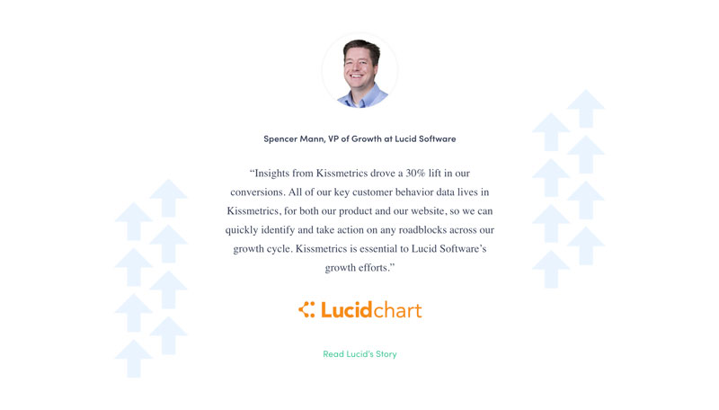
The Kissmetrics website has an interesting and innovative customer testimonials page that is unlike any other, it’s called their ‘Success Stories’ page and it boasts a selection of interesting customer success stories that are wonderfully informative.
Ally
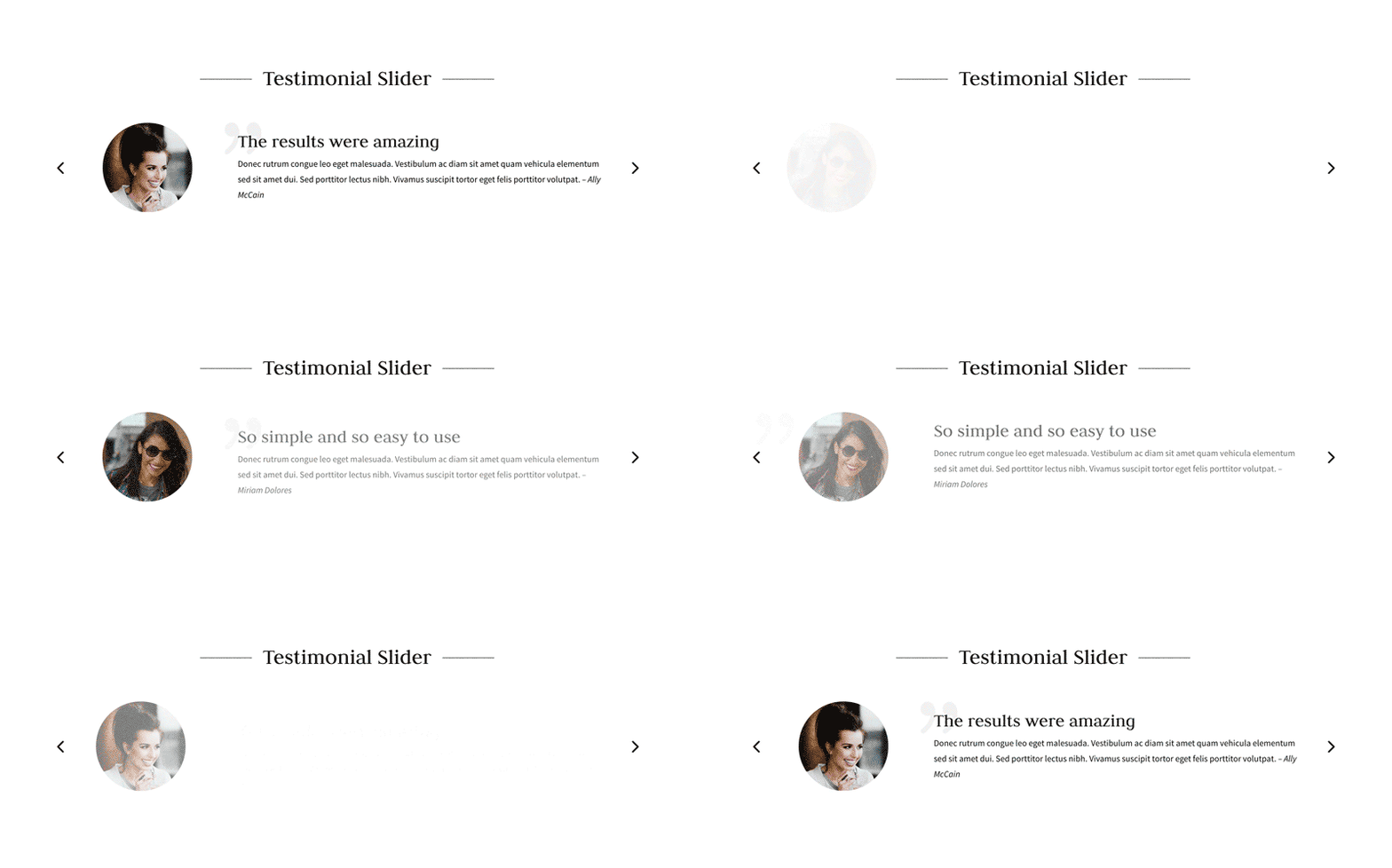
The unique thing about the Ally testimonials page is the fact that it contains various methods of sharing testimonials, including the use of a testimonial slider, which allows various testimonials to be swapped in and out on a regular basis.
PSD to WordPress
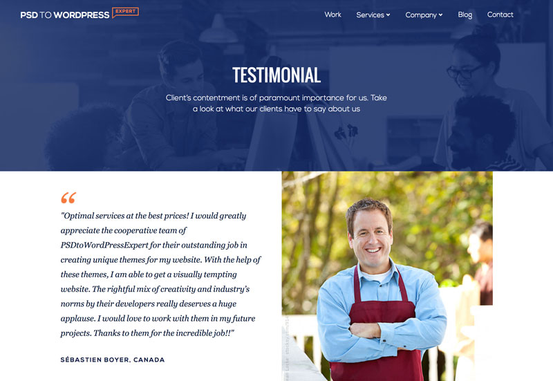
Another website with a gorgeous testimonials page that is eye-catching, unique and completely innovative is the PSD to WordPress page. It’s interesting and informative, plus it incorporates pictures in a smart way that helps to make the entire page seem more appealing.
Elev.io Landning Page by Martin Strba
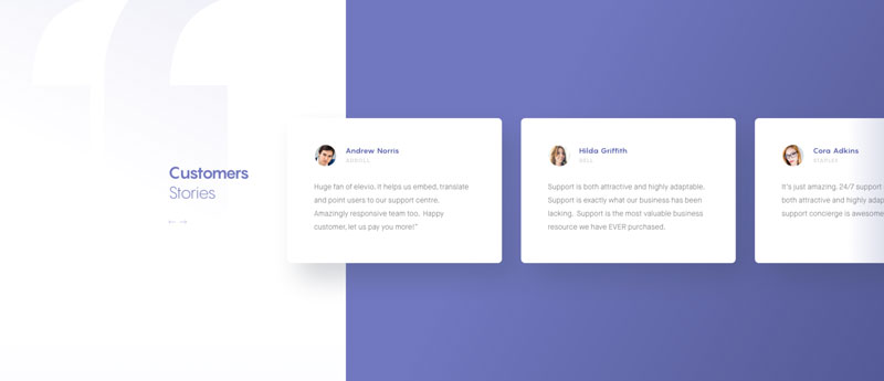
Elev.io has an amazing testimonials page that features a range of customer stories about how Elev.io has provided a service that is second-to-none in terms of the quality and care on offer. The way the testimonials are laid out, in a line on a slider creates a fantastic effect and works tremendously well.
DiviLover
Seller of premium themes for the Divi network, DiviLover displays their customers testimonials using a customisable Divi plugin. What’s great about the DiviLover testimonial page is the fact it incorporates quotes that highlight what’s unique about what DiviLover offers, complete with photos of the people behind the testimonials.
Aidmaid Landing Page
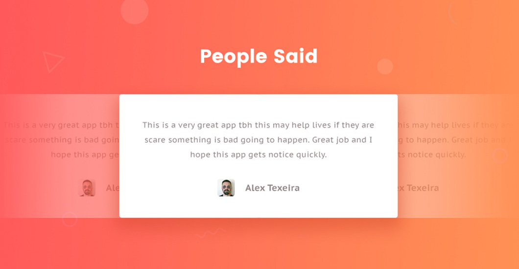
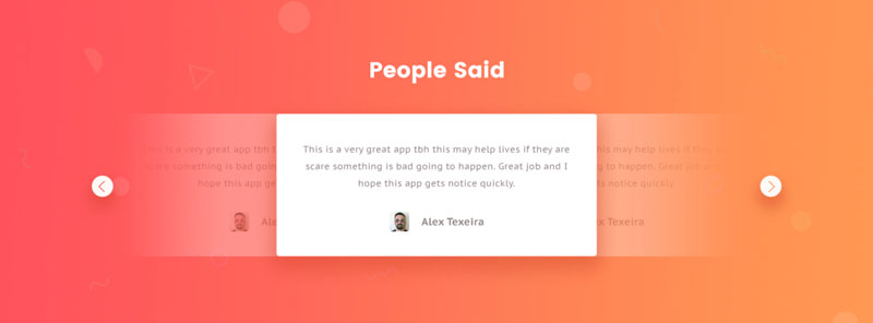
Aidman, an app with the tagline ‘Your Trusted Personal Guardian’. The testimonial page for Aidman is bright, bold and colourful, with testimonials highlighted by a lighter background and smart image of the person giving the testimonial, which has been set up on a slider tool, with testimonials looping around constantly.
Testimonials UX by Pawel Skupien
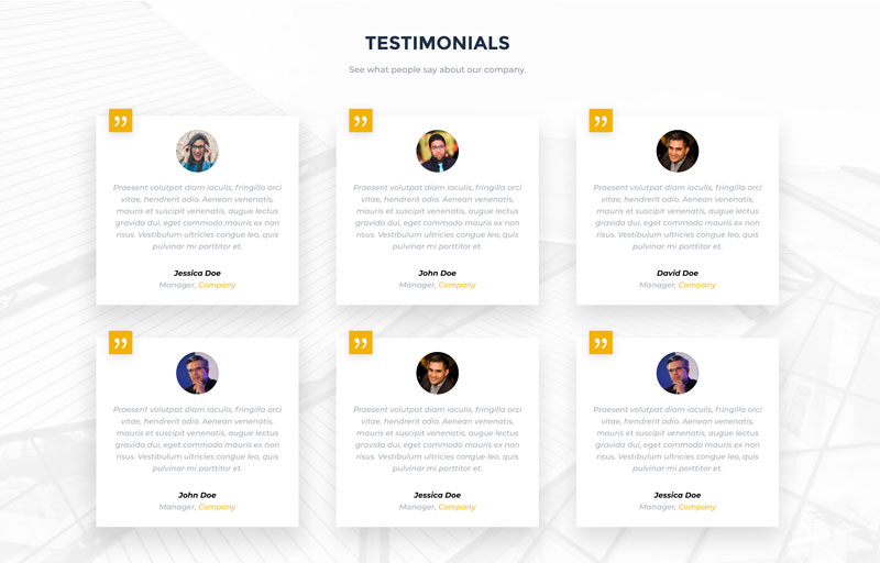
What’s amazing about the Pawel Skupien testimonials page is the layout – it’s bright, appealing, and unique. The colours draw the eye, while the layout of the testimonials also help to capture interest – they are laid out differently. In addition to this, the designer incorporates a slider plugin that ensures that the testimonials are constantly looping around, with different experiences shared constantly.
Marvel
Marvel is a premium Divi child theme built for professional builders, designers and fully customisable for any business. The testimonials page features various testimonials – some long and some short – along with quotes and images. The layout of these testimonials is eye catching, quirky and unique.
Daily UI inspirations
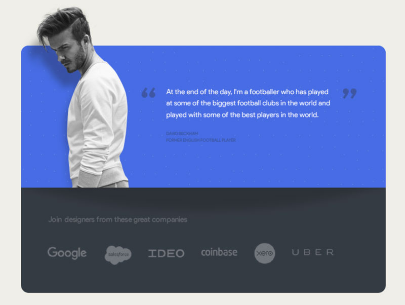
This testimonials section has been designed by Indian designer Ranjith Alingal as part of the daily UI exercises. This sample features person image on the left and testimonial on the right.
Maciej Ekstedt
Creative Director
Maciej is the founder and CEO of B3 Multimedia Solutions. He is a self-made web designer and marketing expert, and he loves his job so much that he barely leaves the office. He transforms creative ideas into effective strategies for his company and for his clients. Maciej is fascinated by the phenomenon of megalopolis. He notices patterns and details which make up the whole thing, and he uses these skills in his work.
Use coupon code SLIDER15 at checkout!









Fantastic lineup. This stuff is catnip to me.
Thanks for putting my team’s site at #2; we’re pumped to be using B3’s Testimonial Slider. We’re also giving it double-duty and using it on our pricing page for how it can sort cards.
Definitely love sliders, like #10. I’m skidding around looking for ways to make that an easier part of building with Divi, without storing a ton of disparate library items.
# 13, Testimonials UX by Pawel Skupien looks really great. But is there a link? Would be great to get a CSS cheat sheet to this one 😉
Hi Frode! I’m afraid there is no link available anymore. It was PSD only and I found it on Dribbble. This link has been unfortunately removed and is not available anymore but we still feature this here 🙂 Happy Easter!
Thanks for the great list. Aidmaid Landing Page stands out among all with a nice gradient background and slider support.
Thanks for sharing this useful guide with the community! It will really help the startups to implement their website design in a attractive manner.