Adventure: A Free Divi Layout
Make a quick start to your next project
Adventure is a responsive Divi layout with a clean, elegant design and a beautiful colour combination. It is not a complete website but rather gives a rough idea of the design. All modules can be easily copied and used on other pages.
Requirements: The Adventure Divi layout requires that you have the Divi parent theme for WordPress installed. It is not included with this product.
What’s inside
- adventure-master.json – importing this file will add the full layout and all of the individual sections to your Divi Library.
- adventure-full-layout.json – this is just the full Adventure layout.
- gallery images folder – this folder contains 12 images used in the gallery module of the Adventure layout.
Installing Adventure Layout
After Adventure layout pack is downloaded, you can add it to your Divi website by following these steps:
- Go to Divi → Divi Library → Import & Export → Import > Select the Adventure Master file
- Create a new page and activate the Divi Builder
- Click Load From Library → Add From Library → Adventure
Getting Started
The Adventure layout pack comes with 6 custom designed sections that guarantee a great user experience. We have used the latest design principles and applied material design styles, so that you can be sure users are going to love it! Each section has attractive hover effects applied which makes the layout extremely interactive.
Hero Image Section
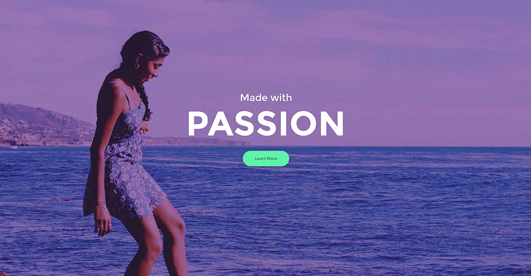
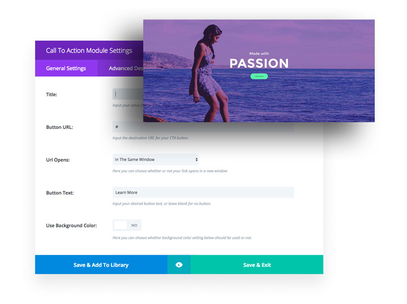
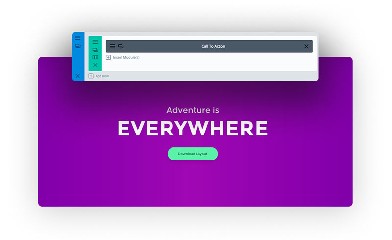
This section only has one row and a Call To Action module which is used for displaying a background image with a big heading and a button. For editing the image, text and button we need to open the module settings where we then upload our own image, and where we add/edit text and setup the link for the button etc.
Gallery with Icons
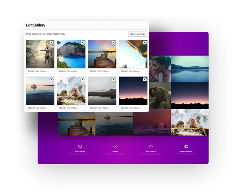
The Gallery Module is ideal for displaying beautiful places, travel photos and amazing moments. After each image is clicked, the slider gallery opens so that users can easily slide the images and see them enlarged.
The Gallery section is built with 3 rows.
The first row is a Call To Action module where you type the heading and a little descriptive text.
The second row is the Gallery Module. Here you select the images and set the number and order of images to be displayed.
The third row is a 4 column layout with 4 blurbs, one in each column. To edit the Blurb Module, go to the Blurb Module settings and edit the text, change the icon or even setup a link.
Team Section
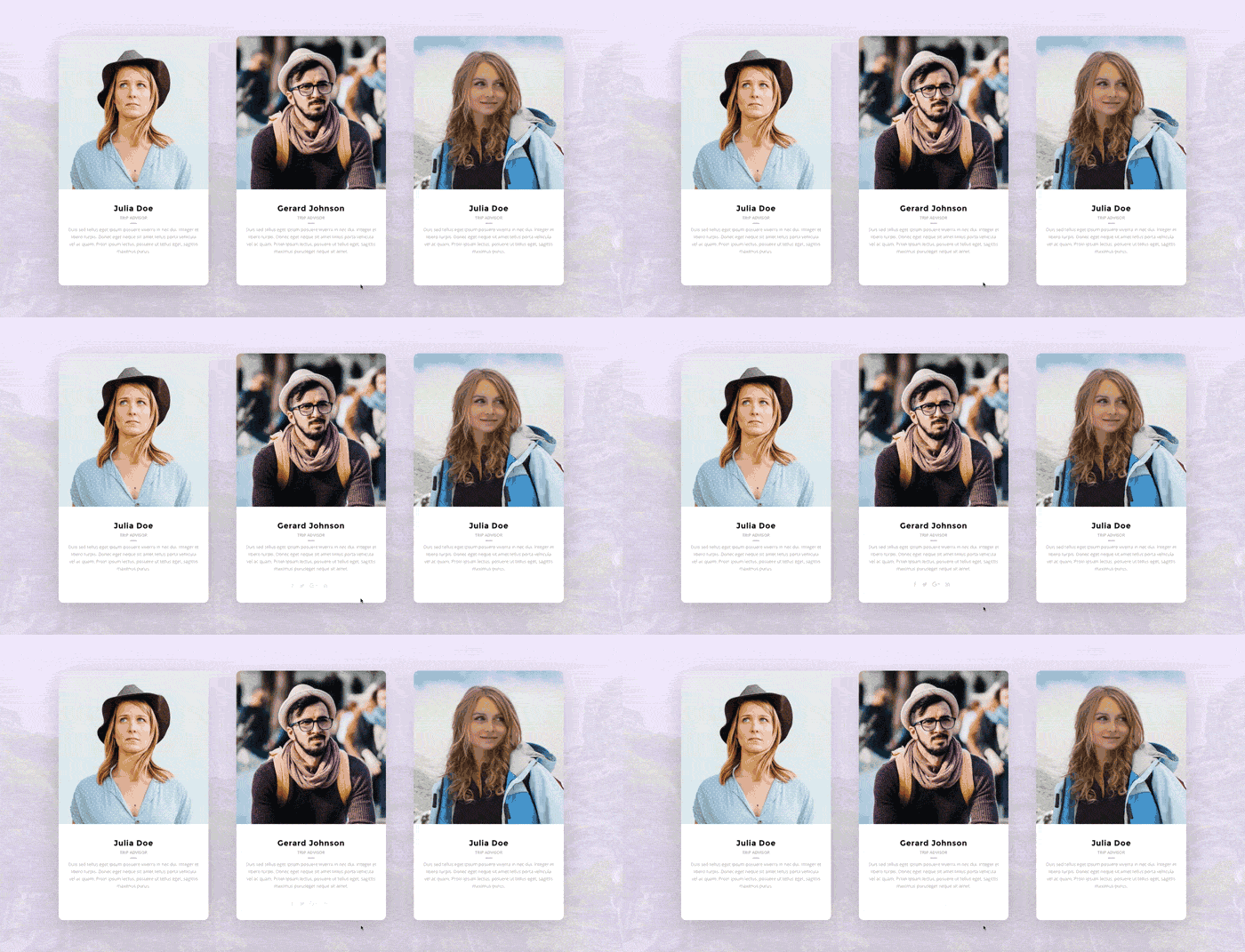
The Team section is shared over 3 columns. In each column we have a Person Module with a pleasant animation. The profile picture zooms in and out on mouseover. The social media icons are hidden by default and they slide up smoothly after mouseover. This module offers several team options like name, title, description, social media links and profile image.
Image with Text
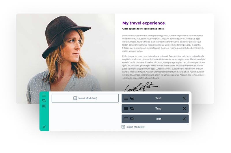
Below the Team section we have a custom section with an image on the left and text description on the right. The first column has a background image setup with the option to enable the parallax effect. In the second column we can see 3 Text Modules with different styles applied.
The Testimonial
Testimonials for your website showcase how others have benefitted from your products or services, making it an excellent tool for establishing trust and encouraging potential buyers to take action.
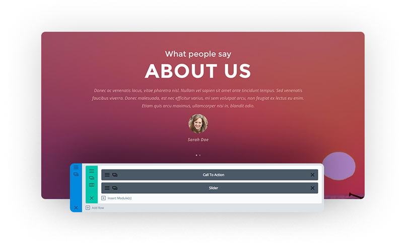
The section features a parallax background and two modules inside. First is Call To Action module that displays your headline text above the testimonials.
The Slider Module description field is where you would put your testimonial text and accompanying photo – we recommend two to five slides.
Image Box with Text
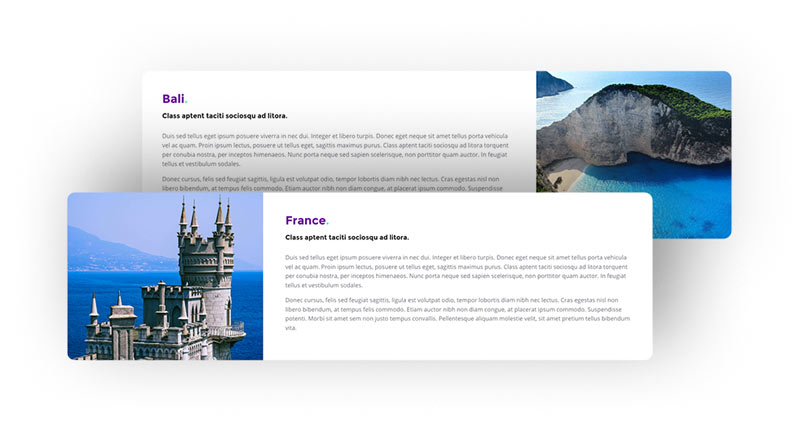
In this section we decided to add some fun effects and play with the font colors. Each box zooms in and out on mouseover.
To build this section we used a 2 column layout. One column has a background image setup. In the second column there are 3 text modules that can be easily edited by going to Text Module Settings.
This section is ideal to showcase popular places, attractions and other special items.
The Call To Action
We all know how a CTA is important on every website. It calls users to take action. In this case we want the user to click on the button to open a new page, a popup window, etc.
In this section we have a background image with parallax effect and a CTA Module inside. In the customizer settings we can edit the text and button styles.
The modules above and below are overlapping this section making it more eye-catching and unique.
Final thoughts
We hope you enjoy this layout and that it will save you time and jump starts your next Divi website project. If you have any questions, please feel free to ask and we will try to answer as best as we can.
If you’re ready to learn more about Divi and get more Divi freebies, make sure you subscribe to our newsletter so that you don’t miss anything!
Maciej Ekstedt
Maciej is the founder and CEO of B3 Multimedia Solutions. He is a self-made web designer and marketing expert, and he loves his job so much that he barely leaves the office. He transforms creative ideas into effective strategies for his company and for his clients. Maciej is fascinated by the phenomenon of megalopolis. He notices patterns and details which make up the whole thing, and he uses these skills in his work.





Great layout… Thanks for sharing.
Please where can I find the CSS code you used to style the “Image with Text” and “Image Box with Text” sections.
Thanks for all
Hello Eric. Thank you for your comment. Yes, preview is available here: https://layouts.b3multimedia.ie/adventure/
Excellent layout!! Thx
Hi Maciej,
Great layout pack. Having trouble getting it to download. I have filled out the form several times but have yet to be redirected to a download page, initiate a download or receive a download link via email. Can you assist?
Hello Jerome, indded we are having caching issues. It should be fine now. Please try again and let me know how it goes! Sorry for any inconveniances caused.
Thanks Maciej,
Download working now.
Thanks Maciej, truly a very clean and very elegant design. It’s got everything a onepage website could wish for. Very good study material, thanks again!
Thanks for the generosity always, another fantastic layout!
Hello, thanks for this great layout! Thank you for sharing this. Question: What is the best way to change the (purple) gradient color? This is in the gallery section of the layout. I see that it’s a CSS class, but I can’t find it anywhere. What is the CSS to change the color or attributes?
Hi Breck,
Thank you for your comment. I’m glad you like it. You can change gradient color by editing .gradient class. All css can be found at the top of your page in first Divi Module called “code”. Hopefully this helps 🙂
Thanks! This helps a lot. I completely missed that.
Great share and very well documented, Thanks!
Thank you Thomas 🙂 Glad to hear that!
Thanks for sharing.
Will be useful as I’m in travel!
Just one question is the section under the very top image supposed to be off centre?
Thanks Danny
Hi Danny. Thank you for your comment and yes, it suppose to be like that 🙂
How can I change the color of the greenish button? Sorry. I’m just not seeing it.
Hello Doug, Please check and edit CSS code placed in first module. To change button color search for .big-button class. Hopefully this helps 🙂
Hi, is it possible to just import one section and not the whole layout.
thank you.
Hi Kevin, unfortunately not. Full page layout has to be imported and then you can extract sections you would like to use. Please be advised, you would also have to copy CSS code required for your section. All CSS is embedded in first module.
Thanks, Love the layout
You guys have taste for the web 🙂
Thanks a lot for this great layout, I really liked it.
Please after I imported it the testimonials section was not included.
Please advise on how to get it.
Regards,
Hi Ahmed,
Thank you for reporting this. I have checked and indeed there was some issue with the layout. I think this could be caused by some of the latest Divi updates. Anyways, I have uploaded new zip file so you can download and import new json with working testimonials section.
Hi Maciej,
The newly uploaded json file works perfectly now.
Thanks a million!
Hi Maciej I have been working for Divi and I am not an expert. My question is, how do I place a footer, as the template does not seem to bring it. Thank you very much.
Hi Roberto,
You can setup footer layout in Divi Customizer and use widgets. Another option is to use Divi Builder and set this section globally. I’m sure Geno’s article will put more light on it: https://quiroz.co/replace-the-default-footer-with-a-divi-builder-footer-saved-in-your-divi-library/
Great layout, thank you. Where can we find the dimensions for the hero image and the image of the team member under “My travel experience.” Those images weren’t included in the download. Many thanks!
Hi Tee,
For hero section we used 2200px / 1360px. Just remember to compress the image as much as possible. Our image has 240kb. All images are free to use and comes from Pexels website. You can also click right button on the image you want from demo page and save it on your computer to use on your website.
If you are looking for free images that you could use for your projects, please check this articles where we have listed our favorites: Free Stock Photo Sites to Make Your Website Sing
Hopefully this helps 🙂 Happy New Year!
Hello Maciej, this layout looks awesome and i loved it from the first time. I am building a website using it (still offline atm) but seems there is a problem with the team section. The pictures looks smaller than the box… this problem came out already at first load of the layout, with the demo pictures too. Can you check that? Maybe latest Divi update made some mess. Is it possible?