9 Annoying Web Design Problems You Need To Avoid Right Now
Having an attractive web design does not only mean having a beautiful layout. It has to have excellent user experience, which will result in happy visitors. Satisfying and pleasing your potential customers alongside trying not to annoy them should be your foremost goal.
Providing poor user experience can lead to your potential customers abandoning your page. It can also result in low conversion rates, poor search result ranking, and a bad reputation.
Web design is always evolving with efficient techniques replacing ineffective practices. For this reason, your website needs to evolve and adapt to these changes to fully serve you and your user’s goals as well.
However, do not restrict the design of your site to the latest web design trends, rather take into consideration all the lessons you’ve learned from experience.
Here are some of the most common web design problems that may be frustrating and restricting your site visitors.
Your site is taking forever to load
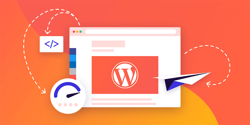
Slow load times will not only annoy your visitors but will affect your conversion rate and how customers perceive your brand. This is especially true for mobile or smartphone users who usually rely on their slow mobile internet connection when accessing the web. So the longer your site loads, the more your site visitors will blame your content instead of their service providers.
Factors such as codes, image size, and videos can impact a page loading time. If you want your target audience to stay on your page, make sure to give top priority at optimizing its load performance.
Not optimized for mobiles
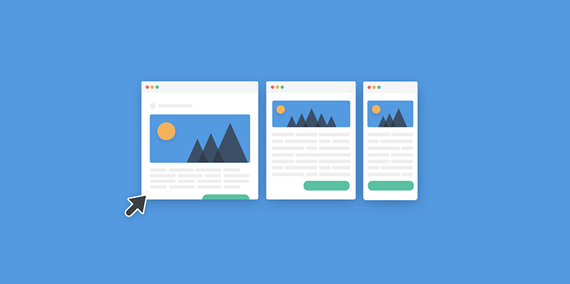
It’s painful to browse a website on your mobile or smartphone when you have to scroll from left to right just to read a copy. It’s also frustrating to pinch-to-zoom when buttons or texts are too small on pages. These things can happen to your site when it’s not mobile-ready, thus providing a bad UX.
Also, one of the biggest reasons why Google continues to update is to improve the browsing experience of mobile users. Hence, you’ll see yourself at the bottom of organic search rankings if you will not optimize your website for mobile devices.
You have poor navigation
When someone lands on your web page, do they have an idea of what to do or where to go? Is it clear what their next steps should be?
This is a no-brainer, but you’re most likely to miss out on possible leads and sales if your website does not provide any clear direction. Explain what you do clearly by including a clear headline copy and page copy without jargon. Also, your main CTA should show your audience the next steps they should take. In short, make the life of your visitor simple and avoid beating around the bush.
Including autoplay multimedia content
How will you feel if you’re so engrossed in browsing a page, and then suddenly you get blasted with a song or ad on a video which you did not play? Annoyed right? You’ll probably look for the mute button right away. But hitting the back button of your browser is a lot easier.
Although social media platforms such as Instagram and Facebook have video autoplay, they’re usually on mute. So give your visitors the same courtesy. Do not force your multimedia content on them. Instead, provide them with an option, at least set its sound or volume setting to mute.
You’re littering your website with generic or stock images
Always using bad stock images? At best they are generic, but at worst, they’re plain ridiculous! Photos are very useful if they communicate and clarify your message for your visitors. However, generic stock photos are not helpful at all for both your site visitors and business.
Consider using real photos of your employees, company, product, location, and customers. If those are not available, find non-generic looking stock pictures on these best free stock photo websites.
Using titles and headlines that are inconsistent with your content
People will click your link to read your content if it has a great title. However, if they’ll be met with content not related to its title, then they’ll be disappointed, and will usually abandon your website.
Capturing the attention of your readers with titles is vital. But make sure you’re not misleading them and that your content can deliver to its promise.
Keyword stuffing your copy
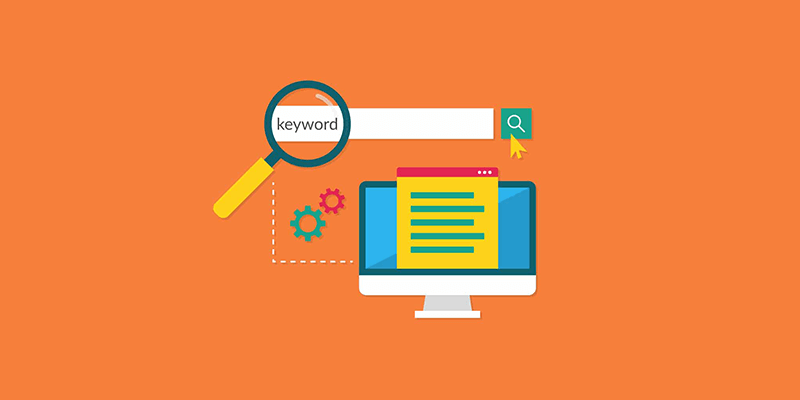
Don’t stuff your copies with too many keywords. It’s visually overwhelming and creates a poor reader experience. Although keywords are vital for the success of your SEO, Google will also you penalize for keyword stuffing. Also, write with humans in mind and not bots.
Lack of social sharing buttons
It’s disappointing to read interesting content and not have the option to share it. Social sharing buttons are an easy way for your sites visitors to share your content on their social media since they don’t have to copy and paste it manually.
As a result, you’ll get more traffic, lead generation possibilities, and do better in search engine results since your online presence and visibility will increase.
Not keeping your website updated
It is crucial to keep your plugins and themes updated to ensure that you’re protecting every possible entry point on your domain. Installing real-time protection such as iThemes and WordPress is the best website security you can have.
Make things simple for your site visitors and lessen their frustration when navigating your website. It should do everything for your target audience and present them with the best solution. Ready to make some changes today? Let us know by dropping a comment below!
Aileen Cuaresma
Aileen is a Technical and Creative writer with an extensive knowledge of WordPress and Shopify. She works with companies on building their brand and optimizing their website. She also runs a local travel agency with her family. On her free time, she loves reading books, exploring the unknown, playing with her two adorable dogs, and listening to K-pop.
Start Building your Legal Services Website with Liberty!
We have a sweet deal for you! We are offering a huge sale! You can get our latest Liberty Divi theme with a 20% discount! Use the coupon code LIBERTY20 at checkout!







Very good post Aileen important for SEO.
Thanks for your informative article. I’ve checked my site and the site speed is only 39. I’m not sure if the image sizes are too large. Do you have any solution to solve this?
It’s ridiculous that the author could forget the SNS buttons. I mean they are awesome links to promote their social pages. I sometimes read creative posts and tend to share them on my homepage, and guess what? No FB or Twitter icons 🙁