17 Inspiring Websites Built with Divi
Krat
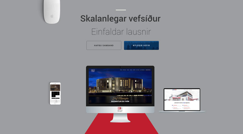
This one-page site presents many options: additional navigation with a fixed side widget, a chat opportunity, a straight-to-inquiry button, a back-to-top button. The gallery of work creates movement and is nicely crafted.
Autism school site
A nice, bright site with a tightly knit colour scheme, effective use of parallax header and some of Divi’s newest features such as animated blurbs and scrolling partner carousel. The pop-out Facebook stream widget is delightful.
Codecrater
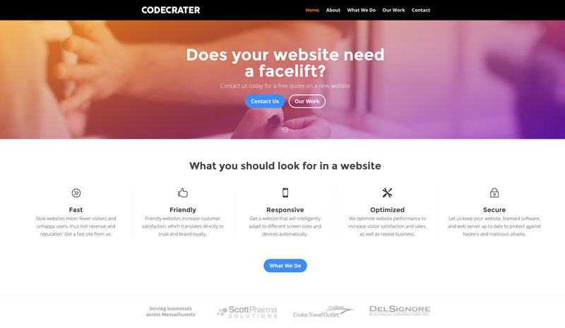
This straightforward site has a creative use of testimonials and toggle blocks next to animated photos. The side-navigation widget organizes each page into sections.
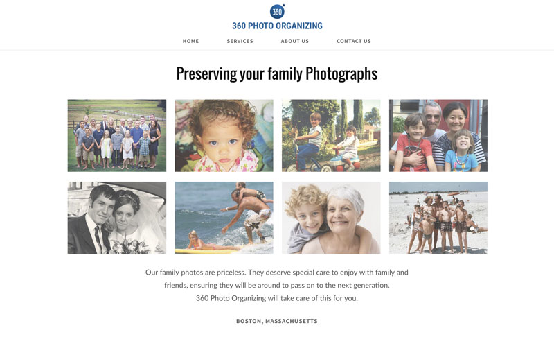
360 Photo Organizing
This clean one-page site features good illustration of services and testimonials, and looks as good on mobile as it does on desktop. Short, sweet, to the point.
Veggies And Chocolate
Chunks of information are packed into a clean, energetic site, and illustrates the use of Divi modules in new and attractive ways. The Bloom popup is big and bold!
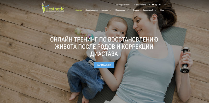
Uesthetic
The mosaic Blog modules and Team gallery presentation are good features of this site, packed with information and illustrations of the benefits of enrolling with Uesthetic. The click-for-callback button is an engaging feature.
FixHeat
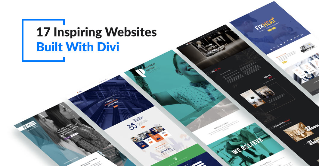
Great graphics and straightforward information, with a CTA on each page. The repeating motion graphic on the ‘Flushing’ page is a great feature, as is the accordion-module FAQ page to answer plumbing symptoms.
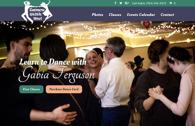
Dance With Me
A fun site with animated menu item and dual logo design rollover. The Classes page makes good use of unusual module borders, and our favorite feature is a categorized events calendar with a strategically placed purchase button.
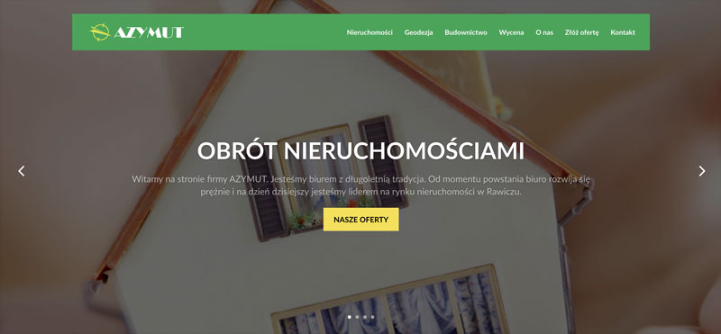
Azymut
This site makes good use of a fullwidth layout and categorized galleries of services. The large photos draw the viewer into the work presented.
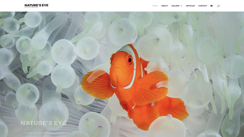
Nature’s Eye
A wonderful photography site that makes use of a full screen slideshow of retina-sharp photos for the homepage header. This site features a clever combination of shop and gallery – a great idea!
Prosthetic Orthotic Institute
A good succinct one-page site featuring diagonal header and big photo backgrounds. Just the basics, and presented very well.
Reason Group
This site is engaging right away, with a slide-in header graphic and self-starting video slider. The site features a clever use of a services mosaic with rollover pop-up descriptions. Diagonal headers and footer keep the eye focused on the page content.
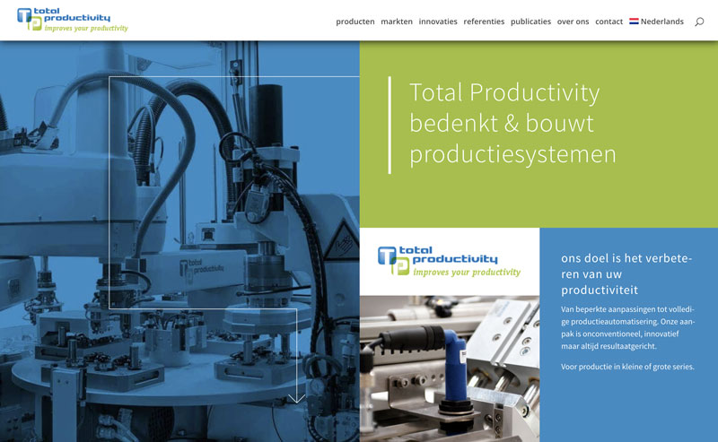
Total Productivity
A most unusual site, where every page is a mosaic. Information is organized into each tightly- knit combination of photos, colour blocks and text modules, and the animated line arrows keep the eye moving.
Bystrzak
This academic site makes great, creative use of Divi modules and colour-blocked blurbs, and features a mosaic gallery page and (on one page) a video mosaic as well.
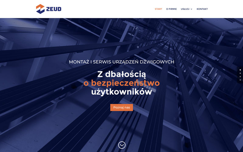
Zeud
The use of colour blocks and some slide-in animation break up this text-heavy site, and a unique feature on each services page is that the service represented disappears from the blurb lineup below, to be replaced with contact information instead.
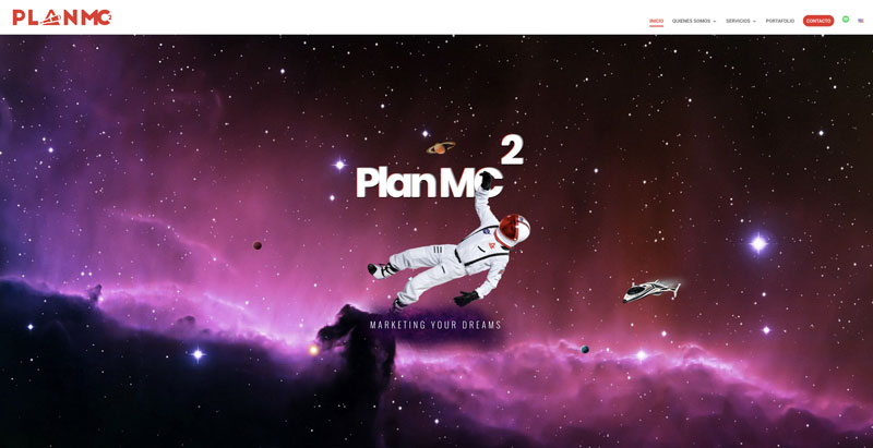
Plan MC2
Great mouse-animation on the homepage header makes you want to ‘play’ with the site. A good use of slide-and-zoom animates featured services, and little icons slide in beneath each headline. The site stays very focused on its rocket ship theme – right down to the back-to-top button.
Spacg
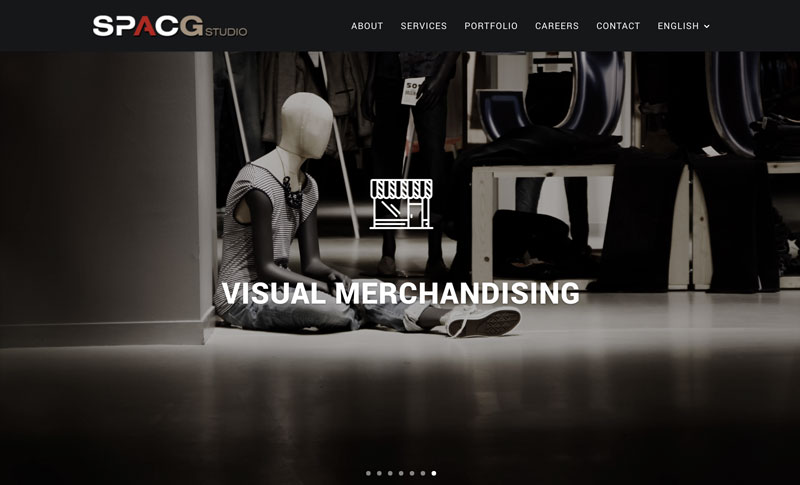
In this site, company-offered services are presented up-front, in a timed homepage slider with title and related icon. The site makes good use of slide-in and slide-up animation in its pages, and a clever slide-in portfolio, to make an elegant presentation.
Tari Donohue
Grace Studio
Tari Donohue is a branding agent and designer from Portland, Oregon, US, and works primarily with wineries, farms and epicures. Her website work is done in Wordpress and Squarespace. She has designed over 40 websites and authored four themes. Her photography is often featured in the websites she designs.









Veonio website offers digital marketing and a website designing which is based on the Divi Builder. The website itself is created with the Divi Builder and presents simplicity of this tool. VEONIO unique design makes it interesting but on the other hand easy to use.
As with any website, good content is key. Anything is possible with great content and Divi is a great platform for it.
As a web designer doing a lot of client paid websites. Good photography and a clear vision from the client with written content is the only thing that can produce an amazing website. I have done thousands of them. Putting it all together is straight forward if the business/client has a clear vision for their project, Designers are always making things look great.