12 Key Elements Of Modern Web Design
There is more to the process of web design than meets the eye. A smart web designer or developer not only will be able to craft a website that is beneficial to the end users but also serves search engines as well which in return can generate potential leads and conversion for many years to come.
There are literally hundreds of elements you can utilize which makes this quite challenging. However, sites designed in a modern way do not benefit from too much fancy stuff. Having a simple, clean, minimal, and professional looking modern design can make your website more effective and provide a better UX.
Today, we have narrowed down your choices with these 12 essential elements of modern web design to improve its performance.
Easy Navigation
One of the most significant elements of web design is easy navigation. It is the process in which a user moves around and explores your website. It is like a map of all the content and areas within your website.
Having an impressive and creative site is of no use if your visitors will have a hard time viewing and navigating it to find the information they are looking for. It should assist them in finding information before making any calls to action.
Your visitors and potential customers are more likely to stay if you keep it clear and simple. This will be good for your business since providing a good user experience will result in your visitors coming back for more.
Overall Layout and Visual Appearance
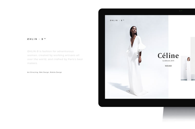
The overall layout and visual appearance of your site helps in improving the user experience. It includes your company’s design taking into consideration the effects of colors, space, typography, photography, and product usability among others.
Branding is also crucial. It should evoke both your site’s looks and what your company is all about. You also need to think of ways on how to leverage your visual branding on several platforms if you want to stand out from the rest of your competition.
Visual appearance is an extremely crucial element of any modern web design, especially if you want to create a long-lasting brand association and relationship with your customers. Every visual aspect of your design should be well-balanced from fonts and colors to shapes and images.
You should also not forget about the basics though. Aside from making sure that your site is aesthetically appealing, it should also be accessible, usable, and easy to find. You and your clients can get the most out of it by combining visual appeal with functionality.
Color Scheme
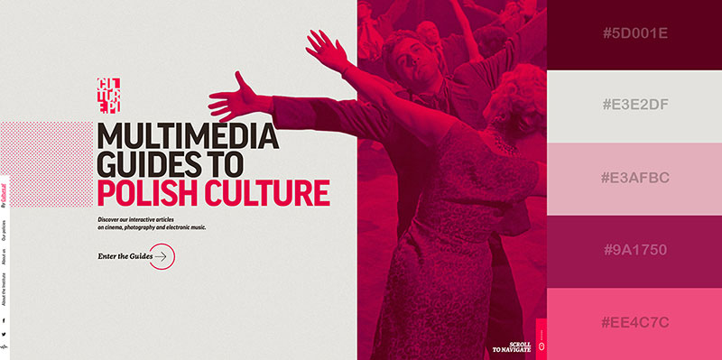
You may think that the color scheme of a website is a basic thing, but it is an important element of modern web design. Building a successful website also relies on choosing the right combination of colors through color theory. Creating a site starts with the understanding of color scheme theory. Ideas are developed through colors. It also expresses messages, creates certain emotions, and sparks interests.
When choosing your site’s color scheme, do not just pick the ones that you like, choose those that can strengthen both your business, brand, and website. Colors that look pleasing individually may not work well together. Learn how colors actually work together and what they symbolize, as well as how they are emotionally and internally evaluated. You can find the right color combination for your website by considering it as both art and science.
Content
One of the main reasons people create a website is for content to be shared. Content is an essential part of any web design and as Bill Gates famously said: “Content is king.” This quote remains true to this day amidst the innovation and advancement in web design tools and techniques.
Content is the foundation of your website. It conveys a message. It can also sell products and services and provides your users with useful information. Publishing unique content which your target audience will find relevant will also increase the number of users who will find your site in Google and other search engines. It is the job of search engines to look for content for customers and every piece of content you publish is a potential new entry point for your site.
Understanding how people read online will help you in shaping up your content into satisfactory headings, bulleted lists, and infographics to engage your users further.
Typography
You can come up with the most compelling content in the world, but if it is too difficult to read, you will lose your readers. Sans-serifs are always the best choice in terms of readability online. If you want to incorporate fancy typography to make an impact, consider using it for your headings.
Considering font size is also vital. Although we can increase the size of fonts on our devices, there are still some users who are not aware of how to do this. Tiny block text may look very clean, but what’s the point of using them if people can’t read them, right? Before, the standard font size is 12pt, but today more and more websites are utilizing the 16pt range because of how well it works on mobiles, tablets, and computers.
Read our pick of the typography trends that will be big in 2019 to know which ones you should be incorporating in your modern web design.
White Spaces – Design Has To Breathe
In today’s online world where we are surrounded with so much information, it is imperative for your layout to be clear. Whether your website is e-commerce or a blog, it should have an easy-to-understand and readable design.
White spaces or negative spaces are the part of your page that are left unmarked. It creates balance, harmony, and it is helpful in branding a design. It is also useful at directing your readers from one element of your page to another. Furthermore, it is an element of modern web design that can make any site look simple, clean, and uncluttered, and you will be able to deliver information that your audience will appreciate, understand, and enjoy.
Quality Images
Quality images are more than just a nice element to add to your website. You may think that the only purpose they serve it to make your site look good, but they do so much more than that.
When used correctly, they can help drive traffic to your site, encourage sharing on social media platforms, and eventually, they can help drive the goals of your business like conversion. They also work well with modern web design and they get you the results you want.
If you do not have a DSLR or mobile phone with an amazing camera, check out our list of websites where you can find free stock photos
Responsive Design
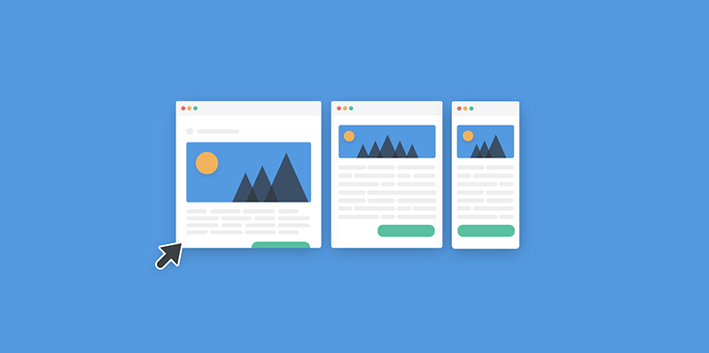
Responsive web design is a big thing right now. It can help solve many issues of your site, make it mobile-friendly, improve how it looks on all types of devices, and prolong the time your visitors spend on your website.
It is essential for your website to be viewable across numerous devices since you never know what kind of device visitors will use to visit your site. Mobile browsing has already overtaken the use of desktop when browsing the web. Furthermore, responsive web design presents several benefits for your site including flexibility, improved UX, cost-effectiveness, ease of management, and SEO gains.
Email Integrations
Email is a big part of our everyday lives. In fact, around 54% of the world’s population uses it. For this reason, integrating your web design with email is an excellent opportunity for your business to reach your target market. You will be able to increase your visibility and reach, which allows for engagement and conversion of leads consistently.
On the other hand, sign-up forms present a chance for your customers to obtain more information about your company or business. It also allows you to update them with the latest products and services which you are offering. It is a very useful tool that you can use to build your email marketing list which you can use in social media platforms and other marketing channels.
About Us Page/Telling Your Story
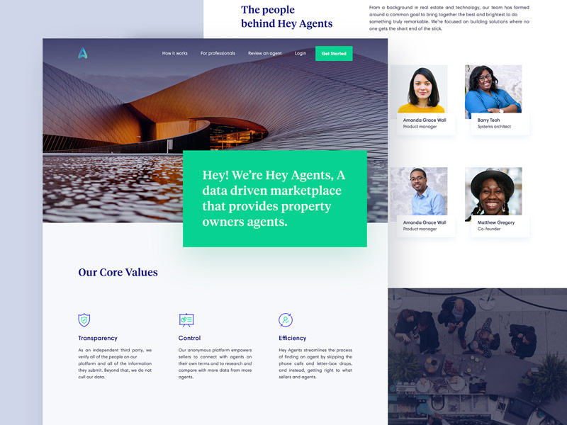
The About Us Page is the next most important part of your website after its homepage. It introduces who you are and what your business, company or brand is all about. It also explains what you do and develops a rapport to your potential clients.
Getting it right can be quite tricky, especially if your business is on the technical side of things. Do not just say what you want to say though. The key here is to explain what you are all about in a manner that is easy to understand. Gain customer trust by being authentic and inject some creativity to add a touch of humanness to it.
Fast Website
Nowadays, buyers are impatient and they will leave your website if they have to wait more than five seconds for it to load. No matter what your business’ niche or industry is, you want to provide your customers with a positive user experience. As the behaviors of customers evolve continuously, the speed of your website is something you should never overlook.
A fast loading website plays an important role in its usability and SEO. Even if your site has an exceptional modern web design, if it loads slowly, your visitors are more likely to lose interest and force them to check your competition instead. Ensuring that your site is fast and loads easily can help potential clients to interact with it and at the same time increase your search engine visibility.
Consistency
One of the golden rules of modern web design is consistency. Staying consistent with the content and design of your website will provide your visitors with a quality experience. It is what separates a good user experience from a negative one.
Your customers should be comfortable when visiting and browsing your website. They should be able to feel that it is created, arranged, designed, and packed with relevant and logical information that is easy to navigate. You are going to make your users happy and satisfied if you are consistent. Thus, they will be compelled to return over and over again.
Visitors will notice if you take the time and effort to make your website user-friendly. You do not have to apply every element we have listed here. The most important thing is that you will be able to fulfil the needs of your audience and provide them with the best user experience. Let us know if we have inspired you on your next project by commenting below!
Aileen Cuaresma
Aileen is a Technical and Creative writer with an extensive knowledge of WordPress and Shopify. She works with companies on building their brand and optimizing their website. She also runs a local travel agency with her family. On her free time, she loves reading books, exploring the unknown, playing with her two adorable dogs, and listening to K-pop.
Create beautiful blurbs with Divi Flip Cards
Let’s celebrate! We have a sweet deal for you! You can get the best flip box plugin for Divi with a 10% discount! Use the coupon code DFC10 at checkout!





Thanks fot the post. Content may be number 1 ?
You’re welcome! Content will always be king of course 🙂
I have benefited greatly after reading this article Thank you and I hope you will continue to keep writing articles related to the field of web design
Great article, thank you!
A nice article summarising the modern key elements of web design. Thanks for pulling these together with such an informative article. Look forward to reading more from your team.
These are all the great web designs.
Thanks for sharing the key elements of modern Web Design. Will be helping a lot of people.